
Base Data: Building a Map
Base Data: Building a Map
Though many pre-designed options exist, and can be selected as described above, the best reference map for a specific task is often the one you make yourself. When downloading base data for a map, you should consider the following data layers, of which you might need a few or many. This is not an exhaustive list of available base data content, but will help you start thinking about the kinds of data you may need.
Terrain Data
A good basemap will often include data that shows the shape of the physical landscape. All terrain layers are typically derived from a digital elevation model (DEM), which is a grid-based (raster) data layer that contains elevation layers.
Elevation can be mapped in several different ways; a common method is hypsometric tinting (hypso) or coloring based on elevation values, shown in Figure 1.6.1.
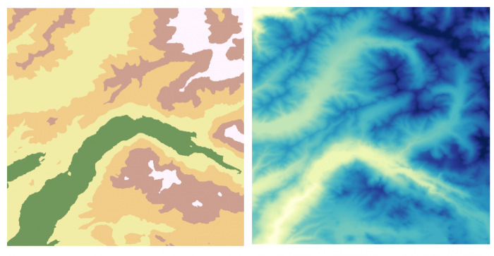
Image description: The image consists of two adjacent square maps side by side in which one shows vectorized terrain and the other depicts terrain though color applied to a raster. Each map appears to illustrate geographical data using colors, potentially representing elevations or other topographical elements.
- Left Map: This map uses a variety of colors including beige, light yellow, pink, green, brown, and white. The colors form irregular, organic shapes that are contiguous and cover the entire area of the map. The green sections appear as elongated, meandering forms that suggest valleys or lower elevations. Surrounding these green sections are lighter colors, with beige and light yellow taking prominent roles, potentially indicating mid-level elevations. Pink and brown are scattered near the top and central regions, while white patches are dispersed, mainly towards the right side of the map.
- Right Map: This map is dominated by cooler colors, transitioning from light to dark shades of blue, green, and hints of yellow and white. The blue colors form complex, vein-like patterns, possibly indicating river systems or lower terrains. Lighter shades, with hints of yellow and white, create a network of lines mimicking geological folds or ridges, suggesting elevated areas.
Contour lines are often used to show more detail about the shape of the landscape, either alone or combined with hypsometric tinting, as shown below.
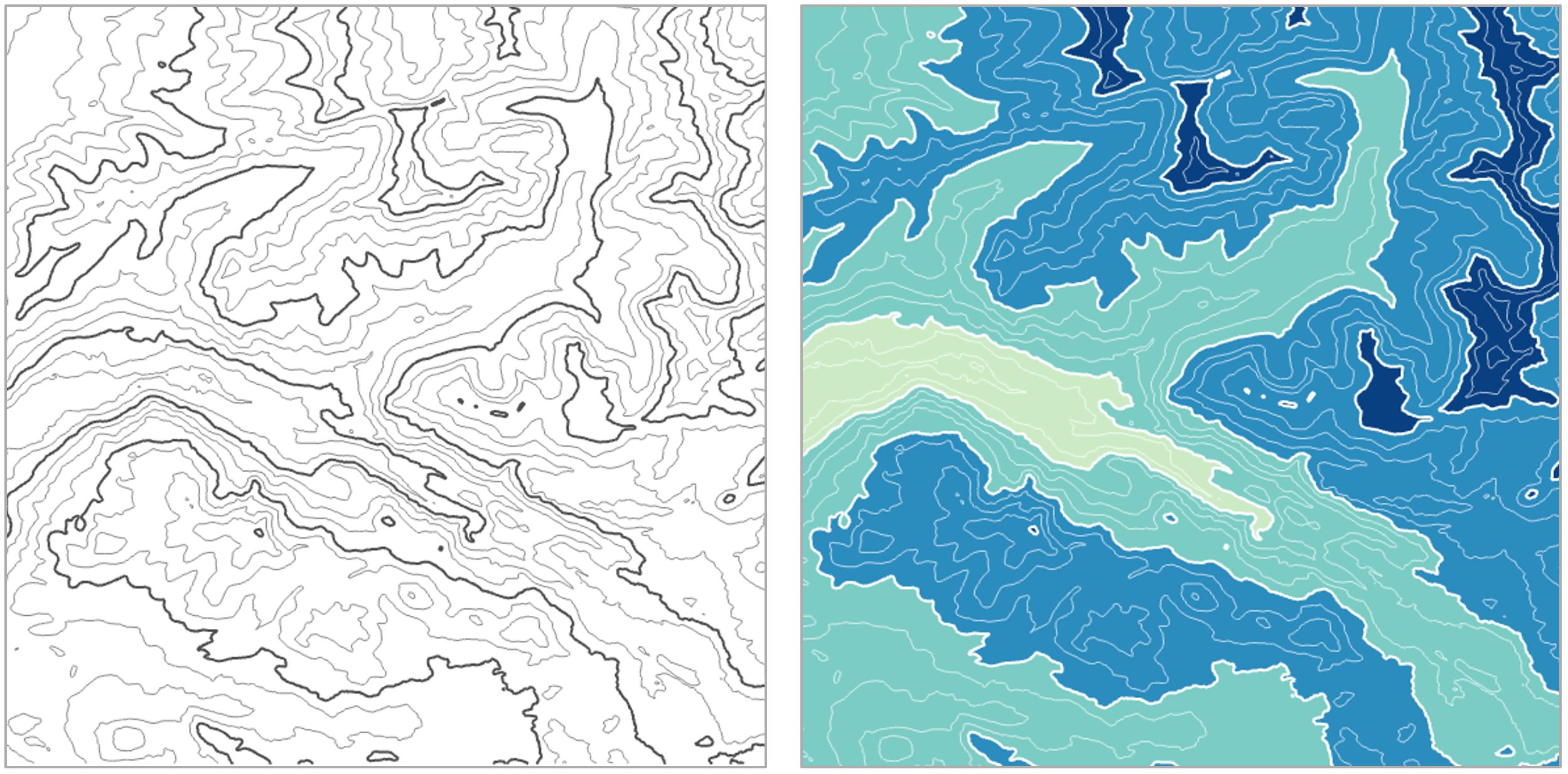
Image description: The image is divided into two vertical panels. The left panel features a topographic map with black contour lines on a white background, showing various elevations and the intricate patterns of the terrain. The contour lines are densely packed in certain areas, indicating steep gradients, while in other areas, the lines are more spaced out, suggesting flatter terrain.
The right panel displays a similar topographic map but in color. The contour lines are white against a gradient of colors ranging from dark blue to light green. The darker blue areas represent lower elevations, while the lighter green areas signify higher elevations. The color transitions provide a clear visual representation of the terrain’s elevation changes.
Other layers such as hillshade and curvature are often added for additional visual detail.
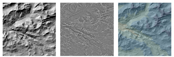
Image description: The image consists of three side-by-side panels, each showing a different representation of a topographical map.
- The left panel is a grayscale hillshade representation, displaying a high-contrast relief with sharp elevations and depictions of mountain ranges or rugged terrain.
- The center panel is a combination of hillshade with curvature using shades of grey, exhibiting detailed textures of the landscape with less contrast but highlighting intricate drainages and terrain features.
- The right panel is a colored relief map, incorporating shades of blue, green, and yellow to represent varying elevations and terrain formations. The colors gradually transition, providing a more detailed visual differentiation of elevation changes.
Orthoimages, or images of the earth’s surface that have been properly transformed for mapping purposes, can also be used alone or combined with terrain layers. We’ll talk more about terrain visualization later in the course.
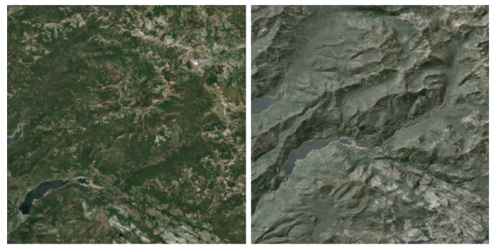
Image description: The image consists of two satellite views of different terrains, positioned side-by-side. The left side of the image depicts a forested landscape with varying shades of green indicating dense vegetation and several patchy lighter areas suggesting either less dense tree coverage or open land. A body of water is visible in the lower part of this section, displaying a dark blue hue.
On the right side of the image, the terrain is more rugged and mountainous, with steep rocky formations and ridges. The predominant colors are grays and browns, indicating rocky surfaces with minimal vegetation. There are also shadows present in the crevices which accentuate the rugged nature of the terrain. A couple of small, narrow water bodies are interspersed within the mountainous areas, appearing in a subdued blue color.
Cultural Data
Political boundaries are often important components of basemap design. Commonly-mapped boundaries include international borders, state or province boundaries, incorporated places, smaller census units such as tracts and blocks, and boundaries of Native American reservations, among others. Place names are used to add additional locational context.
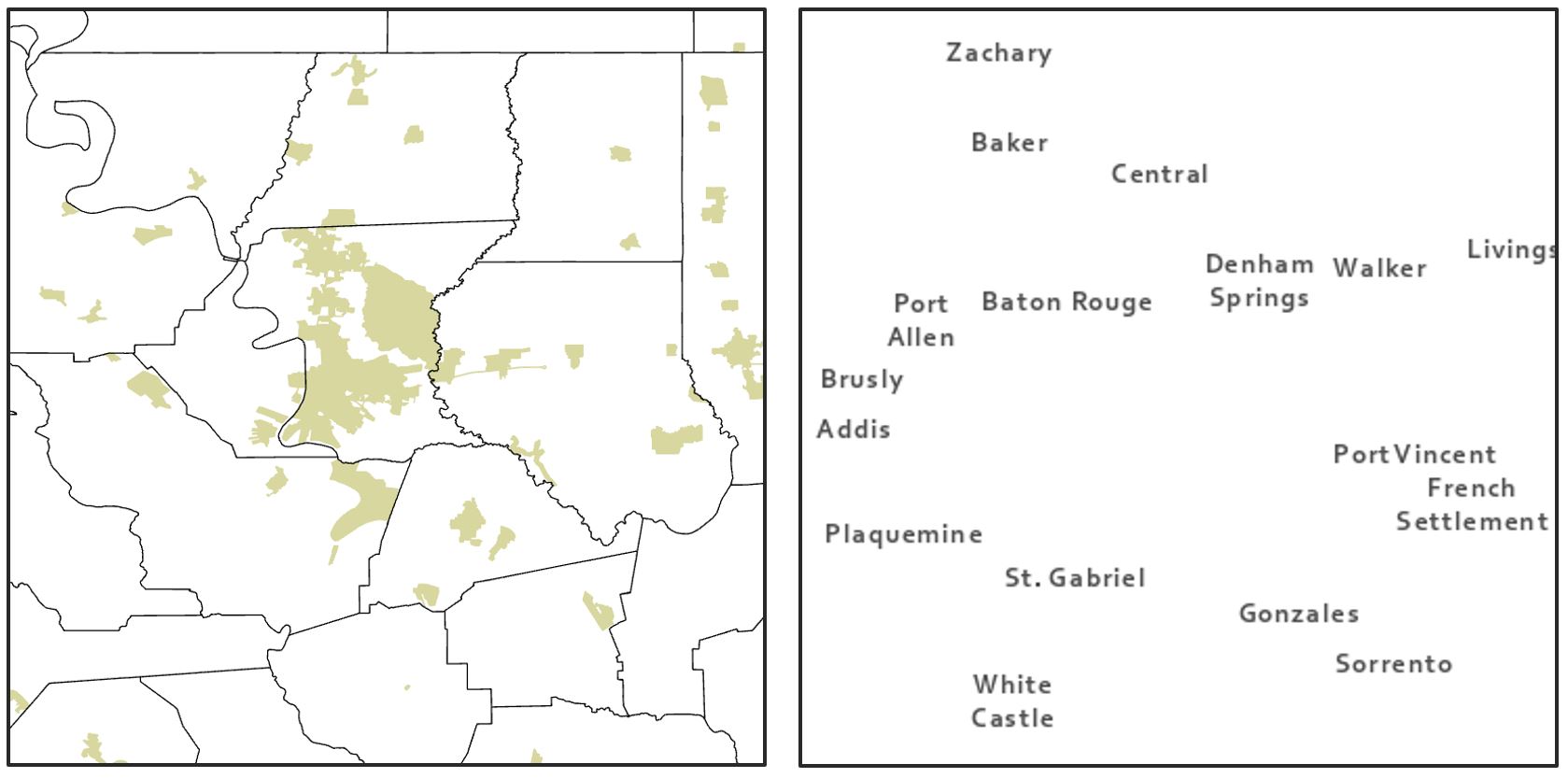
Image description: The image consists of two main parts. The left section is a map that outlines several regions with highlighted areas in light green, while the right section is a list of names corresponding to various locations on the map.
- Left Section (Map): This section depicts a geographical area divided into several regions. Some regions are shaded in light green, indicating particular areas of interest. The map has a simple outline with minimal details, primarily focused on highlighting the light green regions across the map.
- Right Section (List of Names): This section lists several location names, each spaced out and scattered across the white background. The names are written in black text of uniform size. The list is organized loosely to match the geographical positioning on the map.
Additional Data
Other layers that can be useful as base data include zoning and land use data. These data are often available in vector form from local GIS organizations. Land cover and impervious surface data, among other layers, are available in raster form from the National Land Cover Database (NLCD).
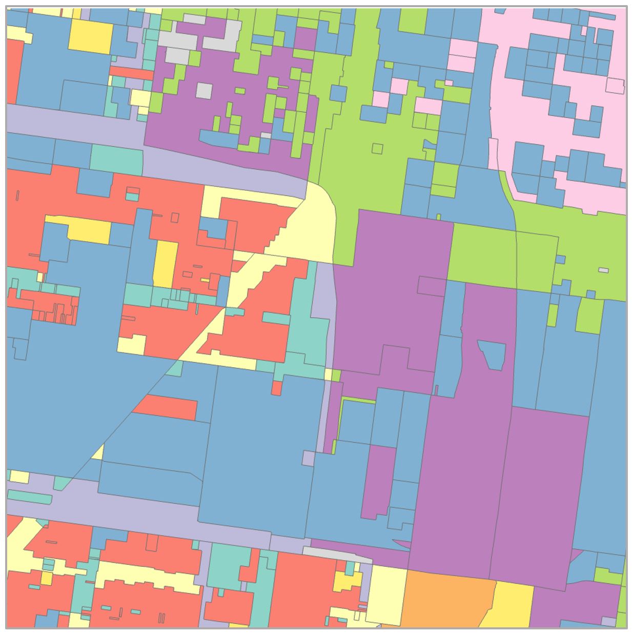
Image description: The image is a color-coded map consisting of various rectangular and irregular polygons with different colors. The map is divided into many sections, each represented by a distinct color including blue, red, green, yellow, purple, and pink. The map’s color scheme appears to distinguish between different areas or types of regions, though there are no labels or legends to specify the exact meaning of the colors. The shapes are interconnected, touching each other along their borders, creating a patchwork effect. There are some larger contiguous areas of the same color, while other sections consist of smaller, more fragmented shapes. A diagonal path cuts through the middle of the image, bordered by different colored sections.
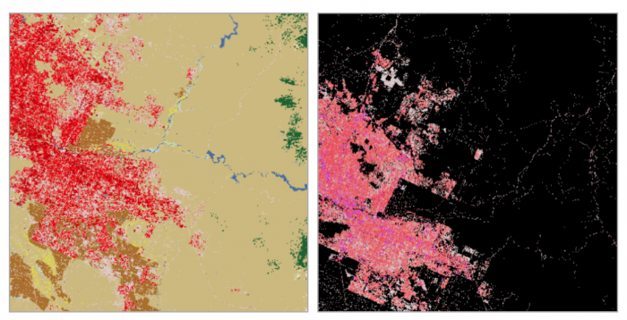
Image description: The image is divided into two parts, presented side-by-side in a comparative format.
Left Side:
On the left side, the image showcases a color-coded map with various hues depicting different areas. The largest portion of the map on the left is a beige color, representing a central feature. Pockets of bright red and green dots are dispersed throughout, indicating different zones. Light blue lines run across the beige areas, representing rivers or streams. The red areas are densely concentrated in some regions indicating urban or highly populated zones. Smaller patches of green, brown, and light pink are distributed sporadically across the entire map.
Right Side:
The right side of the image portrays a contrasting view, possibly utilizing a different imaging technique or filter. The background is predominantly black with bright pink and white dots dispersed throughout. The pink areas appear dense and are scattered similarly to the bright red zones on the left map. Small, dispersed white dots are visible within the pink clusters, and the overlay creates a stark contrast against the dark background.
Hydrography can also play an important role in a basemap. Data used may include streams, rivers, lakes, swamps, marshes, and wetlands, among other water features.
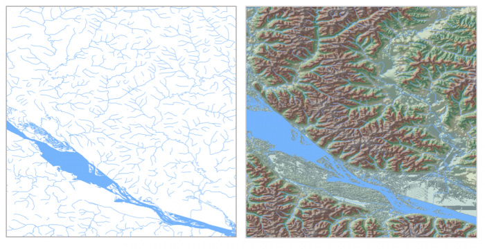
Image description: The image consists of two side-by-side maps. The left map is a simplified, line-based representation of waterways, showing rivers and streams in varying thicknesses of blue lines against a white background. A thicker, prominent river runs diagonally from the top left to the bottom center. Several smaller tributaries branch off from the main river, creating an intricate network of waterways.
The right map is a detailed topographic representation of the same area. It shows elevation and land formations with a detailed texture and color. The same prominent river runs diagonally from the top left to the bottom center with blue color, surrounded by textured land masses in shades of green and brown indicating different elevations and terrain. The topographic map also includes smaller water bodies and streams, similar to the left map but with more detailed land relief representations.
Given the vast amount of data available, it is important to think carefully about the base data necessary for map’s audience, medium, and purpose—and design accordingly.
