
Before you Map: Audience, Medium, and Purpose
Before you Map: Audience, Medium, and Purpose
There is no inherently good map—only a map that is well-designed and properly suited to its audience, medium, and purpose. Before creating a map, you should ask yourself (and if possible, your clients) several questions (Brewer 2015).
Audience—who is going to use this map?
- Will your map readers be novices or experts? Do they have advanced knowledge related to the data you intend to map? You would create, for example, a different map of crime hotspots for criminologists than for the public.
- Are your intended map readers knowledgeable about the area to be mapped? Those unfamiliar with a location might need more detail to understand its geographic context.
- How much time will a typical reader spend with your map? Some audiences will be happy to explore and analyze your map, while others may hope to understand the message of your map at a glance.
- Is your map accessible? Consider how colorblindness or low vision might affect your readers’ interpretation of your map.
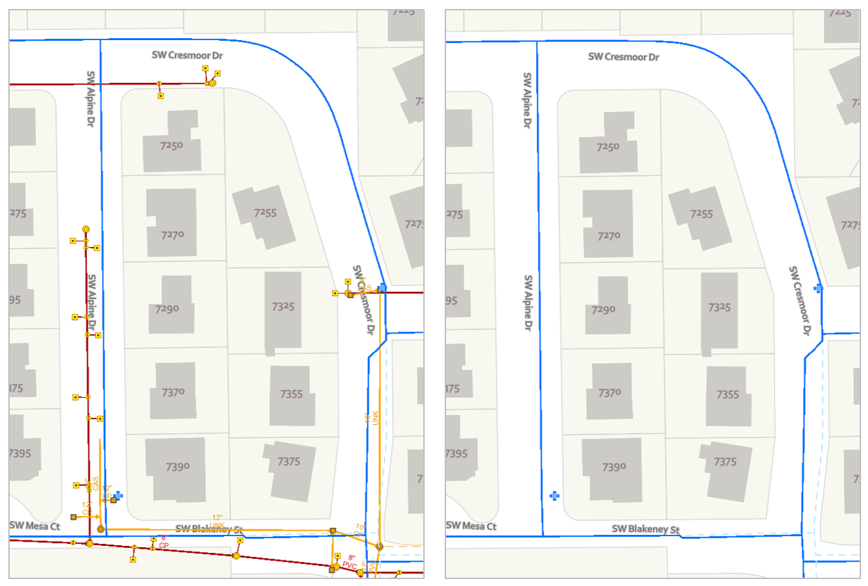
Image description:Two side-by-side maps displaying a residential neighborhood. The maps are nearly identical, depicting streets, houses, and infrastructure lines in different colors.Each map shows a layout of streets, including “SW Cresmoor Dr,” “SW Alpine Dr,” “SW Blakeney St,” and “SW Mesa Ct.” Residential properties are marked with house numbers such as 7250, 7270, 7290, etc. Infrastructure lines in blue and red, along with various symbols, are overlaid across the maps.
Details:
- Streets: The main streets shown are “SW Cresmoor Dr,” “SW Alpine Dr,” “SW Blakeney St,” and “SW Mesa Ct.”
- Residential Properties: Houses are marked in light grey with numbers (e.g., 7250, 7270, 7290, etc.).
- Infrastructure Lines:
- Blue lines represent one type of infrastructure on both maps, typically water or sewer lines.
- The left map includes additional red lines, possibly indicating a different type of infrastructure like electrical or gas lines, which are absent in the right map.
- Various symbols are used to mark utility points, such as small yellow squares with labels.
- “8′ PVC” and “12′ PVC” are noted along a segment on the bottom left of the left map.
Medium—how will this map be displayed?
- Maps are viewed in a vast number of formats—in desktop browsers, on mobile phone screens, in brightly-lit rooms on large-screen projectors, as well as printed in magazines, brochures, newspapers, posters, etc.
- In addition to the broad media category (e.g., mobile phone browser vs. poster), predict the specifics of your map’s final viewing format as much as possible—details such as the map’s size on a webpage or a reader’s viewing distance from a poster can make a big difference in both a map’s utility and aesthetics.
- If your map will be viewed in multiple media formats, you will likely have to create multiple versions of your map, each optimized for its respective display medium.
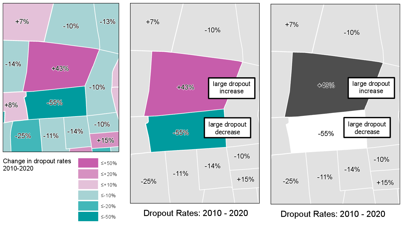
Image description:
Three maps representing changes in dropout rates from 2010 to 2020 in various regions. Each map shows regions colored differently to represent different ranges of dropout rate changes, with specific percentage values marked on them.
- Left Map: This colored map displays changes in dropout rates with a range of colors. Dark pink regions indicate increases greater than 50%, medium pink for increases up to 20%, light pink for increases up to 10%, light blue for decreases up to 10%, medium blue for decreases up to 20%, and dark blue for decreases greater than 50%. Specific values are marked on the regions, such as +7%, -10%, -13%, +43%, -55%, +8%, -25%, -11%, -14%, +15%.
- Middle Map: Similar to the left map, this map uses identical colors for the same ranges, and additionally labels regions experiencing notable changes. One region marked “+43%” is labeled “large dropout increase” in black-bordered white text, and another “-55%” is labeled “large dropout decrease”.
- Right Map: Using grayscale, this map simplifies the display, with dark gray indicating a “large dropout increase” marking +43%, and white for a “large dropout decrease” marking -55%. This map features the same regions and percentages as the previous two but focuses on highlighting areas with significant changes.
Purpose—what is the intended function of your map?
- Maps are used for many purposes (e.g., for navigation, for understanding spatial trends in data, for site selection, for communicating the results of a research project, etc.) Different purposes necessitate different maps.
- When making design decisions, consider how they will influence the success of your users in completing their expected map-use tasks. Maps for driving navigation, for example, are generally more useful when detailed terrain data is excluded, creating a simpler interface. In a hiking map, however, such information is essential.
- Considering in what scenarios a map will be used is also important—users of maps for emergency response, for example, will likely be stressed and working under inflexible time constraints.
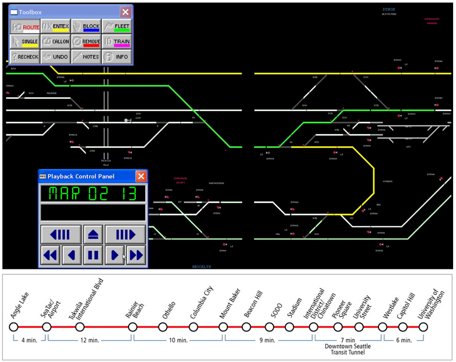
Image description:
A graphical interface of a railway signaling system with a focus on train routes and signal control. The main portion is a network map with colored lines representing different train tracks, displayed predominantly in yellow, green, and white against a black background. Several intersecting lines and junctions are marked by text labels and small symbols. Adjacent to the network map is a “Toolbox” panel, showing various command buttons (e.g., ROUTE, BLOCK, TRAIN) with associated symbols, and a Playback Control Panel showing “MAR 02 13” with playback buttons. Below the network map, a simplified timeline depicts the train stations for a transit line, marking stops from Angel Lake to the University of Washington with time intervals between them and indicating the Downtown Seattle Transit Tunnel.
In this course and beyond, you will make many different kinds of maps. Some will be advertisements, some will be scientific documents – some may be just for fun. No matter the mapping project or process you use, pausing to reflect upon the who, what, and why of your map will always lead to better results.
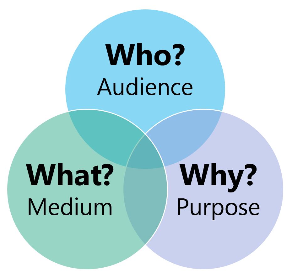
Image description: A Venn diagram with three overlapping circles, each a different shade of blue and green. The circles are labeled with texts, each representing a different element of consideration: “Who?”, “What?”, and “Why?”. The top circle is a light blue color and contains the word “Who?” in bold black text, with “Audience” in regular black text underneath. The left circle is teal-colored and contains the word “What?” in bold black text, with “Medium” in regular black text underneath. The right circle is a light blue-violet color and contains the word “Why?” in bold black text, with “Purpose” in regular black text underneath. The circles overlap in the center, creating a small central area showing the intersection of all three circles.
Student Reflection
Consider a mobile or desktop mapping application that you use frequently, such as Google Maps. What changes might you make to this mapping tool if a client asked you to alter it for a different, singular purpose—for example, as a wayfinding tool for young children, or for assisting police during emergency response?
