Building a Legend
The part of your map layout that will likely require the most thought—except of course, for your map itself—is your map’s legend. A map legend is a key composed of graphics and text that explains the meaning of any non-obvious map symbols. This non-obvious component is important to remember. Consider the general purpose map in Figure 2.6.1 below:
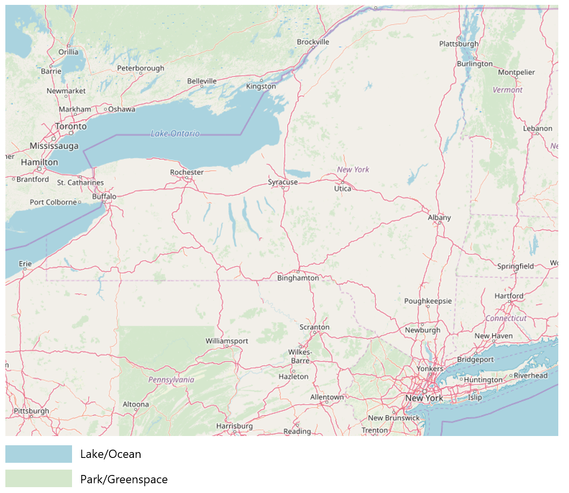
The legend isn’t incorrect, but it doesn’t help explain the map’s already clear design. Did you need a legend to understand that the blue features were water? Every element in your layout takes up precious space—there is no need to waste it explaining symbols that your readers will understand without it.
The same principle applies when adding text to your legend, such as a legend title. Legend titles should be used to add context and explain your map. Don’t title your legend “legend”—your reader will know it is a legend. If there’s no better title then “legend”, it doesn’t need a title at all.
If your map does require a legend, use the same care to design it as you do with map symbols and labels. Be cautious of the way you create column breaks or other visual groups in your legend design. People tend to perceive groups of things as related – use this to your advantage in your legend design.
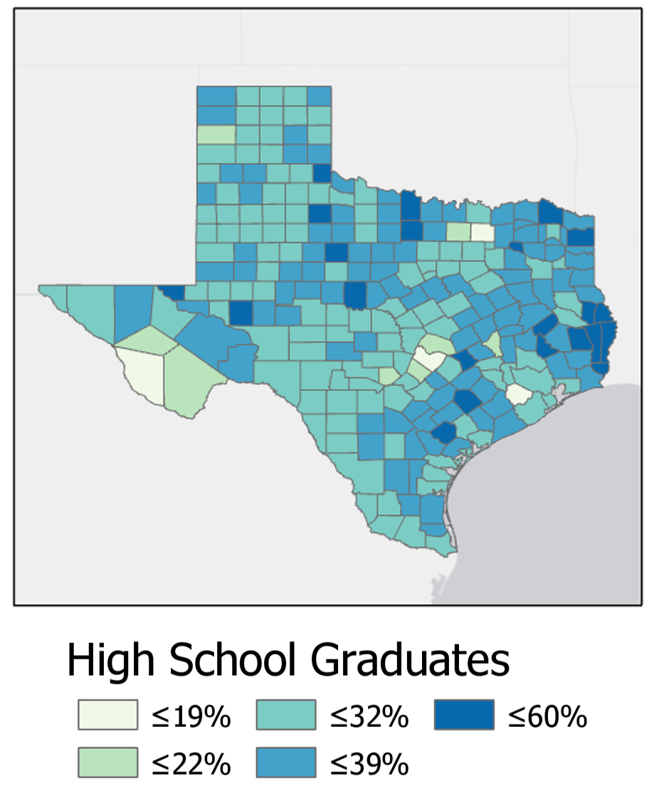
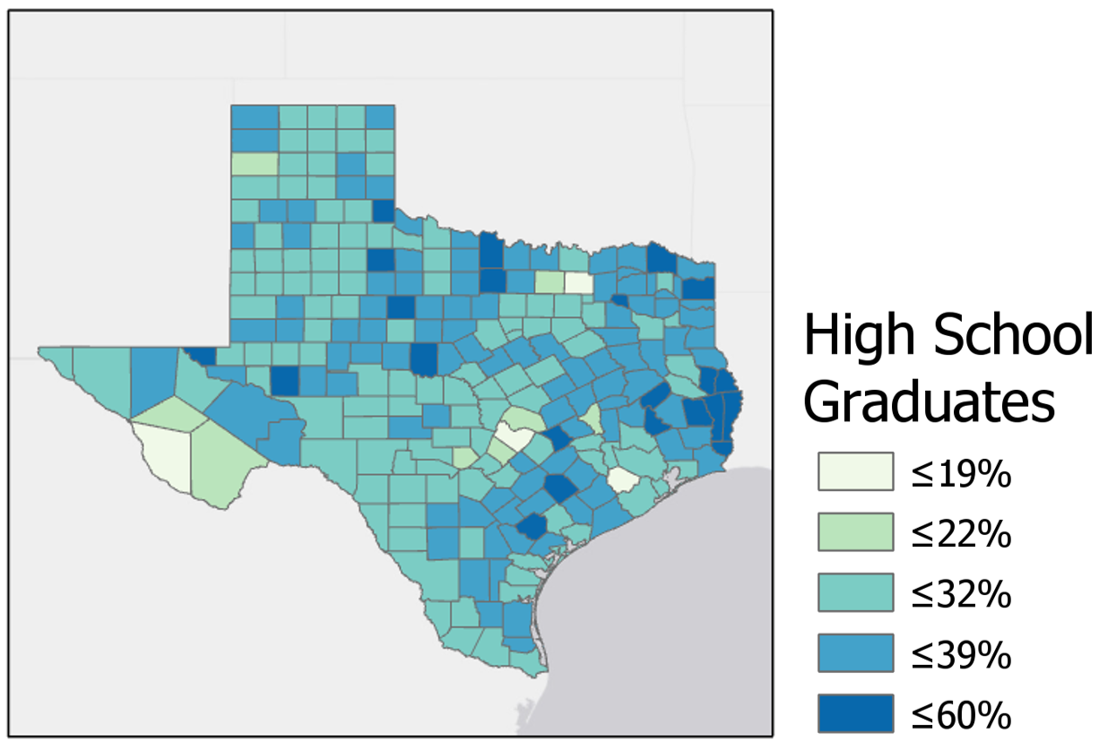
Figures 2.6.2 below shows a choropleth map with an accompanying legend. Though the legend accurately prints the map colors and their matching data values, the splitting of legend items across three columns breaks up the list in a way that may be confusing to the reader.
Below in Figure 2.6.3, the legend design has been much improved. A single column creates an easy visual representation of the color scheme for the reader.
For some legends, you will want not to eliminate column groupings, but to re-position or even create them. In Figure 2.6.4 below, inappropriate column groupings lead to ambiguity regarding the classification of some symbols. Are trails part of transportation, or are they their own category? What about streams? This legend leaves too much up to the reader to interpret.
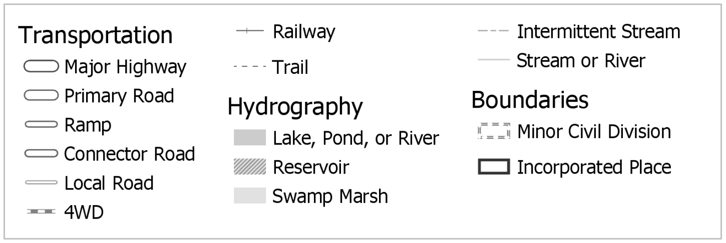
Figure 2.6.5 shows an improved version of this legend. Note that the different shape of the legend container means that it will need to be placed differently on the page—this highlights the importance of experimenting with layout arrangements throughout the design process.
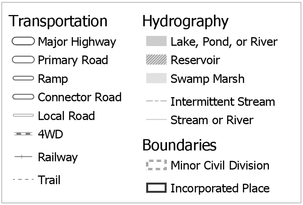
Note that the examples in 2.6.4 and 2.6.5 contradict the previous statement that obvious symbols like “lake” can be left off the legend. We will slightly relax this “only non-obvious features” guideline in order to practice creating well-designed legends, and due to the presumption that some of our symbol designs may stray far enough from cartographic convention to be nonintuitive to map readers.

