Cartograms
Cartograms
Thus far, we have discussed several methods for visually encoding maps with multiple variables via the addition of map symbols. There is another popular option: encoding data by altering the map’s shape or size itself. Area cartograms are maps in which the areal relationships of enumeration units are distorted based on a data attribute (e.g., the size of states on a map might be drawn proportional to their populations) (Slocum et al. 2009).
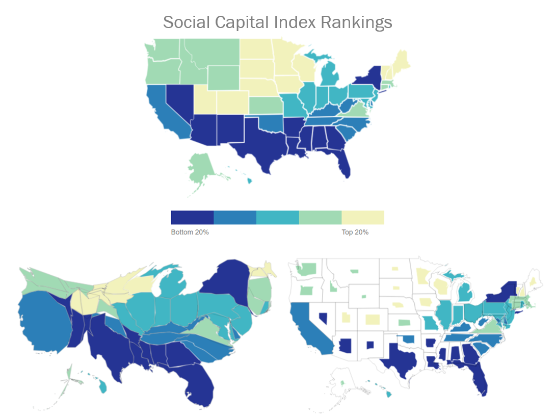
Figure 7.4.1 shows a choropleth map of Social Capital Index ratings (Lee 2018) at the top, and two cartograms beneath it. Each of these maps encode every state’s Social Capital Index ranking using a multi-hue sequential color scheme. The bottom two cartograms also distort the area of each state by sizing them based on their population—but they use different techniques for doing so.

In Figure 7.4.1, the map on the bottom left is a density-equalizing, or contiguous cartogram. Though areas are distorted, connections between the areal units (here, states) are maintained. The map on the right, conversely, is a noncontiguous cartogram. States are still sized according to their population, but this method used does not require the maintenance of connections at areal boundaries. The relaxation of this requirement allows areas to be re-sized without their shapes being particularly distorted. The inclusion of state political boundaries on this map also allows the reader to make an interesting comparison: which states are disproportionally populated, and which as disproportionally less so?
Student Reflection
Think back to earlier lessons—how might you apply color differently to improve the maps in Figure 5.4.1?
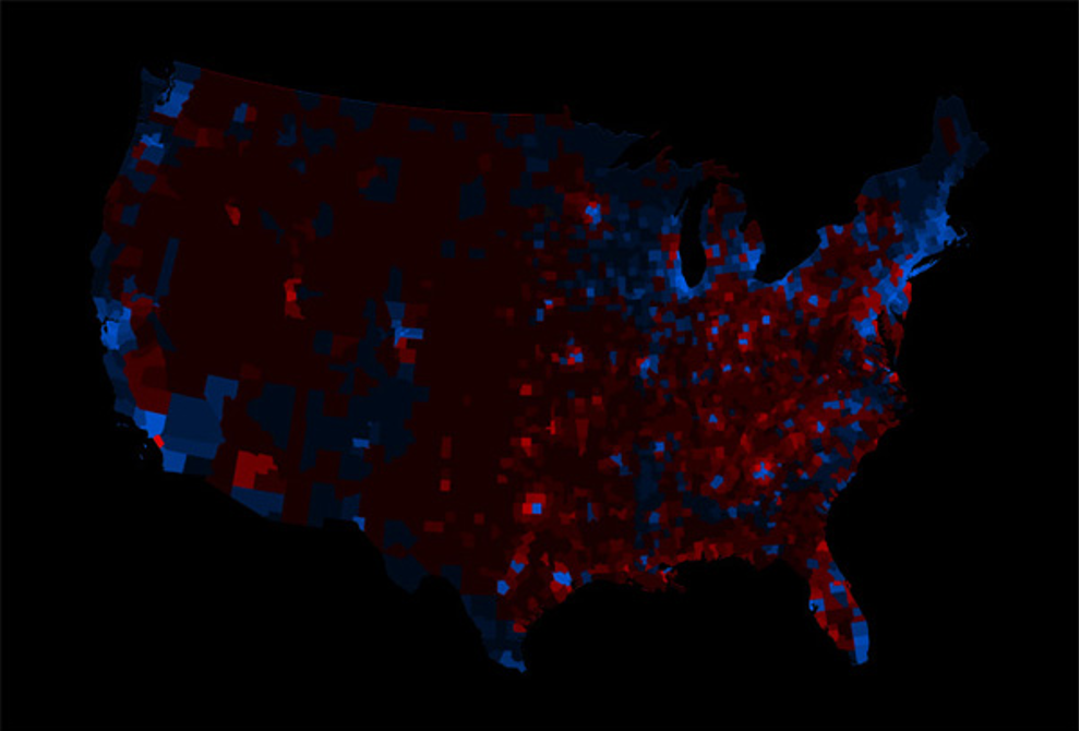
An alternative technique to constructing cartograms, called “Value-by-Alpha” mapping, was recently defined by Roth, Woodruff, and Johnson (2010). Rather than re-sizing areas based on their population, value-by-alpha maps use transparency to fade less-populated areas into the background, giving areas of higher population greater visual prominence. Thus, they serve a similar purpose to cartograms, but do not distort the map’s geography. This is not to say that they should always be used instead of cartograms—but they are perhaps an appropriate alternative when the shock value of a cartogram is undesirable, and maintenance of both area borders and shapes is desired (Roth, Woodruff, and Johnson 2010), which is not possible with traditional cartogram maps.


