
Lab 2 Visual Guide
Lab 2 Visual Guide Index
- Explore the data via the Contents pane
- Design symbols using the Symbology pane
- Make your second (smaller-scale) map
- Add each map to a layout
- Finalize and save your layouts
- Additional tips and tricks
1. Explore the data via the Contents pane
Open up the ArcGIS Pro Project that you created in Lab 1. Make sure that you incorporate any feedback that you received from Lab 1 regarding your geodatabase (using recommended naming conventions, etc.).
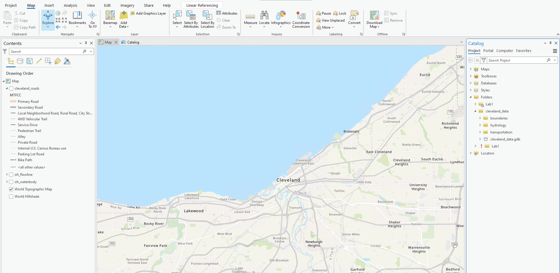
Image description: ArcGIS Pro interface displaying a section of a map focused on Cleveland, Ohio, and its surroundings. The map is shown in the center-right portion of the interface, illustrating geographical features such as water bodies and roads. The Lake Erie shoreline is prominently visible to the north, with the city of Cleveland located along it. Various neighborhoods and suburbs are labeled, including Lakewood, South Euclid, and Richmond Heights. The map uses distinct colors and lines to represent different types of roads and features.
On the left side, there is a panel labeled “Contents,” showing the drawing order and map layers, including roads and water bodies. Different road types, such as Primary Road and Secondary Road, are illustrated with color-coded lines.
The top part of the interface displays a toolbar with several tabs and tools related to map editing and analysis, such as “Map,” “Insert,” and “Analysis.” On the far right, a “Catalog” pane lists project folders and data components related to Cleveland, such as boundaries and hydrology.
You can toggle on and off layers using the associated checkboxes in the Contents pane. The World Topographic Map basemap should be the default basemap in your ArcGIS Pro project. The basemap also comes with a reference layer (that you can use to help locate an area of interest to map) that you can toggle on and off, but we won’t be including any labels on our map in Lab 2. We will work with labeling in Lab 3. While you can use the World Topographic Map layer as a guide during the map design process, make sure that you toggle off the World Topographic Map layer before you submit your final maps for this lesson.
Add all your layers to your map. For better handling of your layers, you can group them in the same way they are grouped in your geodatabase. Highlight the layers that are in the same feature class and right-click and then click on Group. Make sure the name your groups the same name as your feature datasets. Eventually, you will need to look at multiple layers at once, so that you can see how all your symbols look together. It will likely be easiest at first, however, to turn off (un-check) most of the layers so you can focus on one layer at a time.
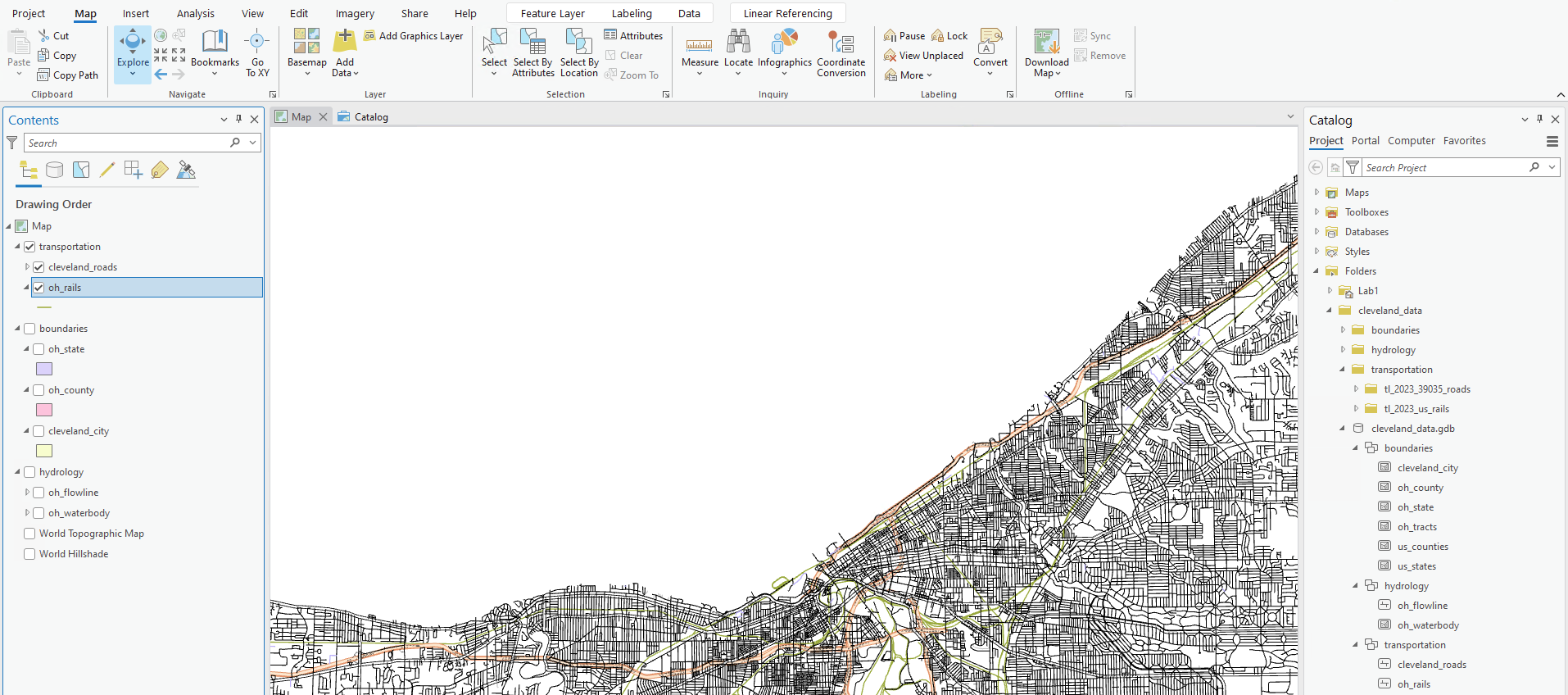
Image description: ArcGIS Pro interface displaying a map focused on the Cleveland area. The main map occupies the majority of the right side, showing a detailed road network of Cleveland, with various rail lines overlaid and colored lines signifying different transportation routes. On the top of the interface are menu options including Project, Map, Insert, Analysis, and others, with several icon tools for map manipulation beneath them. To the left, a “Contents” panel lists map layers organized under categories like transportation, boundaries, and hydrology, with checkboxes for visibility control. On the far right, a “Catalog” pane reveals folders and databases related to the map’s data sources.
3. Design symbols using the Symbology Pane
As a suggestion, it may make sense if you started from the “bottom” layer and worked your way “up.” In other words, think about “visually” what is the lowest layer in the list of data. For example, let’s assume the area of interest you selected is near a large water body. What color would you assign to that water body? Figure 2.3 shows how to select a layer (here, railroads) and open the Symbology pane. Clicking on the symbol will let you edit its properties. The next layer to work with may be “land.” Again, what color do you imagine appropriate for land given you color choice for the water body. How does the land color you selected contrast/compliment with the water color you chose? Upon inspection, you will likely have to change the colors associated with one or more of the layers until you have achieved a visual agreement with all of the layers, their colors, line thickness, and line styles. Continue adding additional layers according to your visual hierarchy.
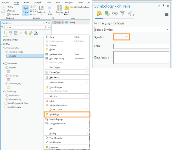
Image description: The image shows a screenshot of the ArcGIS Pro interface, divided into two main sections. On the left, there is a panel titled “Contents” which lists various map layers under “Drawing Order,” such as “cleveland_roads” and “oh_rails.” Various options are visible for interacting with these layers, including “Copy,” “Rename,” “Delete,” and others. The “Symbology” option is highlighted with an orange outline. On the right side, a separate panel is titled “Symbology – oh_rails,” where the primary symbology is set to “Single Symbol.” Below this, there is a “Symbol” field showing a yellow line symbol and fields for “Label” and “Description.”
Looking in the Gallery of the Symbology pane will give you some ideas, but you should alter these symbols – do not accept the defaults.
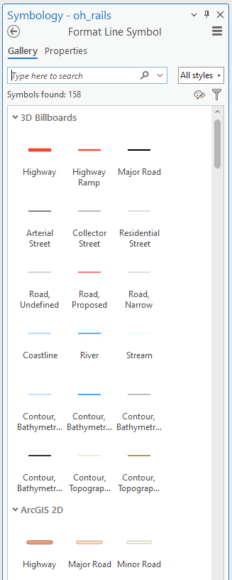
Image description: The ArcGIS Pro symbology panel labeled “Symbology – oh_rails” for formatting line symbols. The panel is divided into sections with different line symbols representing various types of roads and geographical features. At the top, there is a search bar labeled “Type here to search” with a dropdown menu for filtering styles. Below, the “3D Billboards” section contains symbols like Highway, Highway Ramp, Major Road, and others, each with distinct line styles and colors. Another section, “ArcGIS 2D,” includes symbols such as Highway, Major Road, and Minor Road, each represented by different colored lines.
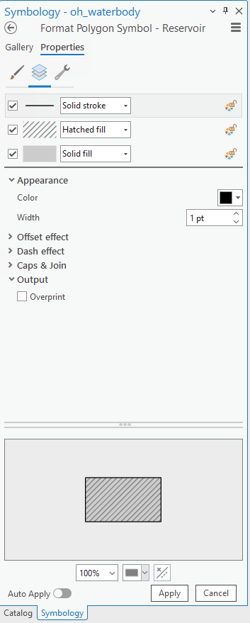
Design changes (e.g., color; thickness, style) are made in the symbol properties tab (Figure 2.5; left tab of the Symbology pane). Note that for Map 1 in this lesson you must work only in greyscale. Think about symbol ordering/importance as you design – more important features should have greater visual emphasis. Most detailed work is done in the symbol layers tab (Figure 2.5; middle tab). Experiment with the many options available (e.g., offsets and dashes). You can also preview your symbol at the bottom of the pane. The Symbol Structure tab (Figure 2.5; right tab) allows you to make multilayer lines. You can also drag to re-order these lines.
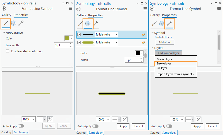
Image descriptions: The image displays three side-by-side panels of the Symbology panels for formatting line symbols. Each panel is headed “Symbology – oh_rails” with “Format Line Symbol” underneath. The panels show different properties and tools in a software application.
The left panel is under the “Properties” tab with an icon resembling a solid line highlighted. Under “Appearance,” there is a color box with a light green color and a line width set to “1 pt”. The “Enable scale-based sizing” option is unchecked. A preview of a light green line is at the bottom.
The middle panel also shows the “Properties” tab but highlights an icon resembling multiple layers. It displays two layers labeled “Solid stroke,” with the top layer showing a dark green color and the bottom a light green color. Both layers have a width of “3 pt”. A preview of a dark and light green line is at the bottom.
The right panel displays another “Properties” tab with an icon resembling a wrench highlighted. It shows sections for “Symbol” with “Global effects” and “Add effect” options, and “Layers” showing options like “Add symbol layer” and a dropdown for “Marker layer,” “Stroke layer,” and “Fill layer.” “Stroke layer” is selected with an orange border. A preview of the line appears similar to the middle panel.
You may notice a strange “caterpillar” effect when you create multi-layer lines. This is due to the default layering of line segments in ArcGIS Pro, but it’s easy to fix.
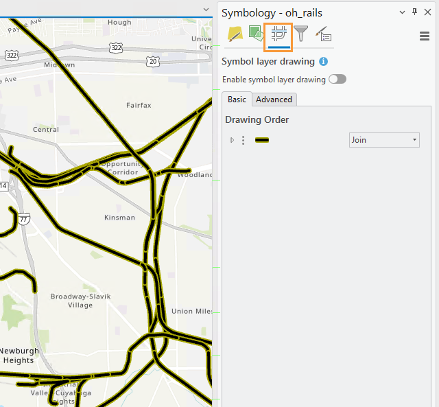
Image description: The image displays the ArcGIS Pro interface showing an area with highlighted railways in bold yellow lines. The map covers locations such as Central, Fairfax, Kinsman, Broadway-Slavic Village, and Newburgh Heights. In the top right corner, a panel titled “Symbology – oh_rails” is visible. An orange box highlights the “symbol layer drawing” icon. This panel shows options for symbol layer drawing with an indicator that it is not enabled. There are basic and advanced settings, with the basic setting showing a drawing order option set to “Join.”
You can fix this layering issue by enabling Symbol layer drawing within that layer from the Symbology Pane.
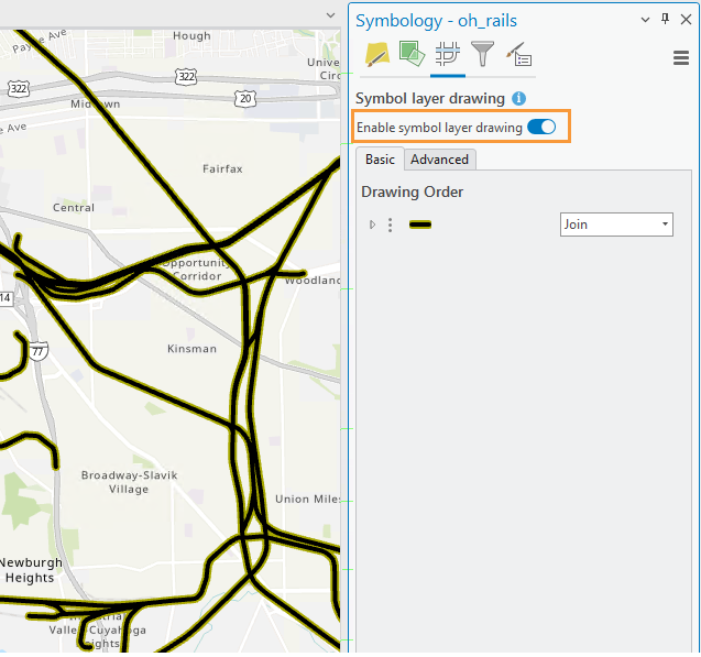
Image description: Image description: The image displays the ArcGIS Pro interface showing an area with highlighted railways in bold yellow lines. The map covers locations such as Central, Fairfax, Kinsman, Broadway-Slavic Village, and Newburgh Heights. In the top right corner, a panel titled “Symbology – oh_rails” is visible. An orange box highlights the “Enable symbol layer drawing” option and shows the indicator is enabled. There are basic and advanced settings, with the basic setting showing a drawing order option set to “Join.”
In Lab 1, you classified the road and water features. See if you can make any improvements upon your existing symbology for these features using what you learned so far. One example of the way you can change the line symbology is making more important road types such as highways more visually prominent) while one way you can change the area symbology is to explore the fill and outline color/pattern options. Experiment with different patterns but be careful with their implementation as patterns can look harsh and visually disruptive: remember that your main map must be designed in greyscale. Exploring the Gallery tab may help you develop ideas.
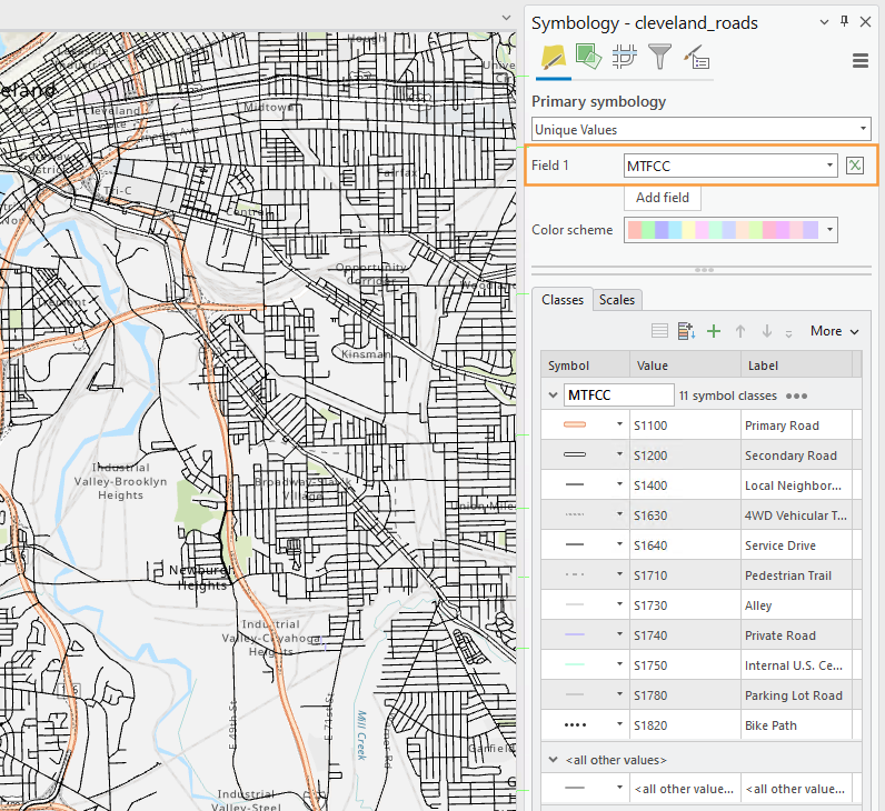
Image description: ArcGIS Pro interfaces showing road networks in Cleveland.” The left side features a map with various road types depicted in differing colors and line patterns, highlighting primary, secondary, and local neighborhood roads. Orange lines represent primary roads, while thinner black lines denote smaller streets. Blue curves indicate waterways. Regions labeled with text include “Valley-Brooklyn Heights,” “Industrial Valley Cuyahoga,” and others. The right side contains the symbology panel of the cleveland_roads shapefile showing a legend with road classifications (e.g., Primary Road, Secondary Road), their symbolic representations, and associated values coded as S1100, S1200, etc. The color scheme bar provides options for visualizing the data.
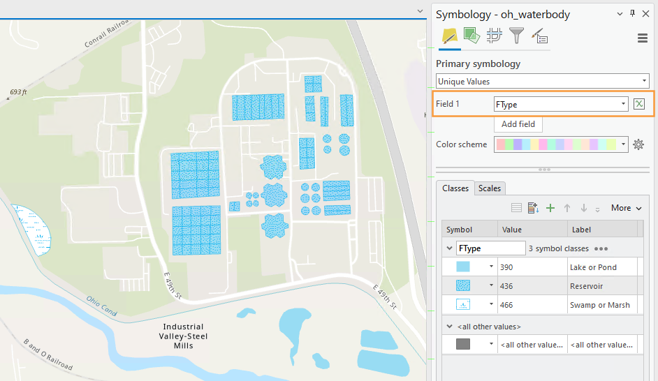
Image description: ArcGIS Pro interface with various water bodies highlighted in blue. These water bodies are depicted in a light blue color on the map, indicating different types, such as lakes, ponds, reservoirs, or marshes. The area is divided by grid-like streets and structures, with a railroad labeled as “Conrail Railroad” in the top left corner and the “Ohio Canal” along the bottom. Industrial Valley-Steel Mills is labeled centrally, with water bodies scattered throughout the area. To the right, the symbology panel showing the symbology of “Symbology – oh_waterbody” shapefile, provides a key with symbols and corresponding values for different water types: “Lake or Pond,” “Reservoir,” and “Swamp or Marsh.” The map includes street labels such as E 49th St and E 45th St. There is a transparent rectangle with an orange border highlighting the Field 1 primary symbology option.
You are free to alter the labels for each feature type, or change their order using the arrows in the Symbology pane. Note that it doesn’t really matter what your labels are for this lab, as long as you understand them. We will not be creating a legend in Lab 2, so these labels will only be visible to you.
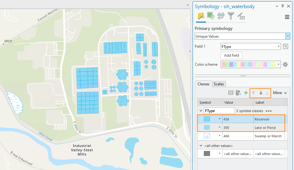
Image description: ArcGIS Pro interface with various water bodies highlighted in blue. These water bodies are depicted in a light blue color on the map, indicating different types, such as lakes, ponds, reservoirs, or marshes. The area is divided by grid-like streets and structures, with a railroad labeled as “Conrail Railroad” in the top left corner and the “Ohio Canal” along the bottom. Industrial Valley-Steel Mills is labeled centrally, with water bodies scattered throughout the area. To the right, the symbology panel showing the symbology of “Symbology – oh_waterbody” shapefile, provides a key with symbols and corresponding values for different water types: “Lake or Pond,” “Reservoir,” and “Swamp or Marsh.” The map includes street labels such as E 49th St and E 45th St. There is a transparent rectangle with an orange border highlighting the Reservoir and Lake or Pond feature symbology.
You can also drag to re-arrange entire layers within the Contents pane. Think carefully about the ordering of the features on your map. Should railroads be drawn above or below lakes and rivers? What about political boundaries? Why? You may want to reference popular general purpose maps such as Google maps to compare your choices, but there is not always a right answer. Think of your audience and map purpose!
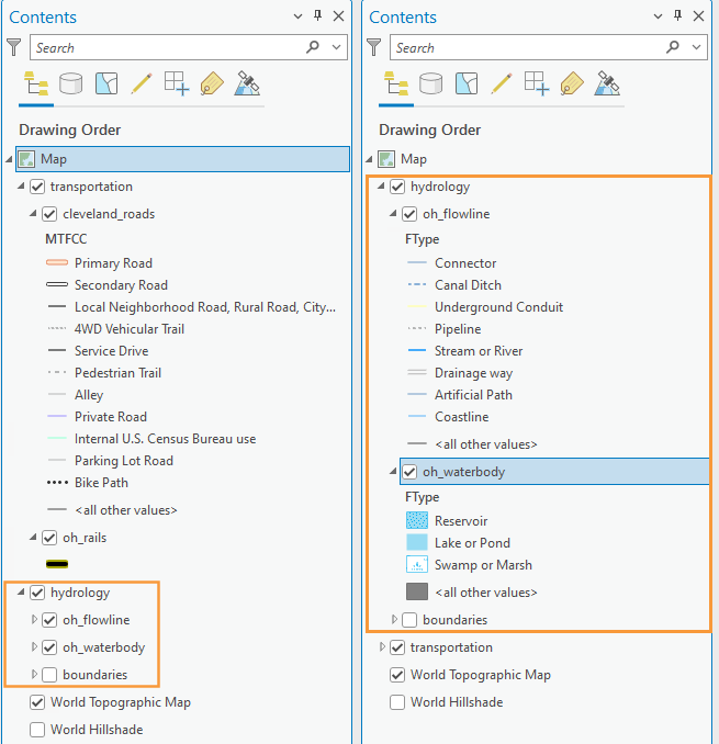
Image description:
The image shows two side-by-side screenshots of the “Contents” from the ArcGIS Pro interface. Both panes display hierarchical lists for map layers and their subcategories. The left pane is titled “Contents” and shows a drawing order for a map with categories such as transportation (including cleveland_roads and oh_rails), hydrology, and boundaries. Under transportation, subcategories include various types of roads and paths. The features of the hydrology layer is highlighted in orange. The right pane is also titled “Contents” but focuses on hydrology, specifically showing the features for oh_flowline and oh_waterbody, each containing subcategories like Connector, Stream or River, and Reservoir. These features and sub-categories are highlighted in orange. Both panes contain similar toolbar icons at the top.
4. Make your second (smaller-scale) map
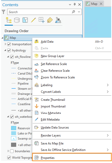
Once you’re happy with your large-scale (1:24,000) map, save it as a map file by right-clicking on the map name in the Contents pane – you should save it in the same folder as this ArcGIS project folder to keep everything organized and connected.
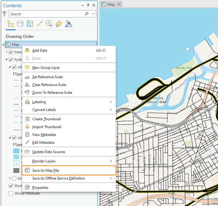
Image description: The image shows a screenshot of the ArcGIS Pro software interface. The left side features a panel titled “Contents” displaying various tools and options. Below the title, icons for search, drawing, and tool adjustment are visible. Upon right-clicking on the Map icon, a menu opens, displaying multiple options related to map organization such as “Add Data,” “New Group Layer,” and “Zoom To Reference Scale.” “Save As Map File” is highlighted in orange. The right side of the image displays a detailed map section with roads, labeled areas, and water bodies on a light blue background. The map shows parts of a city layout with streets and a waterfront.
You can then import that saved map into this map project. Note that a map project can contain several different maps and map layouts. Once you re-import your map, this will create a duplicate map within the project file. You can then use this as a starting map for making your smaller scale map. Your main tasks then will be to add color and adjust your symbols for this smaller scale.
Creating a duplicate map this way is not required. Another option is to start your second map from scratch. I recommend creating and editing a copy of your first map instead, as this map will likely have a similar design to your first map, and creating a copy will prevent you from having to re-do a significant amount of design work (unless your second map has a different scope and purpose than the first map).
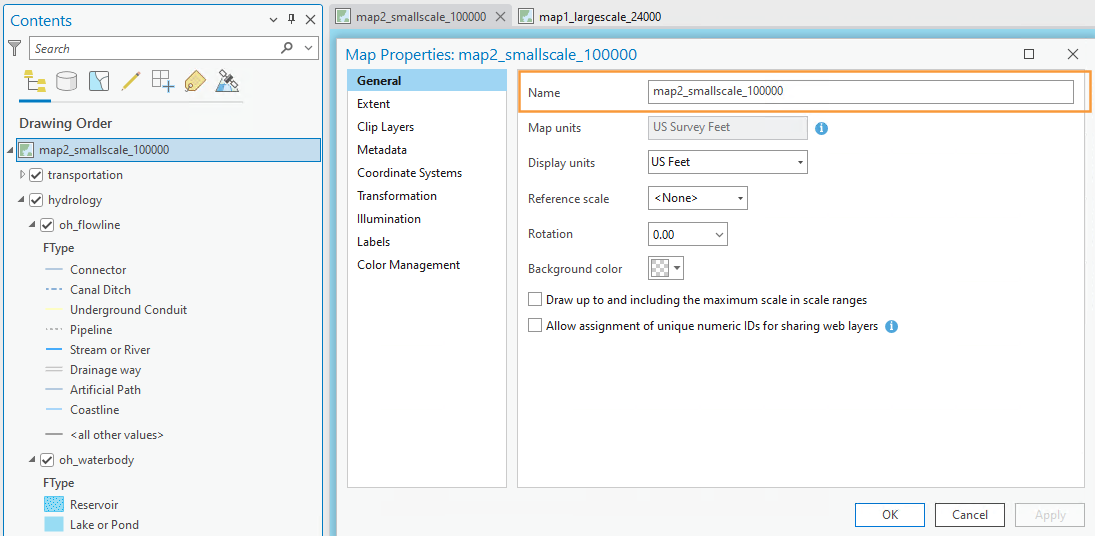
Staying organized will help you tremendously in the long run. A big part of this is saving your map files with useful file names. Use the Properties dialog box to change your map names to something memorable and descriptive – you don’t want to mix them up.
Some ideas for descriptive map names are shown below:
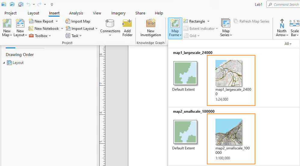
5. Add each map to a layout
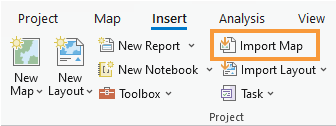
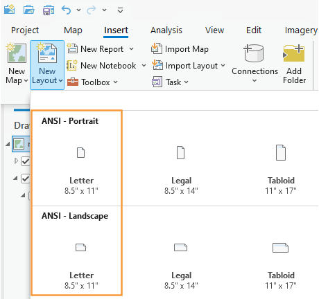
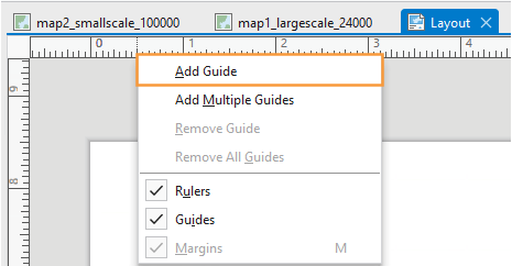
Use the Insert tab to create an 8.5″ by 11″ layout. Either Portrait or Landscape layouts are fine—but either way, use guides to create a ½ inch margin all around. Once you’ve created a layout, you can import your map as shown below. Use the labeled map rather than the “default” map to insert your map at the appropriate scale.
6. Finalize and save your layouts
Once you’ve added your map to a layout, you’ll want to make some final adjustments.
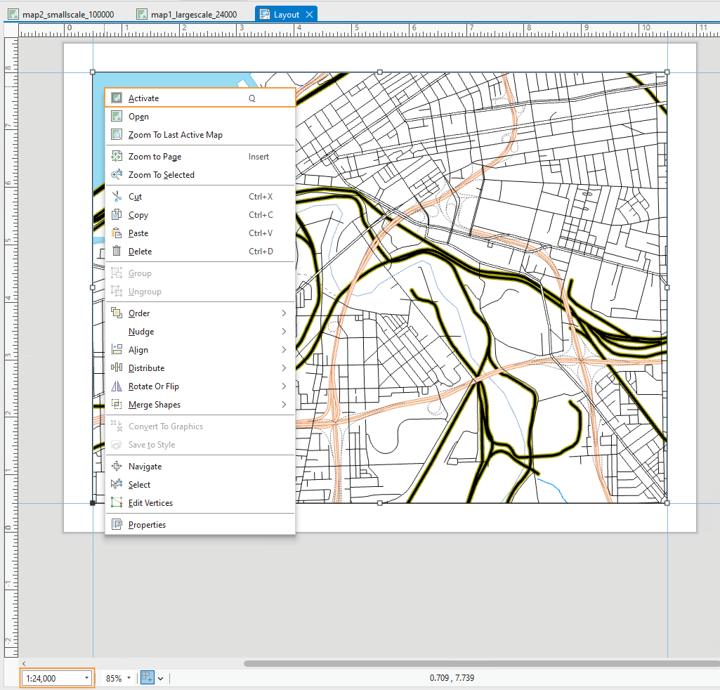
- You’ll need to activate your map as shown below to pan around the area.
- Make sure you’ve chosen an area of interest that suits the map requirements. It’s ok to adjust your map’s location at the end – when you designed your map symbols, they were automatically applied to the entire dataset.
- Whether or not your map is activated, you can adjust its scale at the bottom of the page.
- Make sure that you toggle off any basemaps before you submit your final maps. Except for your name, there shouldn’t be any labels or text on the map.
- Note that the map in Visual Guide Figure 2.19 is not well-designed at all – it’s intended only as an example of how to insert and activate a map in a layout.
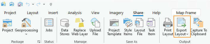
The final step is to export your maps as PDFs. Remember you will have two layouts, one for each map. Use the Share tab to export your layouts.
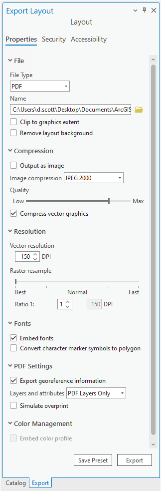
Considerations when exporting. For most maps, a 300dpi is fine. However, if you use
- gradient area fills
- complex area patterns
- coastline effects
then, change the resolution to 150dpi. Otherwise, the file sizes will become extremely large and Canvas can’t display these large file sizes. Once your PDF is exported, check the file size. You should keep your exported PDF’s file size to less than 10MB. When I go to look at your maps, Canvas has a difficult time displaying files larger than 10MB.
7. Additional tips and tricks
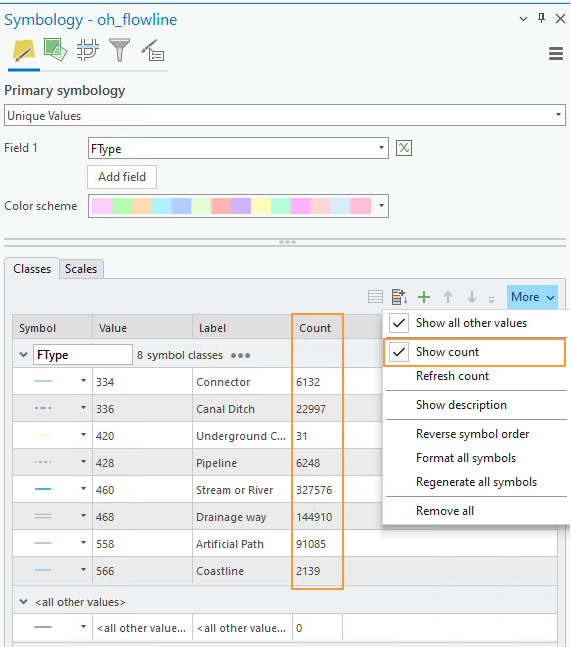
Use “Show count” to view how many of each feature type are included in the map data.
Remember to experiment with multiple layers, verify your map design meets all requirements, and design your 1:24,000 map in only greyscale and your 1:100,000 using color. Designing a map in greyscale may require you to be a bit creative with multilayer symbols and patterns – but that’s a good thing! As shown in the example below, you can use different shades of grey and patterns or other fill ideas to create interesting map symbols.
Data Source: The National Map.
