
Lab 3 Visual Guide
Chapter 3 Lab Visual Guide Index
Part I: Labeling
- Starting file
- Finding names in your data
- Adding labels to your map
- Editing label classes
- Designing label symbols
- Positioning label symbols
- Creating label expressions
Part II: Layouts
- Putting it all together
- Build your layout
- Add marginal elements
- Create a legend
- Final tips and tricks
Part I: Labeling
1. Starting file
Start this lab by opening your project file from Lab 2. Use “Save As” to create a new project for Lab 2. After this, you’ll be ready to add labels!
2. Finding names in your data
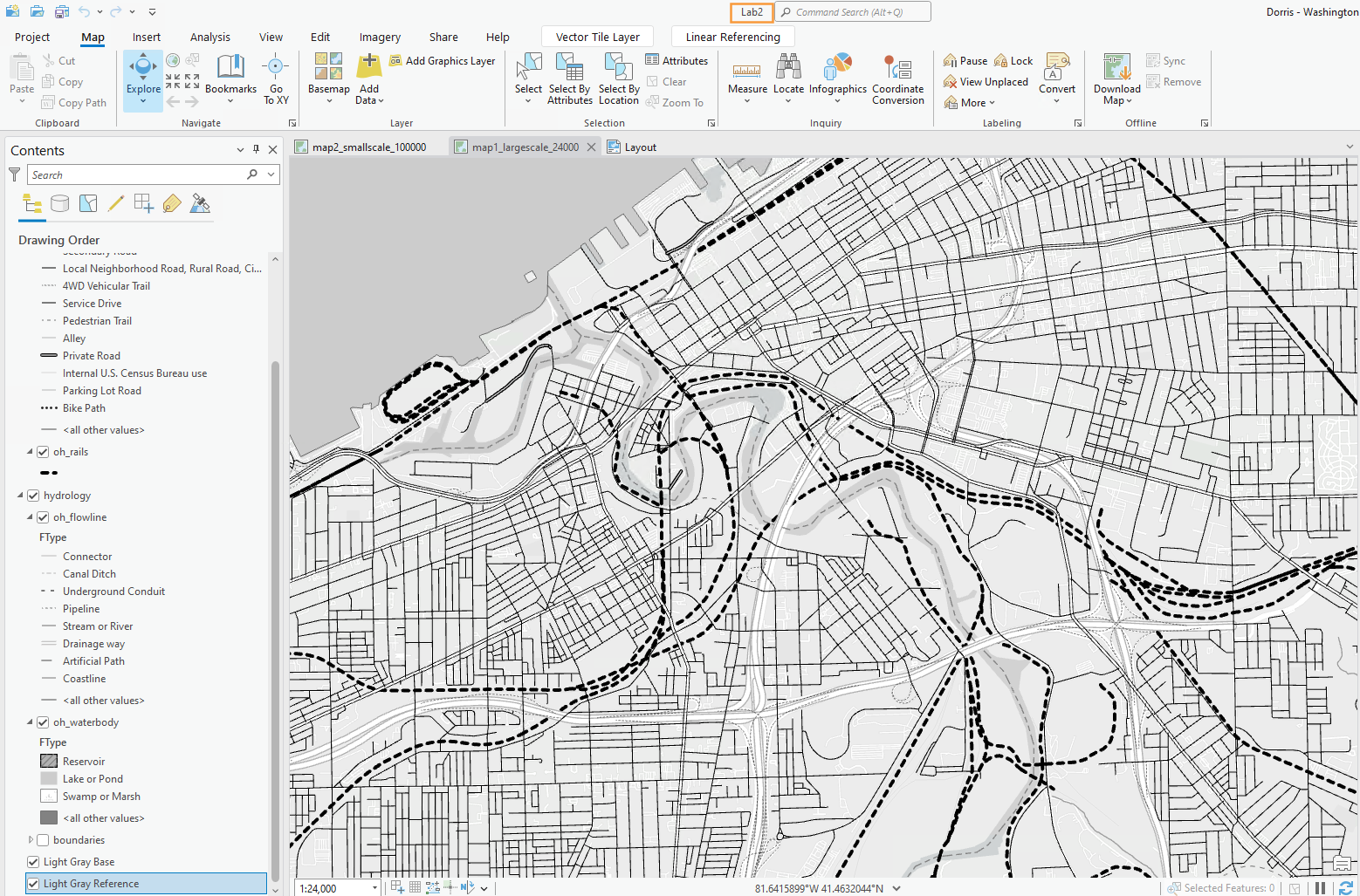
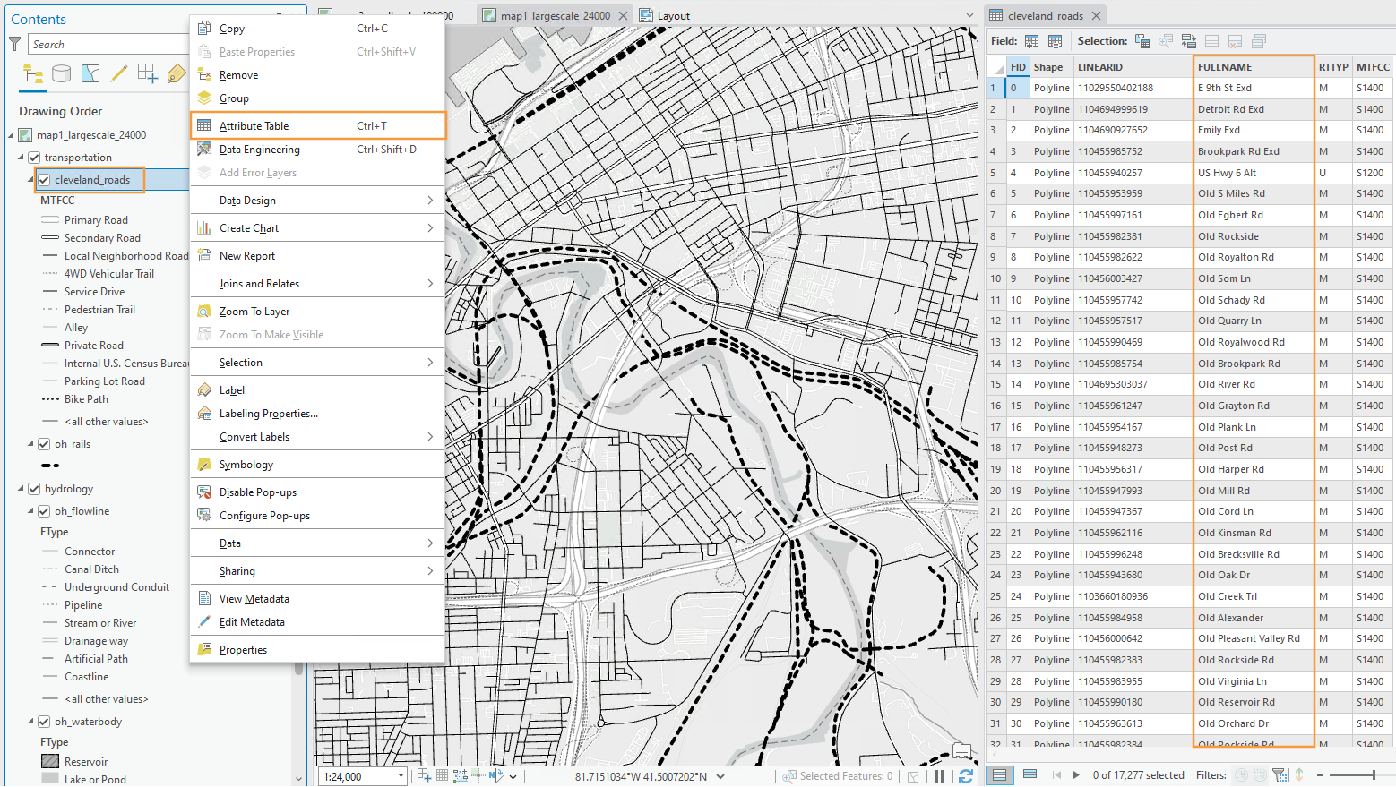
We do not have to write our own labels for map features – they’re already in our data – we just need to make them visible. Map features often contain multiple fields (data columns) with possible names, so we need to identify the best ones to use. To do this, open the attribute table for the layer you want to label. We can see the Full_Street_Name field seems like a good option to start with for this layer.
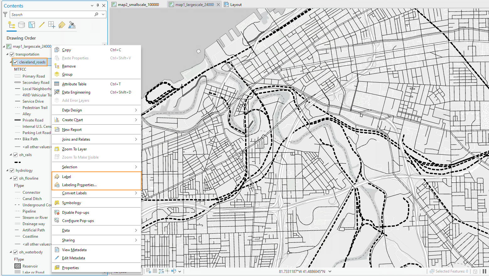
3. Adding labels to your map
To turn on labels for a layer, right-click the layer and toggle labeling on. To edit the labels, open Labeling Properties as shown below. This will open the Label Class pane. In this pane, the expression box shows how your labels are being drawn from a field in the attribute table. In some cases, ArcGIS will correctly identify the best field to use for labels. In other cases, it will not, and you will have to alter the expression manually. We will use Full_Street_Name, the field we identified earlier.
4. Editing label classes
Begin editing the style of your labels with the Labeling menu in the ribbon shown below. The default label symbols available are good starting points – they will help give you an idea of how to best design your own labels.
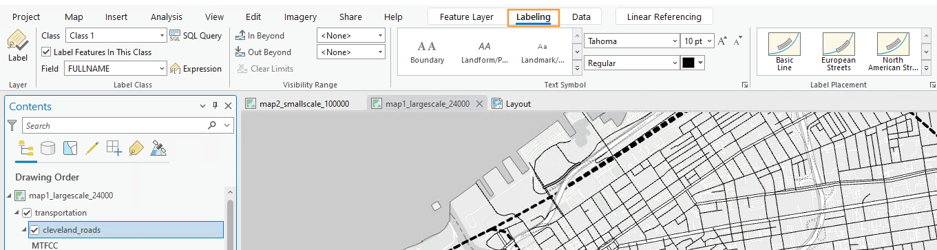
You should also create label classes using this top menu bar. Similar to when we classified roads by their MTFCC code in Lab 2, we create label classes so that we can create different types of labels within a feature category, and use these classes to design our labels with visual order and/or category.
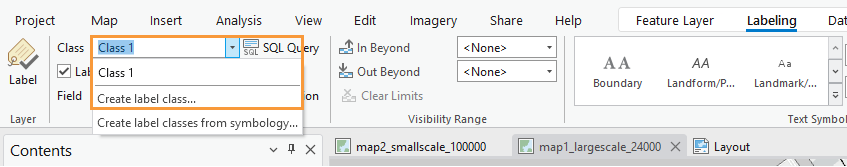
When you create a label class, all you are creating is a class with a name – ArcGIS will not automatically recognize, for example, that a label class named “Interstates” should only be applied to roads which are interstates. We will tell ArcGIS this using SQL (structured query language).
In our data, all interstates have a MTFCC code of S1100 (this code signifies the interstate road-type; see the 2022 MAF/TIGER Feature Class Codes document). We can define this label class using the SQL view in the label class pane. See below:
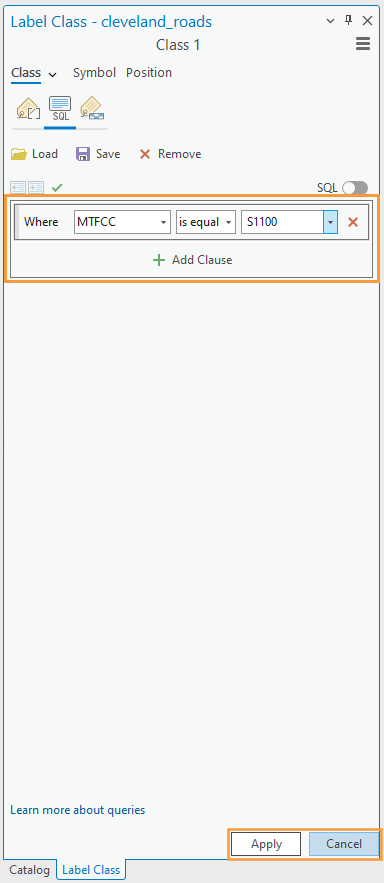
Note: The Label Class Pane can also be used to create label classes, instead of the top menu bar. You may find it more helpful to use the Label Class Pane for most labeling tasks.
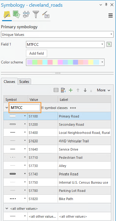
If you forget which MTFCC code refers to which road type, you should refer to the image below. You can also open this view in your project – your road features should still be classified by MTFCC code, so viewing it in the symbology pane should create a view similar to the one below.
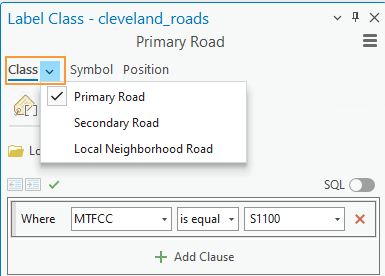
You should create a different label class for each road type for which you wish to have a different type of label. This includes small differences, such as font size. You do not necessarily have to create a different label class for every road type, but you will likely have several (e.g., local road, collector road, highway, etc.). You should reference the lab requirements page to ensure that you have created enough different label classes throughout your map.
Once you create your label classes, you can switch back and forth between them while editing using the Class dropdown menu. Note that if you create multiple label classes, you will need to define all of them, including the default label class. If you do not, you will have duplicate labels. For example, you may have Interstates labeled in one class, and all roads labeled in the default class – causing interstates to be labeled in both classes.
Another option is to delete the default label class – but be careful when doing so that you are maintaining all the labels you need.
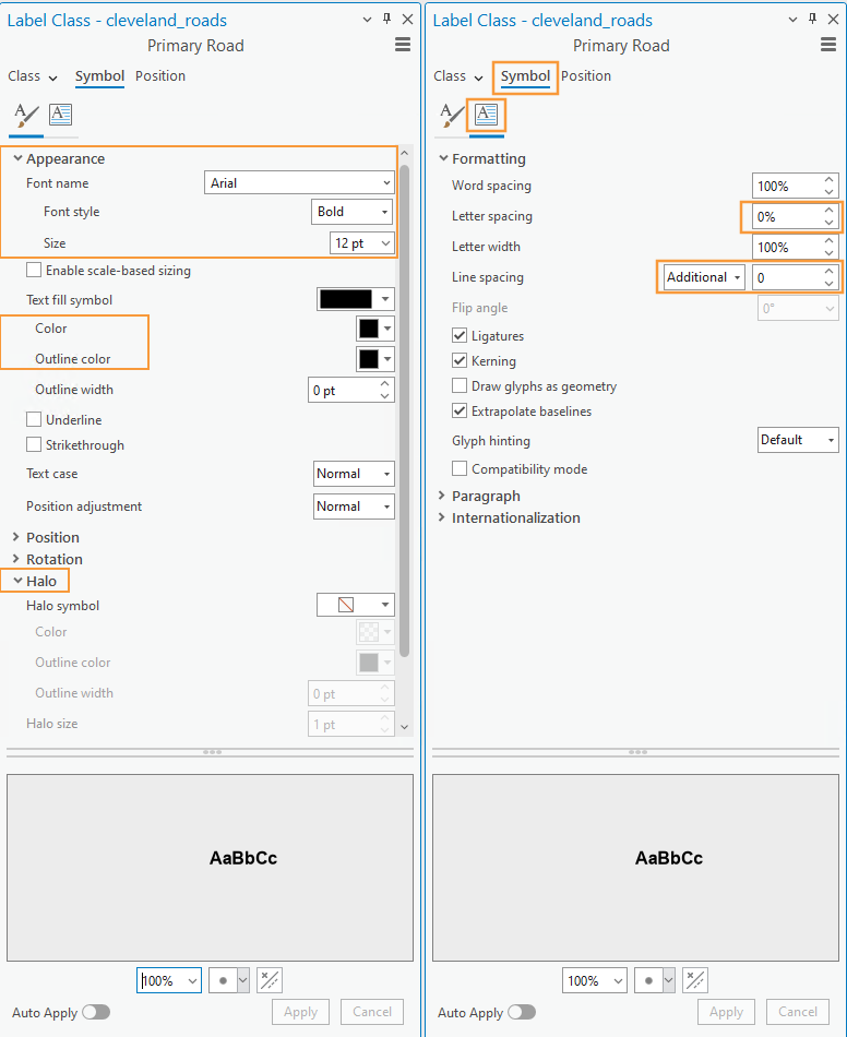
5. Designing label symbols
Once you’ve created a label class, you can use the Symbol tab in the Label Class pane to edit its style. Shown here is the label symbol editing menu (left), and the formatting menu (right). These are used to change many aspects of a label’s symbology – including fonts, sizes, spacing, color, etc. Highlighted in green are options I’ve found especially helpful – but don’t limit yourself to these. You should experiment with all options for symbol design—font, weight, spacing, etc. Recall from the lesson content that line spacing (leading) can be a negative value.
Symbology editing tip: As you work with the labels, you may find that there is a lot of “clutter.” The number of labels can be overwhelming. When you initially try to label the roads layer, it will likely slow your computer way down to the point of stopping (or at least appearing that it stops). To reduce the clutter, consider using the select tools in ArcGIS Pro to select roads by attribute or by location and then export the selected data to its own layer. Then, work with just that layer when labeling. This is a quick way to remove some of the road clutter from the map. Simply “un” -symbolizing the layers does not prevent the roads from being labeled. Using this method to select roads that, for example, intersect with another feature or have one or two MTFCCs, can save you computing power (and frustration).
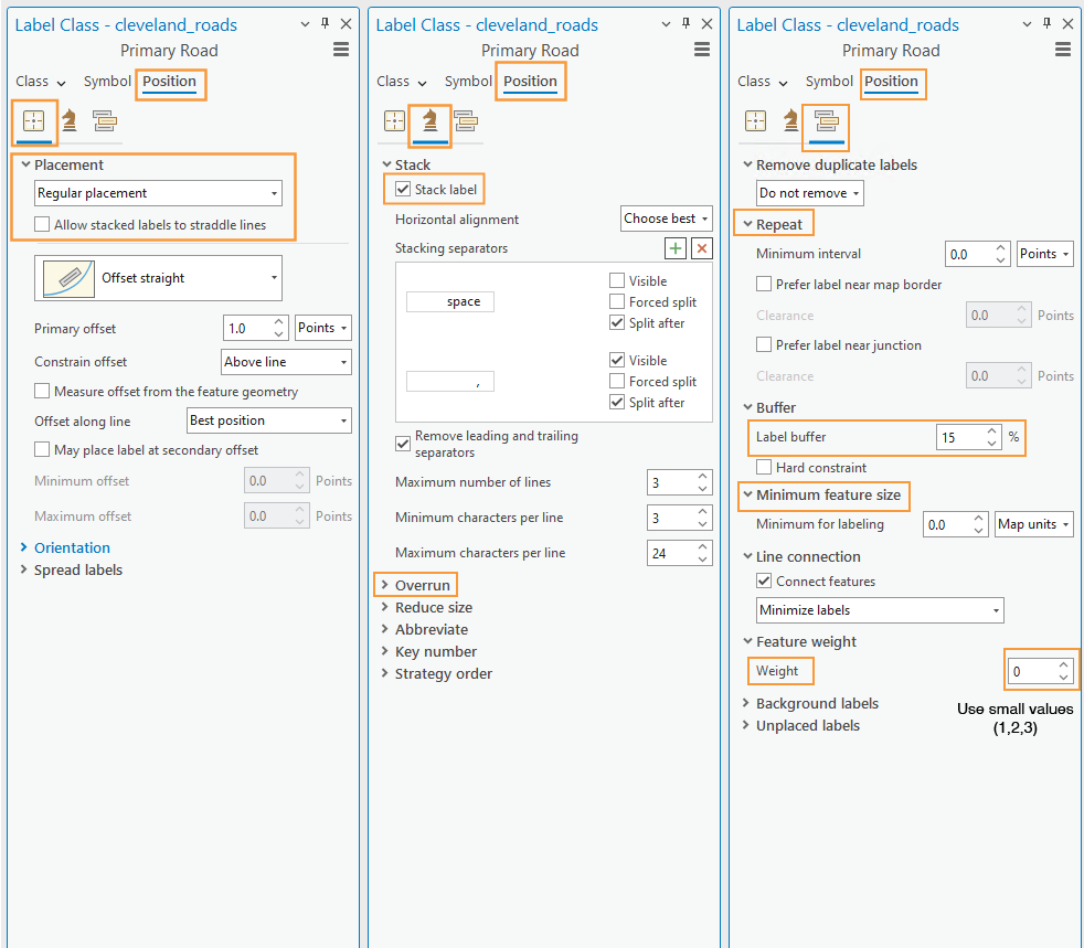
6. Positioning label symbols
In addition to changing the style of your labels, it is important to also assign how they should be positioned. Recall the lesson content on text placement – our goal for this lab is to place labels only with automatic rules. We will not be placing or adjusting labels by hand.
There are many positioning parameters you can adjust in the label position tab—try them out and watch how your labels change. There are a lot of useful options (e.g., Feature Weight) whose function may not be immediately clear to you – I recommend using the link at the end of this sentence to learn more about labeling with the ArcGIS Pro Maplex Label Engine.
7. Creating label expressions
In addition to simply drawing a label from a feature’s attribute table, you can edit label expressions using SQL to append words or other text for more descriptive labels. Don’t worry if you haven’t done any programming – you only need to make minor edits to create label expressions.
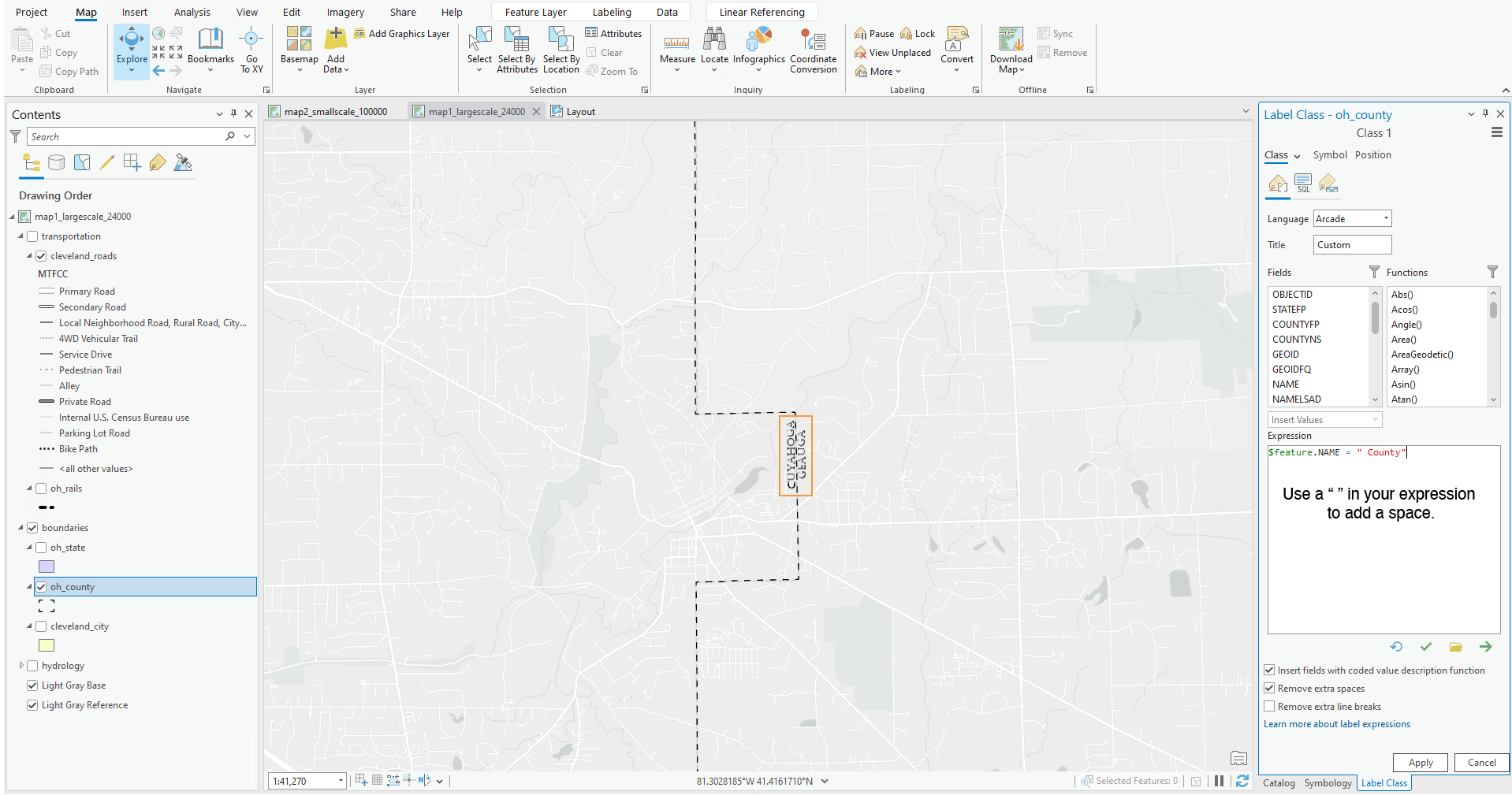
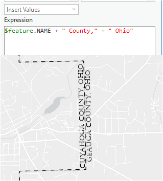
You can also use SQL to append additional text to a label from the attribute table. An example is shown below – though, in this example, you are creating quite a wordy label, which is generally not recommended.
Part II: Layouts
1. Putting it all together
Remember that you will be adding labels both to your large-scale (primary) map, and your small-scale (locator) map. Once you’ve finished adding labels to your primary map, you can add similar labels to your locator map. You can also save and then import a copy of your large scale map into your project, and then adjust it for the new smaller scale. This is the same process we used to create our second map in Lab 1.
To duplicate/re-import (a refresher):
- Save the most current version of your map as a map file (right-click on the Map in the Table of Contents (TOC)).
- Import that saved the map as a copy back into your project (Insert Tab –> Import Map).
- Change the scale of your new map, and design for this new smaller scale as a locator map.
Your final task is to create a Portrait or Landscape layout with your two maps, a legend, and text elements. An example layout design is shown below.
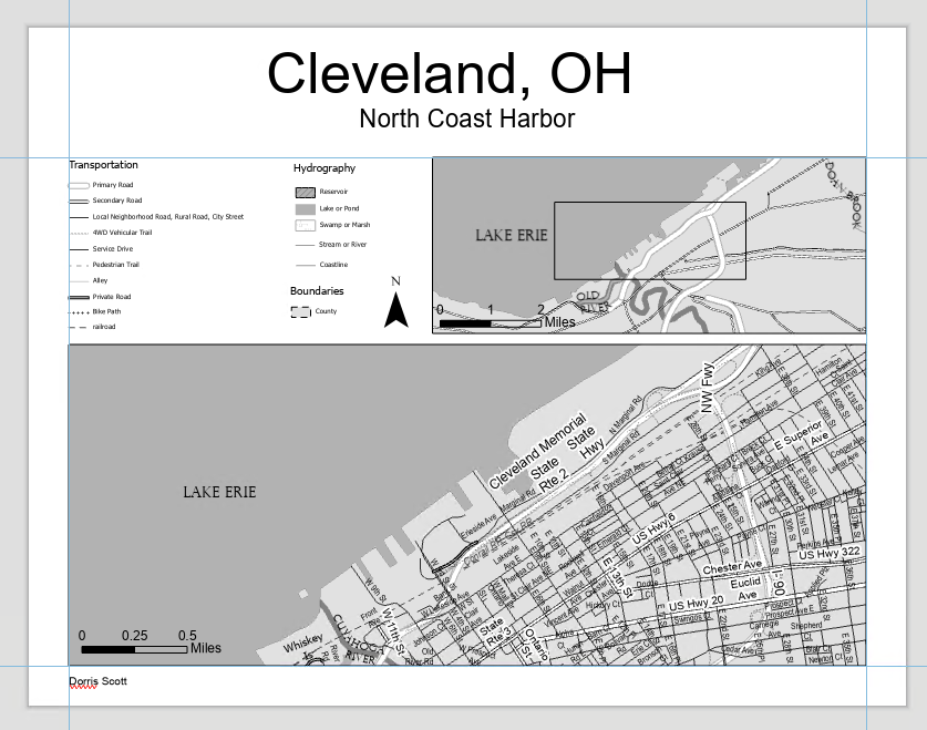
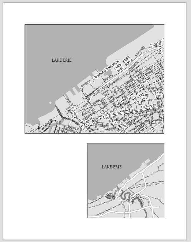
An example of a portrait layer is shown below: not that your map will also include a title, legend, etc. Additionally, these map examples are not shown in their final form – you are encouraged to use them for layout ideas, but you should not copy their designs. You should make sure your map meet the lab requirements. Refer to the lab rubric to confirm that you have the required elements in your map.
2. Build your layout
Before importing your maps, add guides for ½ inch margins – you should not include anything on the page outside of these margins. Note again that the examples below contain unfinished design—they should not be interpreted as examples of finished feature or label symbology.
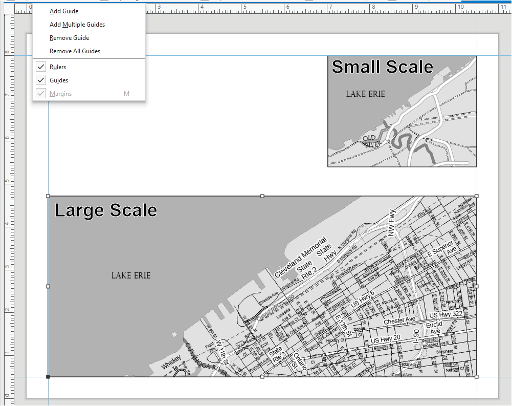
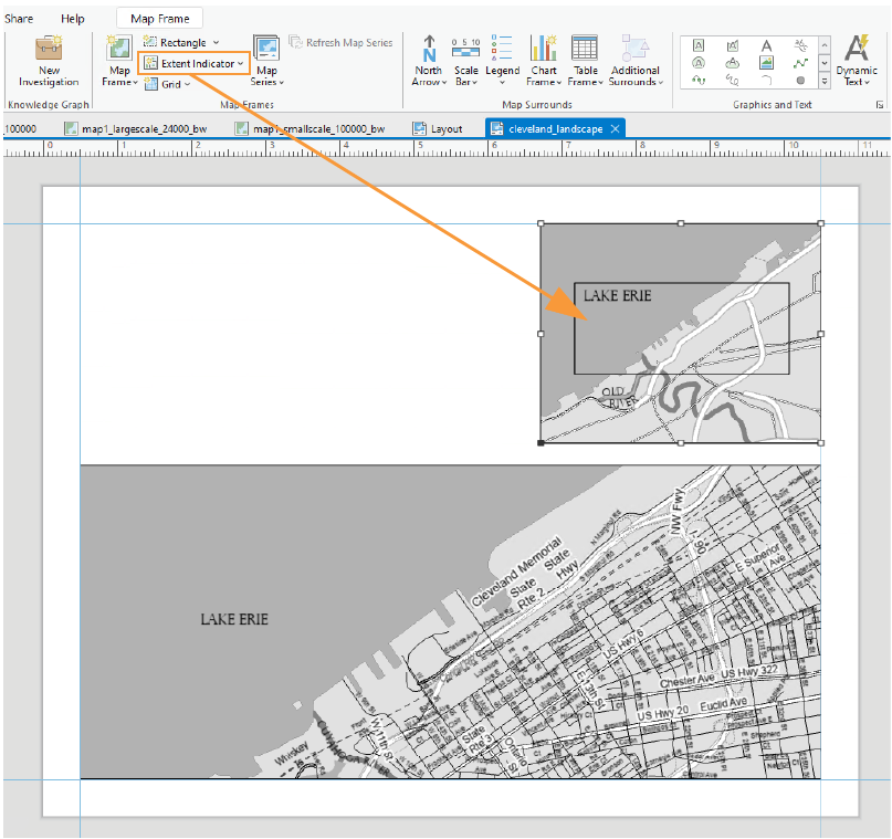
For the locator map to be useful, you will need to insert an extent indicator. You should do so with the small scale map selected. This will draw a rectangle showing the extent of your large-scale map within the (larger) region covered by your small-scale, inset/locator map.
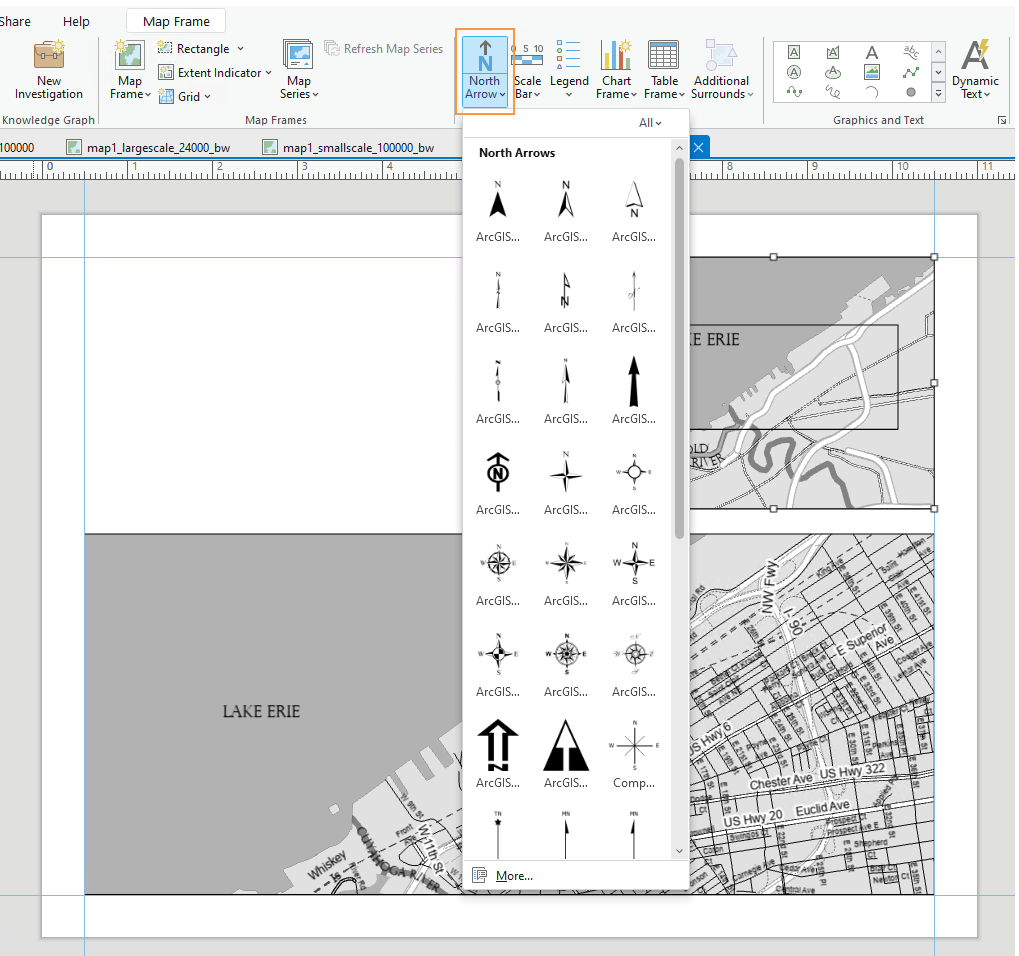
3. Add marginal elements
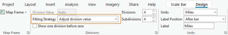
Marginal elements such as north arrows and scale bars should be added at this point. Keep your North arrow and scale bars simple and easy to read. Use “adjust width” to create clean scale bar values. You can also edit the color, font, label locations, etc., of all marginal elements. Reference lesson content for design ideas.
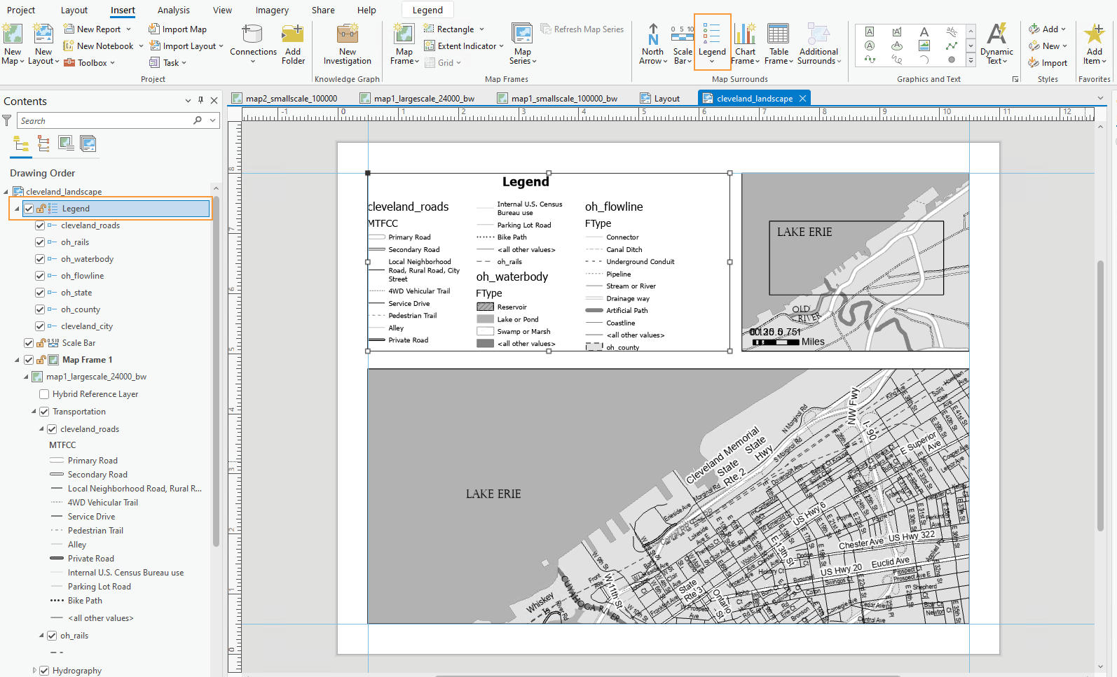
4. Create a legend
Another important component of your map layout for this lab will be its legend. Insert a legend with your large-scale map selected so it reflects your large-scale symbol design. Your locator map should use similar symbols, and therefore should not need a legend.
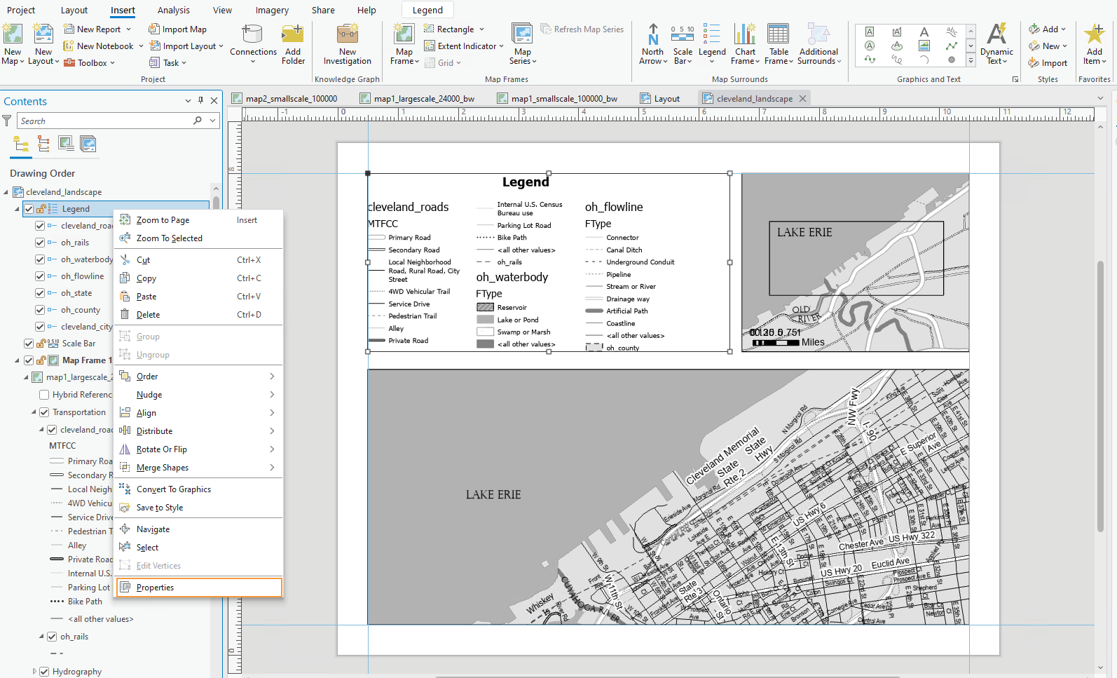
Right-click your new legend element in the contents pane, and choose “Properties” to edit.
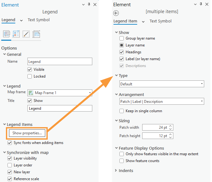
You do not have to include every item in your legend, and you may want to change the names of some items significantly. Your goal is to create a comprehensible map. To change the design of different legend elements, select them from the drop-down menu in the Format Legend pane.
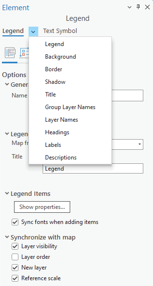
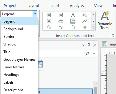
You can also make changes from the ribbon.
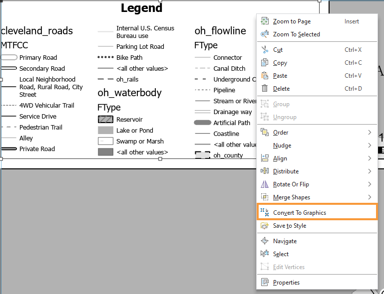
Once you have made sufficient edits, you may want to disconnect your legend from the data by converting to graphics. This will give you more freedom over the design, but as your legend will no longer update dynamically if you update any map symbols, you should save this step until the end. You will have to “ungroup” the elements to edit them. Once you convert to graphics, you will need to right-click and “ungroup” multiple times to edit the elements for detailed design work. (Note that this is not a well-edited legend, just an example of one in process).
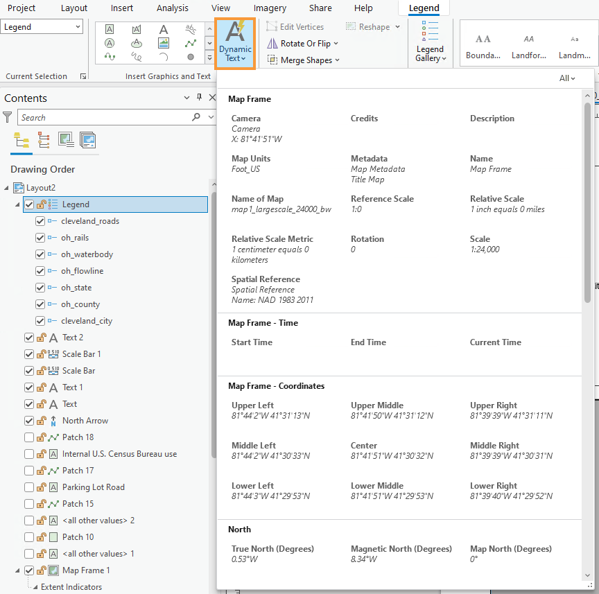
Once your legend is complete, there are only a few final touches to be made. Use the “Dynamic Text” dropdown to move the service layer (basemap) credits out of the map frame and place them elsewhere in your layout, for a cleaner look.
Don’t be afraid to re-arrange your layout elements as you go! It may take quite a few tries before you find an optimal design.
Remember to create visual hierarchy for marginalia elements:
- Title
- Subtitle
- Legend Titles
- Legend Text
- Data Source
- Name
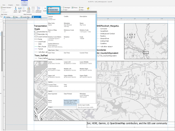
Below is an example of a landscape layout made from similar data – you will need to adjust your map to work with the assigned data and location. Note also that the map below may not include all required elements for this lab, but is an example of how your layout might look if you are on the right track.

5. Final tips and tricks
- You may use color, but do not over-rely on it. It is often advised to use all greyscale at first, and then add color later on for emphasis. Too much color on a map that is not well balanced will result in a poorly designed map.
- Don’t be afraid to change course while you work—try out different labeling and layout options before committing to a final design.
- The Lab 3 Visual Guide contains many design ideas and suggestions. Do not rely on the Guide to tell you how to design your map. Instead, use the instructions to learn how tools in ArcGIS Pro are used and then let your creativity guide your design.
- See the Lab 2 and Lab 2 Visual Guide instructions if you need a refresher on how to design symbols or how to export your map. Remember, if your map uses a gradient fill, complex area fill patterns, or coastline effects, export the map setting the resolution to be no more than 150dpi.
- Check that your map meets all listed requirements by referring to the lab instruction document and rubric before you submit.
Data Source: The National Map.
