Choosing Symbols for Maps
Understanding your data’s spatial dimensions, geographic model, and levels of measurement will help you select which visual variables to use in your map. Recall the table of visual variables we first encountered in Lesson One (Figure 3.5.1). This is a good time to check your own knowledge and consider which of the follow seven variables are best for visualizing data category, and which are best for visualizing order.
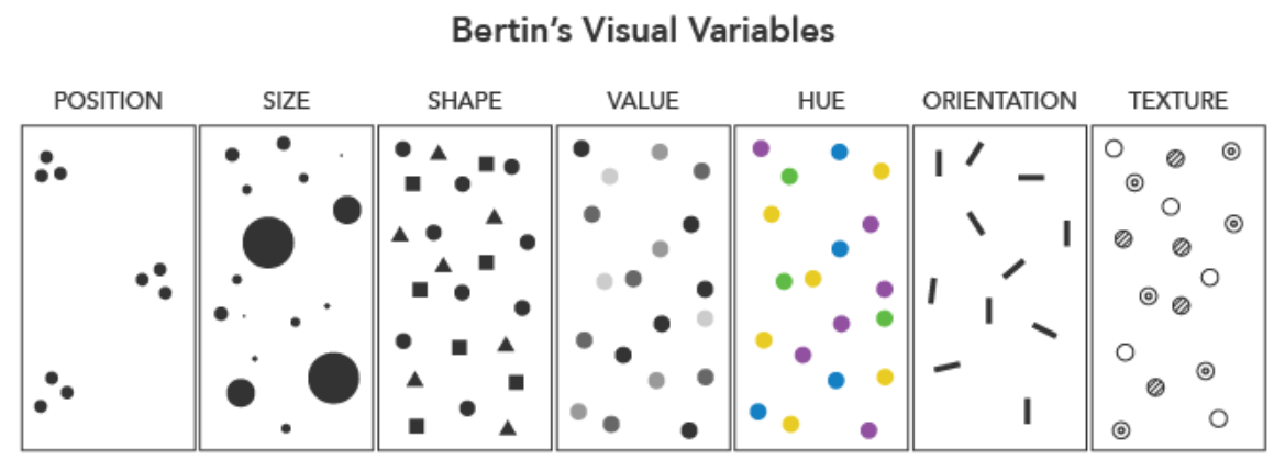
Some visual variables are also better than others for encoding data with different levels of measurement. Bertin (1967) only considered size (other than position on the map) to be a truly quantitative variable, its visual representation able to be matched precisely to a numerical value. This makes it a good choice for mapping ratio-level data, as making mathematical calculations with such data can be useful. Visual variables that can typically encode only category, not order (e.g., color hue; shape) are best for qualitative data.
Note that the visual variables presented in Figure 3.5.1 are those originally proposed by Bertin, and though they are arguably the most common still in use, this is not a comprehensive list. The graphic also does not demonstrate the many ways in which these variables might be altered and/or combined to create new designs. At the end of this lesson, we will assess a variety of maps, many of which use multiple visual variables. We will also discuss multivariate mapping further in Lesson 7 (Multivariate and Uncertainty Visualization).
The figures above focus on geometric visual variables (e.g., color; pattern; size), though another common mapping technique is to use pictographic or iconic symbols (Figure 3.5.2).
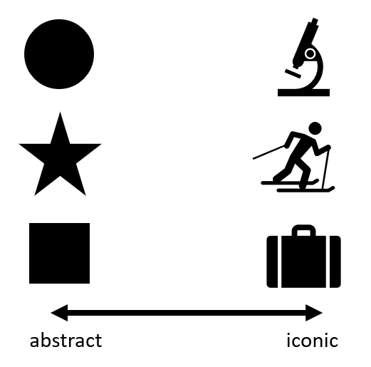
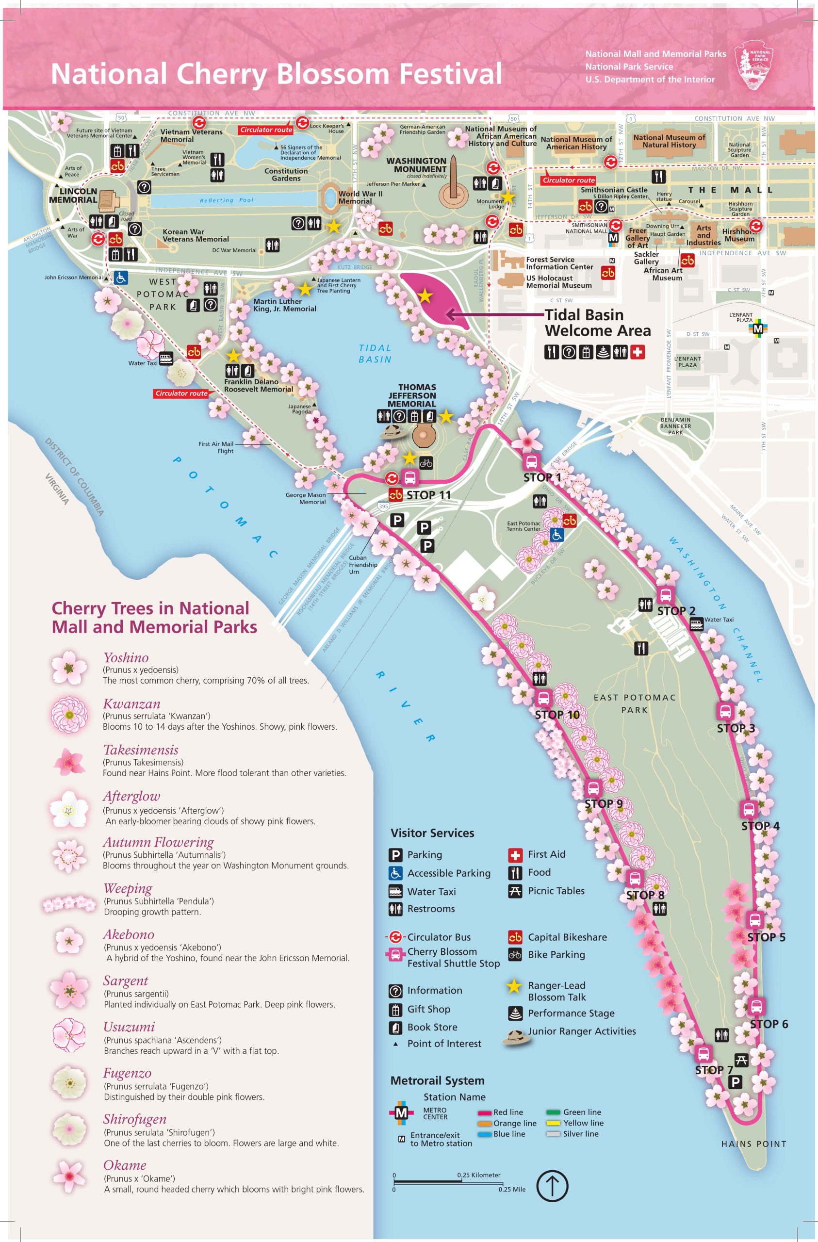
Iconic symbols are those that provide a closer visual match to their referent, or the real-world element meant to be depicted by the map symbol (Maceachren et al. 2012). The map in Figure 3.5.3 below uses flower symbols that are drawn similarly to how they appear in reality to create an engaging and useful map. It is important to balance usability and realism when using iconic symbols on maps – ensure that they do not become overcrowd, or distract from the map’s purpose.
Another important consideration that should be weighed when considering the use of iconic symbols is the cultural context of those symbols. Iconic symbols can have meaning only to a specific group of individuals. For example, imagine that you are driving down the interstate and see a road sign that shows a knife and fork. Some people would understand these icons to imply food. However, the knife and fork icon is not necessarily understood to imply food by individuals who, for example, only use their hands while eating and may have never seen a knife and fork. Iconic symbols, therefore, are very culturally contextualized and that context should be weighed before icon symbols are chosen to be used on a map. Here is an article(link is external) that further explores the idea of symbols and icons and their meaning in cartography.
Like other continuums we have discussed (e.g., discrete to continuous; abrupt to smooth), map symbols cannot always be classified as simply abstract or iconic, and instead, exist somewhere in the middle. National Geographic’s Atlas of Happiness for example, uses smiling face graphics to encode data about happiness. Thus, it is less abstract than if this data had been encoded only with color value or size, but less iconic than if more realistic graphic images of people were used.
Visual variables are used in many mapping techniques: in addition to selecting which visual variables you use for your maps, you will also need to choose what type of thematic map you will create. The four most popular thematic map types are choropleth, isopleth, proportional symbol, and dot maps.
Below we give a general overview of the four most popular types of thematic maps.
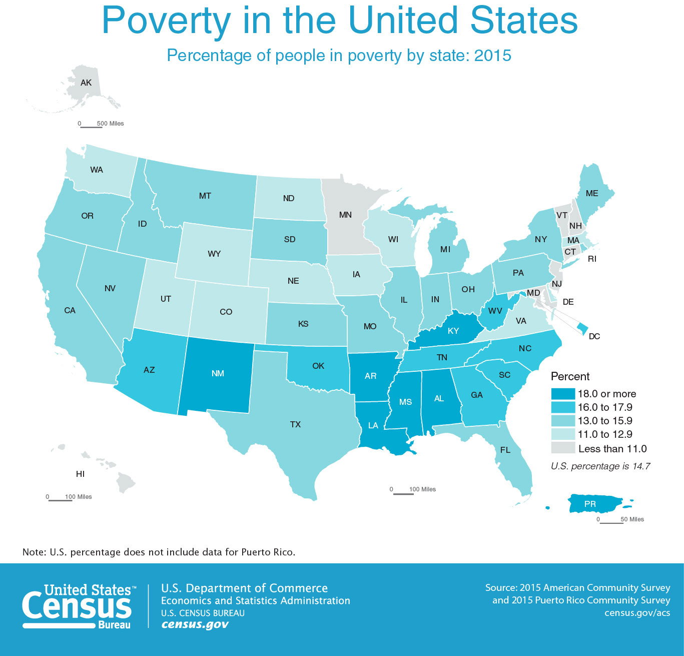
Choropleth Maps are maps in which color or shading is applied to distinct enumeration units, usually statistical or administrative areas. Color hue, saturation, and value are the most frequently used visual variables in choropleth mapping, though pattern is sometimes used as well. Choropleth mapping should not be used to encode exact counts (e.g., number of people living in each state), as the visual encoding of color by enumeration units makes this confusing. For example, consider that more people live in California than in any other state. You could create a state-by-state choropleth map showing counts of, say, universities or gas stations, and California would likely lead in both. But a map showing this would not be interesting—California has more people and things because it is a bigger enumeration unit. The map would tell us nothing interesting about California’s system of education, or its residents’ consumption of gas.
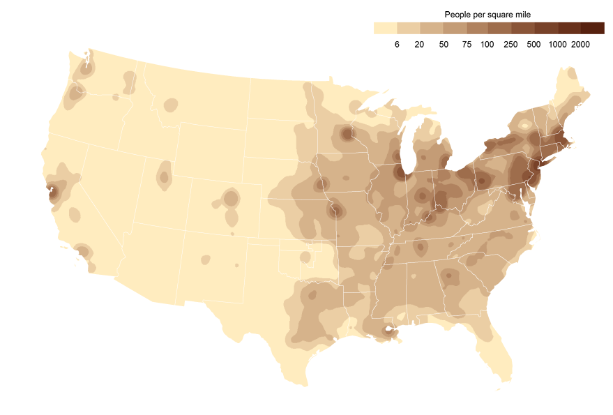
Isopleth Maps are like choropleth maps in that they typically use color value to encode data values, but unlike choropleth maps, they do not visualize the enumeration units from which they are built. Isopleth maps are preferred for mapping phenomena that vary continuously over space, as they better represent the distributions of these phenomena than choropleth maps. The primary disadvantage of isopleth maps is that they require quite a bit of data to design them accurately. They should also not be used to map data that change abruptly at administrative boundaries (e.g., percent sales tax). Choropleth mapping is a simpler and more appropriate method for mapping such data.
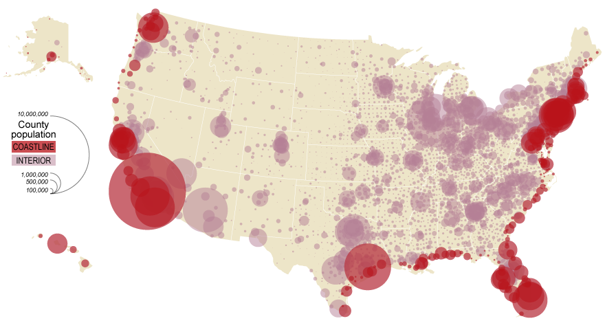
Proportional Symbol Maps are best for mapping abrupt, discrete data; they visualize data using the size of a symbol (most often a circle) placed inside an enumeration unit. As the symbols are scaled only based on the data value—irrespective of the size of the enumeration unit—this permits the reader to not only view the variation between symbols, but also perform a visual comparison of the size of the symbol and the size of the enumeration unit over which it is placed. Note that the map in 3.5.6, unlike the previous two maps (3.5.4 and 3.5.5) displays count data (population) rather than a rate (percent in poverty; people per sq. mile). This is an appropriate choice for a proportional symbol map.
Size, the visual variable used in proportional symbol mapping, should not be used to map standardized data such as rates (e.g., people per sq. mile). When mapping count data such as population counts, you should use a proportional symbol map, or you should standardize your data before using it to make a choropleth or isoline map. We will talk more about standardization in Lesson Four.
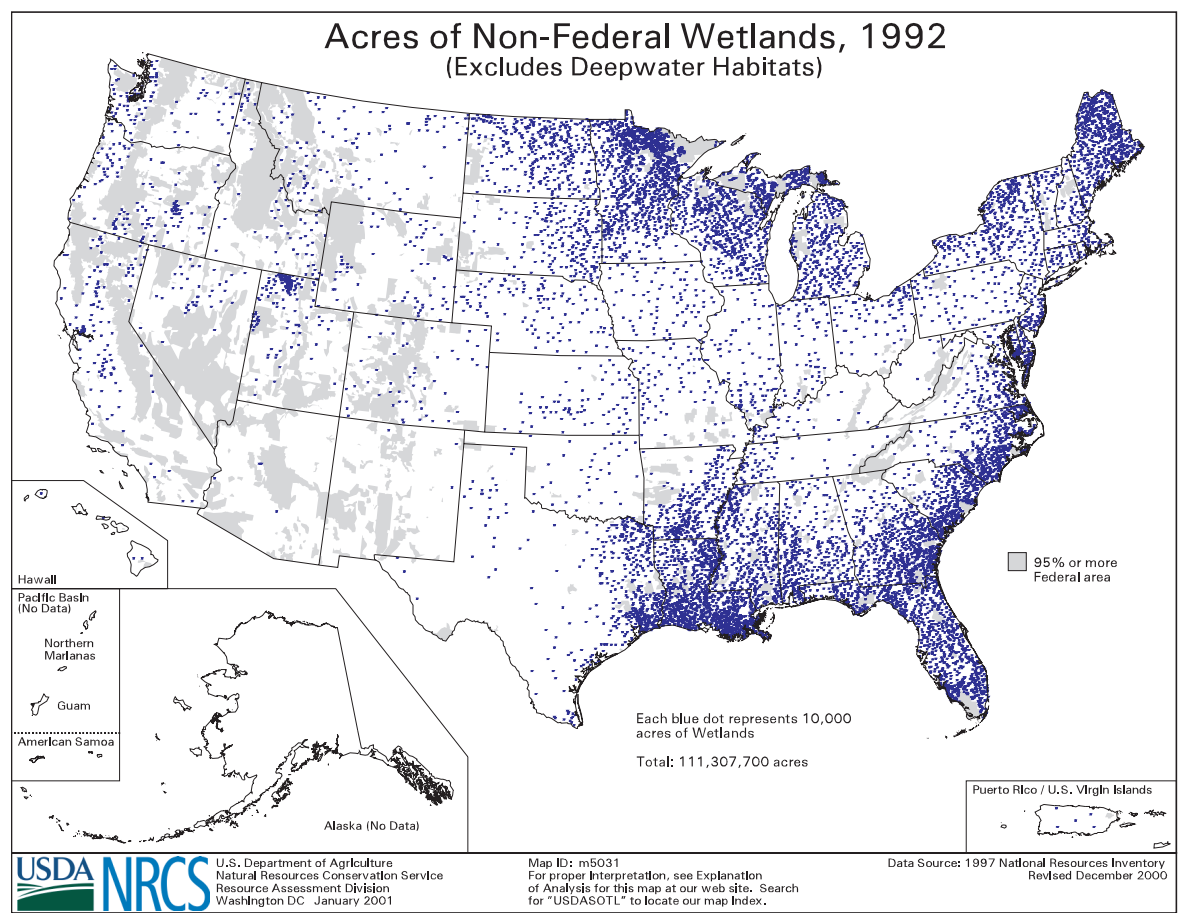
Dot Maps are like proportional symbol maps in that they are excellent for visualizing discrete data. Rather than displaying a different-sized symbol per enumeration unit, however, dot maps are constructed by filling enumeration units with a count of symbols (usually dots) based on the count of the variable of interest within the unit. Thus, this technique is preferred over proportional symbol mapping for mapping data which vary more continuously over geographic space.
It’s important to think critically when creating and reading dot maps. Often, dot maps are made by scattering the appropriate number of dots randomly throughout each enumeration unit. To a novice viewer, they give the illusion of high precision – you might assume that if every dot represents one person, that the dots are placed on the map exactly where those people live! However, this is very rarely the case. We will explore the differences between dot and proportional symbol maps more in the lab at the end of this lesson. As you will see, which method is most appropriate depends not only on what phenomenon you are mapping, but also on the scale at which you map it.

