
Color and Data
Color and Data
When using color as a symbol on your maps, your first priority should be to apply it analytically. As stated before: the perceptual structure of your color scheme should match the perceptual structure of your data. You should apply color based on the guidelines previously discussed in this lesson before worrying about choosing aesthetically-pleasing colors, or your audiences’ likely favorite colors, or colors that correspond to the context of the data (e.g., using a green color scheme to create a map about sustainability).
However—when appropriate—adding context to colors in your maps can benefit your readers. See the map in Figure 4.8.1 below. Rather than choosing a traditional sequential color scheme, this cartographer chose to match the colors of the leaves to the colors on the map.
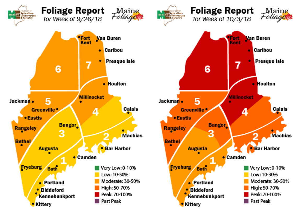
This approach may not always work to best represent the mathematical order of your data classes. But your maps aren’t just about dots along a number line—they represent real-world phenomena. Using color assignments that make sense (e.g., red for negative values), or are customary (e.g., yellow for residential in zoning maps) can improve the clarity and comprehensibility of your maps.
