
Communicating with Maps
Communicating with Maps
Though you won’t need to understand the biology of the human brain and visual system, making great maps requires understanding how people perceive visual information. When discussing how people interpret maps, we can frame this discussion in terms of perception, cognition, and behavior.
Perception in map design refers to the reader’s immediate response to map symbology (e.g., instant recognition that symbols are different hues) (Slocum et al. 2009).
Cognition occurs when map readers incorporate that perception into conscious thought, and thus combine it with their own knowledge (Slocum et al. 2009). For example, readers might be able to interpret a weather radar map without its legend due to their previous experience with a similar map, or might incorporate knowledge of a map’s topic into their interpretation of a visual data distribution (e.g., the higher concentration of people aged 65+ shown in some Florida cities makes sense given what I know about retirement communities).
Behavior refers to actions that go beyond just thinking about maps. Considering how design may influence behavior is essential in anticipating the real-world effects your maps may have. The way a map is designed can influence its readers’ actions and decision-making, and these decisions may range from small (e.g., for how many seconds will the reader look at this map?) to great (e.g., will this flood-risk map convince the reader to purchase insurance?).
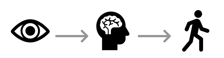
Image description: A simple, symbolic representation of showing the process from perception to cognition. There are three main elements in a horizontal sequence:
- On the left, there is a black icon of an eye, symbolizing vision.
- In the center, there is a black icon of a human head in profile. Inside the head is a white brain with black lines representing neural connections, symbolizing cognition or thought processing.
- On the right, there is a black icon of a walking human figure, symbolizing movement or action.
Connecting these three icons are two straight gray arrows pointing from the eye to the head and then from the head to the walking human figure, indicating the flow of the process from seeing to thinking and then to acting.
Another useful way to think about map communication is with the cartography-cubed model (MacEachren 1994). The model MacEachren (1994) proposed focuses on how different maps and visualizations are used. Within this framework, any map can be located within the cube by determining its location along three dimensions: (1) from public to private (with regards to the map audience), (2) from presenting knowns to revealing unknowns (e.g., is the map for displaying known information or for exploration?), and (3) from low to high interaction (e.g., a static map vs. an exploratory interactive mapping tool).
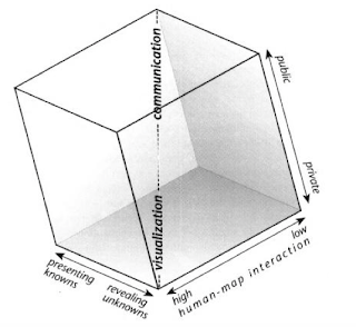
Image description:
The image is a black-and-white, three-dimensional cube diagram. The cube is oriented to show its top, front, and side faces. Each axis of the cube represents different variables.
- The vertical axis, labeled “communication,” spans from the bottom to the top of the cube.
- The horizontal axis pointing towards the right is labeled “human-map interaction,” ranging from “low” at the near end to “high” at the far end.
- The horizontal axis pointing leftward and downward is labeled “visualization,” going from “revealing unknowns” on the far right to “presenting knowns” on the near left.
The right side of the cube is labeled “public” on the top edge and “private” on the bottom edge, corresponding to the human-map interaction axis. The cube’s left face is shaded, creating a sense of depth and dimension.
These dimensions are often correlated, hence the shown corner-to-corner continuum from visualization to communication. A printed map in a magazine article, for example, we could classify as a tool for communication, while an exploratory mapping tool designed for epidemiologists would be better described as (geo)visualization.
Student Reflection
Return to the previous section (Types of Maps). Where would you place each of the maps shown within the cartography cube?
