
Design Matters
“Not only is it easy to lie with maps, it’s essential.” – Mark Monmonier, How to Lie with Maps, pg. 1
When making a map, it is impossible to map everything. In fact, to be a useful model of our world and of any phenomena in it, maps must always obscure, simplify, and/or embellish reality. These actions—which make maps useful—also make their construction subjective. Cartographic design, even when informed by well-established conventions, is an art as much as a science. Every design choice a cartographer makes ultimately influences the map readers’ comprehension, appreciation—and even trust—of the map that he or she creates.
Though maps may include or be supplemented by text or other media (even by sound, smell, or touch), map creation at its core is about visual design. As such, cartographers often talk of graphicacy and its importance in facilitating visual communication with maps (e.g., Field 2018, pg. 194). Graphicacy was first defined by Balchin and Coleman (1966) as “the intellectual skill necessary for the communication of relationships which cannot be successfully communicated by words or mathematical notation alone.” Graphicacy—like literacy—has its own grammar and syntax, and learning the rules of graphic language is essential for designing effective maps (Field 2018, pg. 194).
Student Reflection
Which map of the two below best communicates the trend of the data? Why?
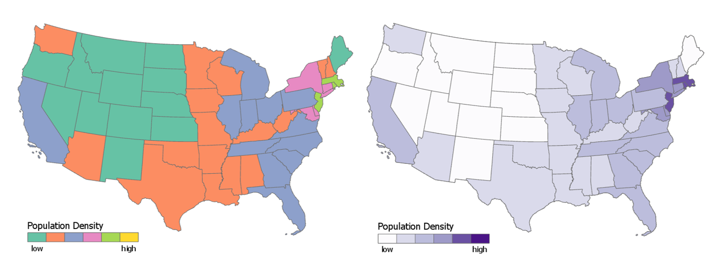
Image description: The image consists of two maps of the United States side by side. Both maps depict the population density across various states using different color schemes to represent varying density levels.
Left Map:
- The map is color-coded with shades of green, pink, purple, yellow, blue, and orange to represent population density.
- California, Texas, Illinois, and most southeastern states are colored orange, indicating low density.
- The states in the northeastern region, such as New York and New Jersey, are in green, indicating high density.
- A legend at the bottom left indicates the population density scale from low (orange) to high (yellow).
Right Map:
- The map uses gradients of purple and white to show population density.
- Northeast states, like New York and New Jersey, are in dark purple, signifying high population density.
- Most states in the west and central regions are light purple or white, indicating lower population densities.
- A legend at the bottom right uses colors ranging from white (low) to dark purple (high) to denote population density.
Observations
- Lower population density is more along the center part of the US and population density increases as one goes east. Also, population density is higher in the coastal areas.]
In the map on the left (Figure 1.1.1), the rainbow color scheme makes it easy to view the states as grouped into categories by hue, but the lack of an obvious order between the selected colors makes the overall trend unclear. A sequential color scheme (right), however, makes it easy to view the trend of the data, as low-to-high values as are encoded intuitively from light to dark.
The design decisions that go into making a map often go far beyond choosing a color scheme for a simple state-by-state choropleth map. The map below is a Russian Civil War map – flames and smoke are used as symbols of the Bolshevik uprising. This map not only communicates information; it conveys emotion.
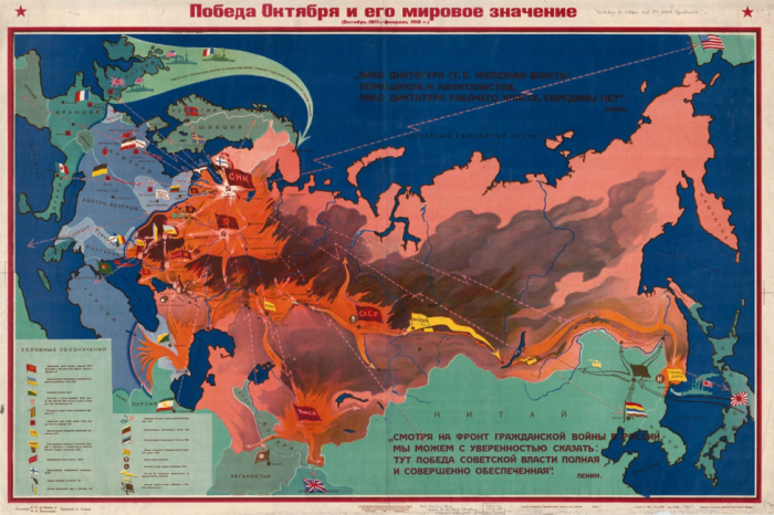
Image description: The image is an old, detailed, and colorful map illustrating the impact and the extent of the Russian Civil War’s engagements and Soviet power, with a focus on the victory of October and its global significance. The map covers the majority of Europe and parts of Asia. The background is predominantly divided into various colors indicating different regions and movements during the civil war period. The key at the bottom left corner explains the colors and symbols used.
The map is titled in Russian at the top center, with some additional text and details scattered around the map. Several arrows of varying colors and widths spread across the map, indicating movements, battles, and occupation areas. Differentiated regions are marked with varying shades, such as orange, green, blue, and red. The map also features several Soviet and national flags in various positions, providing context to the geopolitical landscape of that era.
As demonstrated by the examples above, the way in which you design a map can deeply influence how your readers interpret it. A well-designed map can intrigue and even surprise its readers, leaving a meaningful and memorable impression. Shown below is a map of projected future storm surge in New York City, designed by Penn State alum and cartographer Carolyn Fish. The map doesn’t ask the reader to imagine what NYC might look like under future climate scenarios – it shows them.
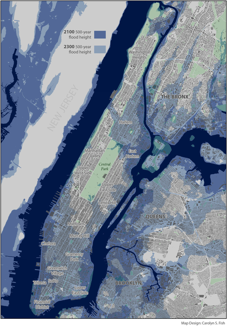
Image description: A detailed map showcasing future flood projections for parts of New York City and surrounding areas, including Manhattan, The Bronx, Queens, Brooklyn, and neighboring regions. In 2100, the 500-year flood height which will be reached by the year 2100 is indicated by dark blue-purple and in 2300, the 500-year flood height which will be reached by the year 2300 is indicated by a light blue-purple. The 2100 500-year flood height areas are in parts of New Jersey, and the periphery of queens, Brooklyn, the Bronx in addition to East Harlem, Lower East Side, the Financial District, Tribeca, and Chelsea. The 2300 500-year flood height areas are mostly in Brooklyn, Harlem, Midtown, Murray Hill, Gramercy Park, Greenwich Village, and SoHo.
Following cartographic conventions—such as applying sequential color schemes for sequential data—typically results in more effective maps. However, some maps diverge from these guidelines. Learning cartographic best practices will help you to both apply them—and thoughtfully disobey them—when prudent.
Student Reflection
View the maps in Figures 1.1.4 through 1.1.7 below: Do you think they are effective? Is there anything you think should have been done differently?
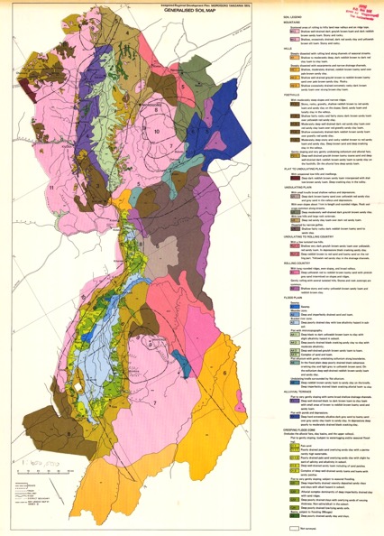
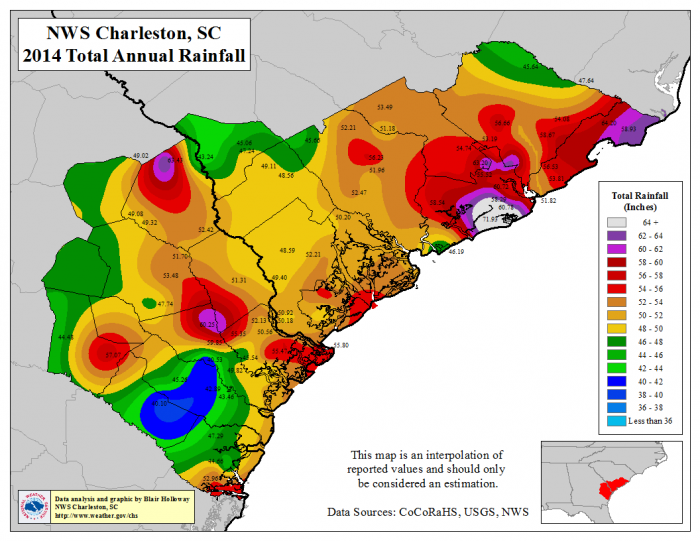
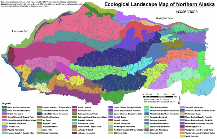
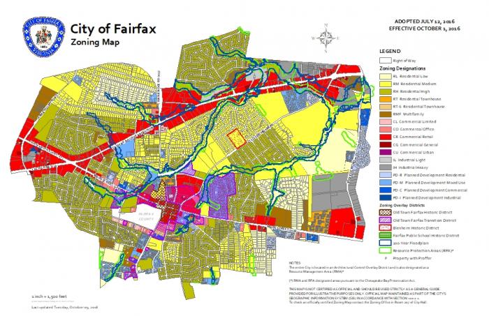
Image descriptions
Image 1.1.4: A soil map from Morogora Tanzania in which different colors indicate different soil types. The central region of the map includes various colored sections such as pink, purple, green, brown, yellow, orange, blue, and gray. These colors are used to differentiate areas that have distinct soil characteristics. The map is filled with intricate lines that likely denote boundaries and topographical elements, and small black numbers are scattered throughout the colored sections.On the right-hand side, there is a legend that lists the different soil types, each with its own description and corresponding color. This legend provides detailed explanations of the properties and distribution of the soils depicted on the map.
Image 1.1.5: A map titled “NWS Charleston, SC 2014 Total Annual Rainfall”. It shows the total annual rainfall distribution across South Carolina and its surrounding regions. The map uses various colors to represent different rainfall levels, ranging from less than 36 inches to more than 64 inches, as indicated by the legend on the right side of the map. The areas with the highest rainfall are in shades of purple and blue which are on parts of the south east coastal area, while areas with the lowest rainfall are in shades of yellow and green which are areas to the west, north and southwest. Several specific locations have rainfall data numbers printed directly on the map. In the bottom left corner, there is a small section with a label mentioning Blair Holloway, NWSCharleston, and a webpage link (http://www.weather.gov/chs). The bottom right corner features a small inset map showing the southeastern region of the United States with South Carolina highlighted in red.
Image 1.1.6: Ecological Landscape Map of Northern Alaska in which different colors indicate different ecological landscapes. On the right is the title in black bold text that says “Ecological Landscape Map of Northern Alaska” in which there is the subtitle of “Ecosections.” The most prominent ecosection is the Endicott Southern Mountain land scape which is found in the center and southern part of Northern Alaska. Other prominent ecosections are western Beaufort Coastal Plain and the Upper Western Brooks Foothills that are in the northwest part of Northern Alaska. The Western Beaufort Coastal Plain is farther north than the Western Brooks Foothills. The three least prominent ecosections are the Kiona hills, which is indicated by light green, Noutak Mountains, indicated by yellow, and Sadlerocht Mountains which indicated by a light bright green. The Kiona hills are in the far southwest, the Noutak mountains are in the southwest, and the Sadlerocht mountains are in northeast.
Image 1.1.7: The image is a zoning map of the City of Fairfax, displaying various zoning designations using vivid colors and patterns. Main and smaller roads are represented, along with water bodies like rivers indicated by blue lines. Each zoning district is represented by a different color. RH residential high, RM Residential Medium are the biggest zones which is signified by greenish yellow, and bright yellow colors respectively. The smallest zones are CO Commercial Office and PD-C Planned Development Commercial which is signified by salmon and blue colors respectively.
