
Lab 4 Visual Guide
Lesson 4 Lab Visual Guide Index
- Saving a Lab 4 Project
- Download Census Data to Map
- Format Census Data for Import
- Add ACS data to your project
- Joining Census data to boundary files
- Symbolizing Data
- Creating a Layout
- Save-As: Building Dot Density Maps
- Additional Tips
1. Saving a Lab 4 Project
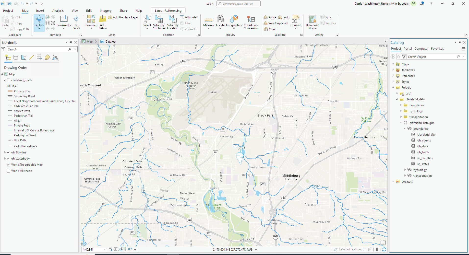
Open up a previous project from a lab. I would recommend Lab 1 given that lab was dedicated to downloading and preparing your data for subsequent labs. Click on Project > Save Project As and name it Lab 4. Your map will focus on the state of your chosen city for your City Story. For each mapping technique (proportional symbol; dot map), you will create three maps: state-level, county-level, and census-tract level.
2. Download Census Data to Map
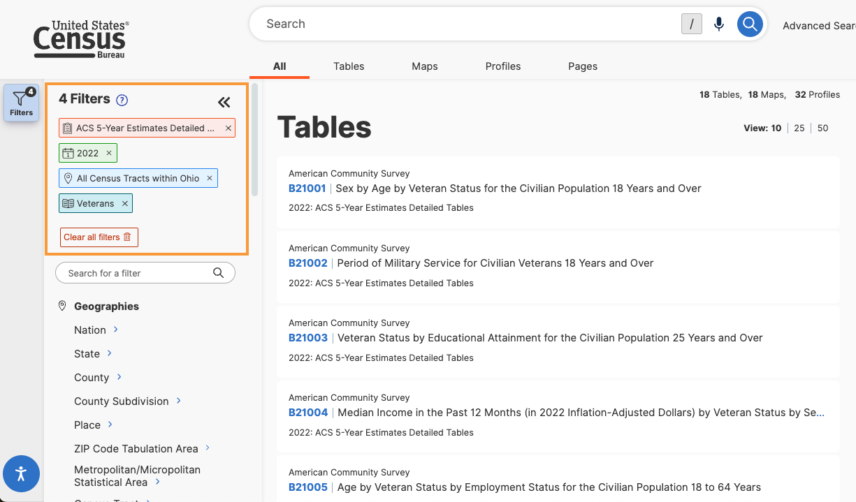
The ACS census data that you download will include demographic data of your choosing for the state, county, and tract level geographies. This demographic data will be in spreadsheet format that you will then join to the TIGER boundary files. If you use the Advanced Search option in the census data tool, you may find it easier to search for Census data according to specific topics, geography, years, surveys, or codes. For example, assume I am interested in choosing ACS 2022 five year surveys for all census tracts in Ohio for the purpose of examining the number of veterans. Here is what I would search on using the Advanced Search option. The words listed below correspond to the search criteria in the Advanced Search interface. Note that you can narrow your search for data by clicking on any of the search criteria in any order. Here is the order I used.
-
- Surveys: Choose the American Community Survey > 5-Year Estimates > Detailed Tables
- Years: Choose 2022
- Geography: Choose Census Tract > Ohio > All Census Tracts within Ohio
- Topics: Download topic of interest for a variable of interest (e.g., Populations and People > Veterans)
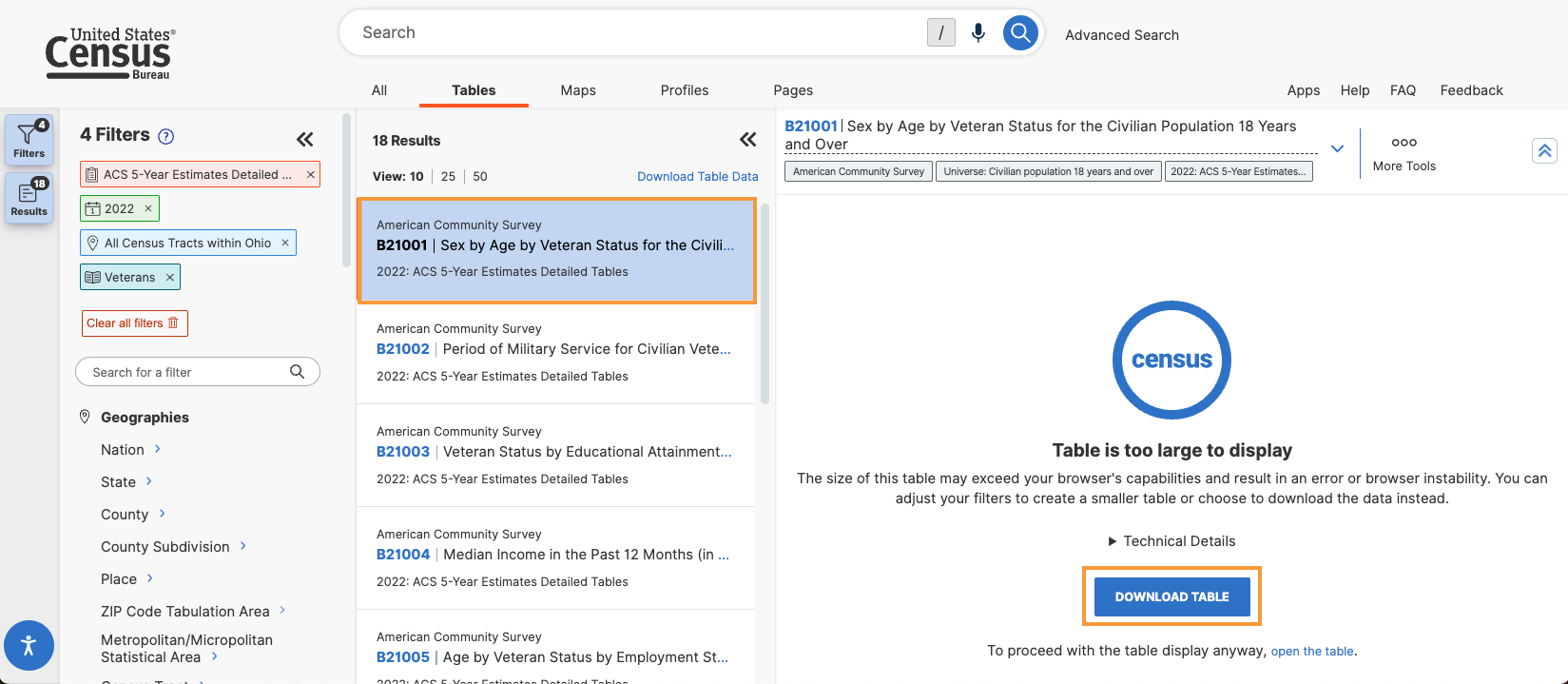
- A listing of detailed tables will be returned from which you can choose one table.
- The census tract results will likely too large to display (no worries). On the screen that appears, download the data as a zipped CSV file format.
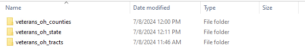
- To follow recommended data management guidelines, a folder called veterans_data was created to store the data on the state, county, and census tract level. They were renamed veterans_oh_state, veterans_oh_counties, and veterans_oh_tracts respectively.
4. Format Census Data for Import
For each geographic scale (state; county; tract), open the appropriate CSV file from your downloaded data folder and follow these steps:
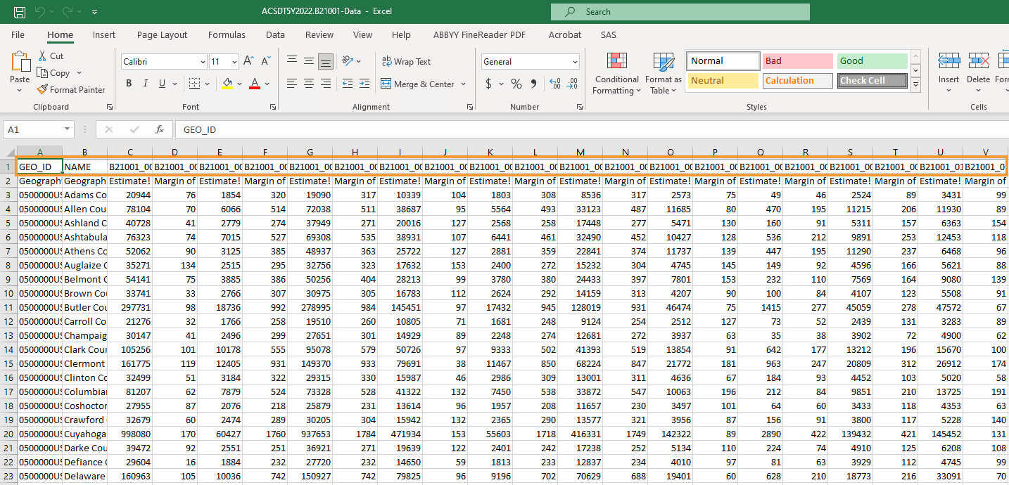
- Delete the top row (you only want one header row; this will become your top row/field names in ArcGIS).
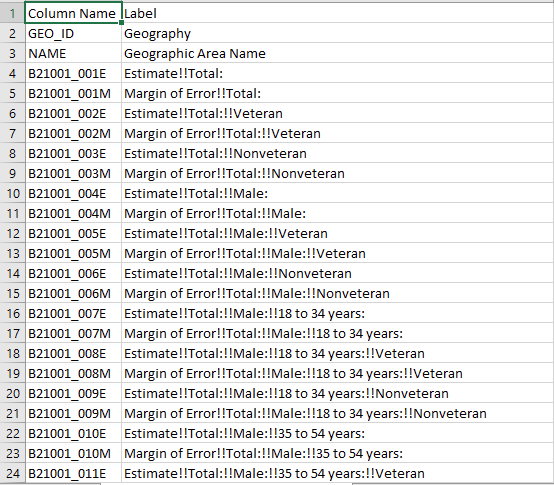
- As you scan through our file, you will see that there are likely a lot of data columns and they use a naming convention. . Choose one column (variable) that interests you. Most of the columns (variables) you will not use for this lesson. Therefore, it is also helpful to delete the columns you don’t need for your map, as this will make the table easier (and faster) to import and deal with in ArcGIS. can refer to the metadata table to see a full listing of the columns and their corresponding labels. (Tip: Change the first column labeled “Geography” to “GEOID”)
- To make the column names easier to read, do a “Find and Replace” (Control + F) to replace the !! with spaces. Just leave the Replace with section blank and make sure to click Replace All.
- Go to File > Save As and save each CSV file with a name that follows recommended data management guidelines (hint: look at the naming structure of your folder). By doing this, you create a new CSV file that includes your modifications and keeps the original data table in tact.
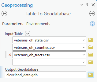
5. Add ACS data to your project
Use the import table(s) function to import your CSV files. Hit F5 (refresh) is your data appears to be missing! It likely just needs to be refreshed.
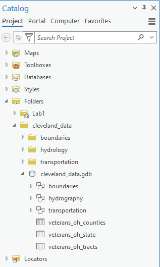
Refresh your database in the catalog pane to see the tables you have imported.
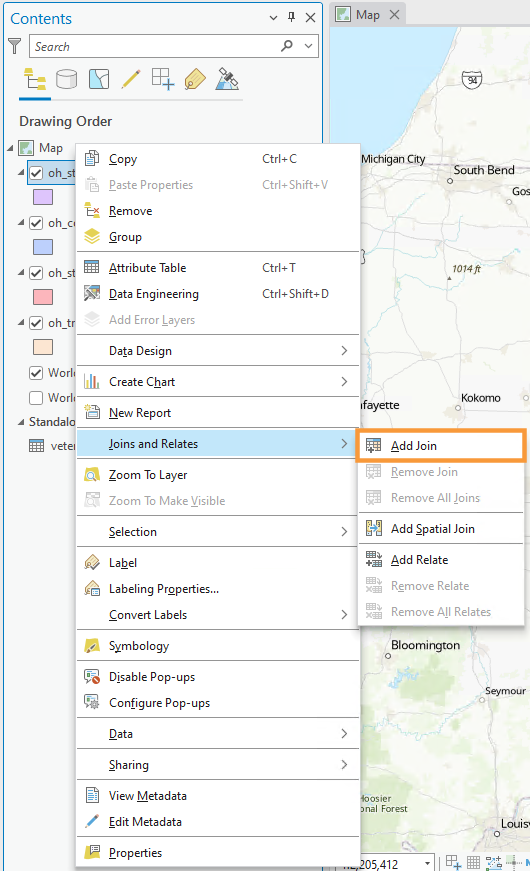
6. Joining Census data to boundary files
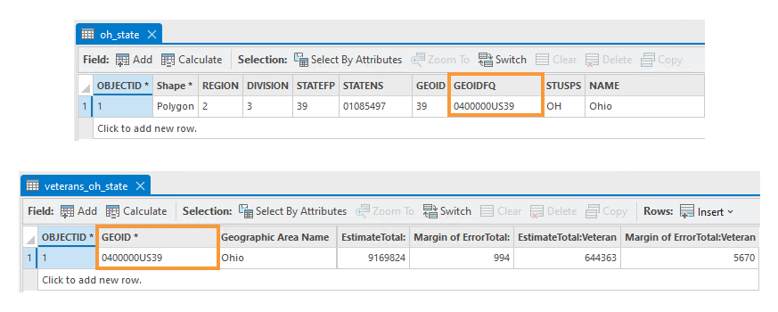
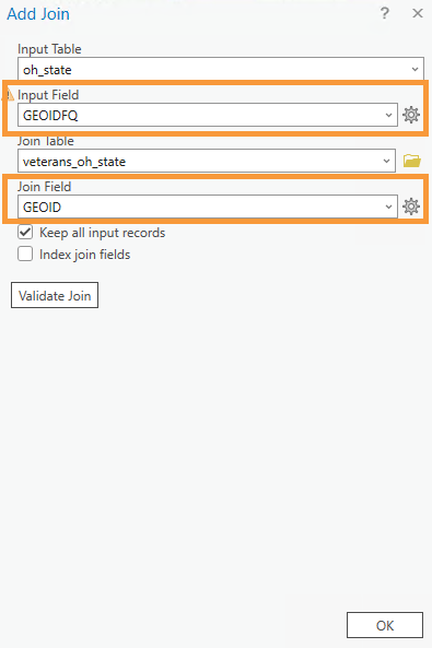
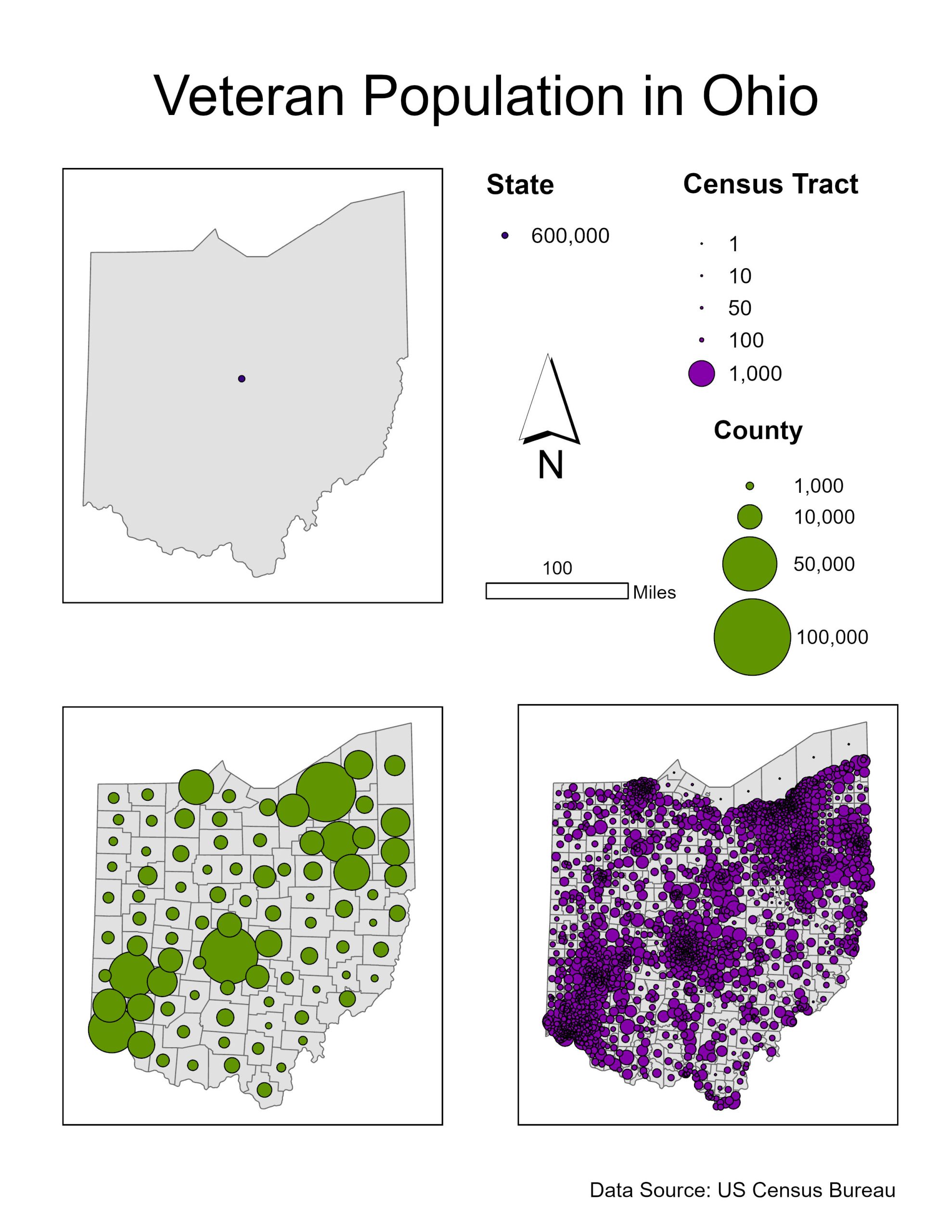
For each map, we want to join our imported ACS table to the spatial boundary file. To do this, we want to find the field that matches the ACS table and the spatial attribute table – we will join them using this field. Figure 4.9 below shows that the GEOID field in the veterans_oh_states census table matches the GEOIDFQ field in the oh_state boundary file. We will join them using this field. You also need to make sure that the fields have the same data types. For example, if the GEOID field is a numerical field (double, long, short) and GEOIDFQ is a text field, then you will not be able to join the fields.
In the case that the data types are not the same, in the boundary file, you will need to create a new field and make sure the field type corresponds to the data table field type. For example, the veterans_oh_state GEOID table is a text field, but the oh_state GEOIDFQ field is a double field (you will see that the data types match but consider this as the scenario!). You will need to make sure that the GEOIDFQ information is text data. First, add a new field and make sure that the field’s data type is a text field (Note: The GEOIDFQ field is in the correct data type (text) and this process is being done for demonstration purposes only). Make sure to save after adding the field.
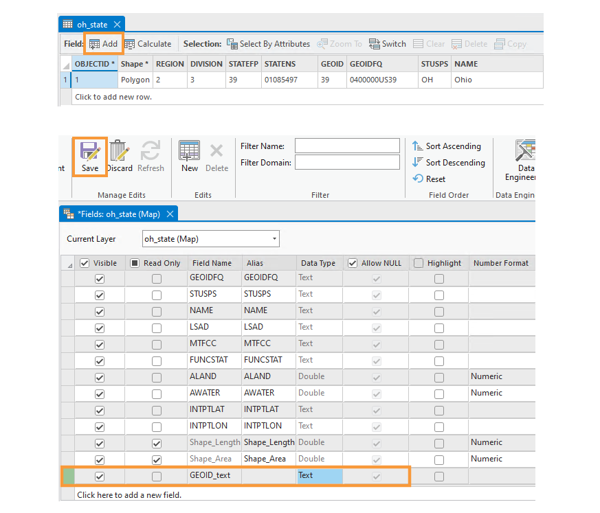
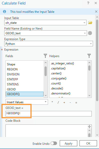
We will calculate this field by requesting that the new values be equivalent to those in the original field (GEOIDFQ) that we want to use. In essence, we are creating a duplicate field with the same values and the data will be saved in the chosen data type format.
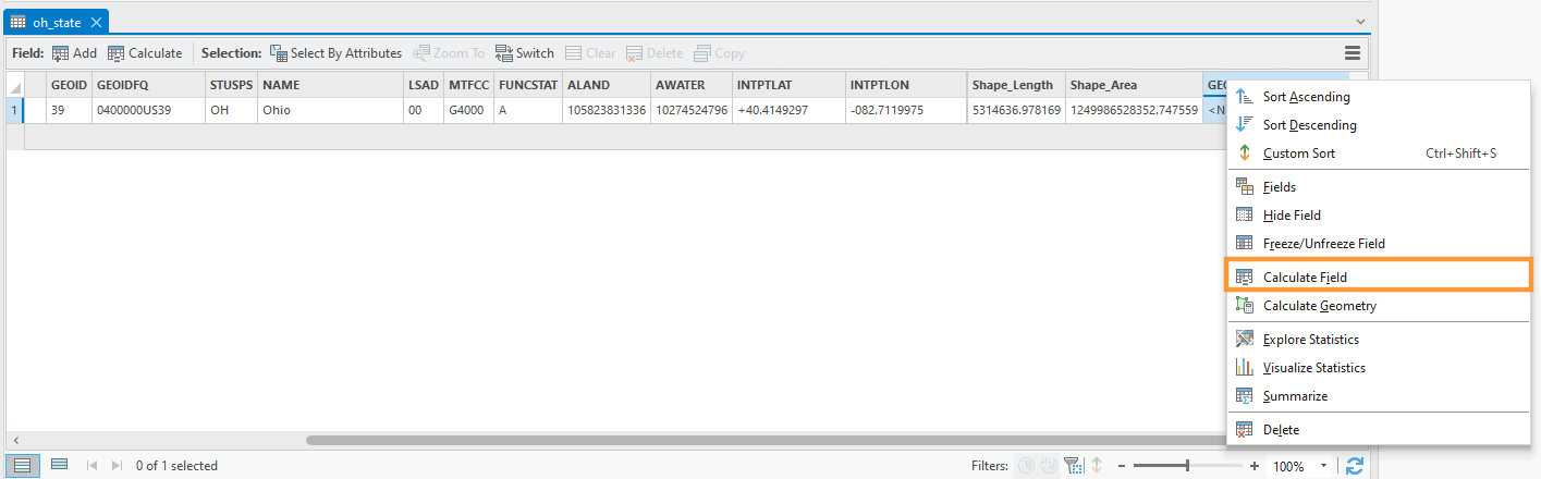
Once you made sure that the data types of GEOID and GEOIDFQ are the same, you are now ready to join the data.
Add the join, using your newly calculated field and the matching field in your ACS data.
7. Symbolizing Data
Reminder: Please make sure that your data is projected before proceeding with this step!
Before symbolizing your maps, repeat the previous steps (create and calculate new field; join ACS data) for your county-level and census-tract level maps. You will then have three maps ready to symbolize.
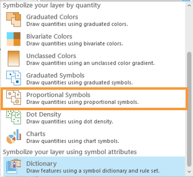
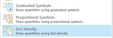
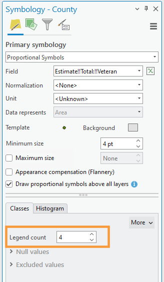
Use the Proportional Symbols method to symbolize your data.
Proportional Versus Graduated Symbols
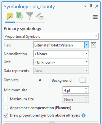
Think carefully about the parameters you choose here! If you set the parameter to <None>, the software will give you truly proportional symbols – allowing the symbol sizes to vary according to the range of data values. In some cases, your range of data may be very large. As a result, unless you constrict the Maximum Size to some value, your proportional symbols may become too large, cover up much of the map space, and create a visually undesirable design. Setting the Maximum size to some value constricts the range of symbol sizes and therefore does not portray a true proportional symbol approach. However, your design may benefit from setting the Maximum size to some finite value. Note that for true proportional symbols, your maximum symbol size should be <None> – otherwise, you are creating graduated, not proportional symbols. Remember that graduated symbols create individual classes of symbols where each class represents a range of data values and that range is symbolized by a single symbol. Proportional symbols, on the other hand, are displayed on a map where each symbol is shown in proportion to a data value. With proportional symbols, if you have 50 unique data values, then you will have 50 unqiuely sized symbols. You will need to experiment a bit here to determine which approach creates a more appropriate design for your data.
Background Option
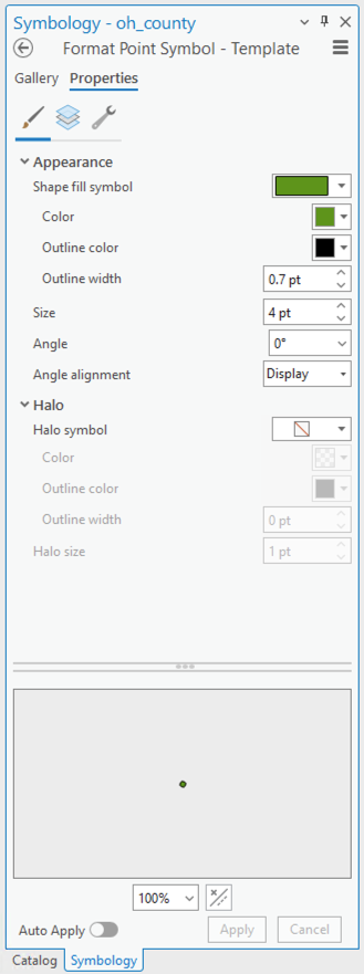
On the Proportional Symbol window shown in Figure 4.17, the Background option is present. This option allows you to alter the outline style and fill color of the enumeration unit. This option comes in handy so that you don’t need to add an unnecessary data layer of your enumeration units to your map environment. By setting the outline style and fill color using the Background option, your enumeration units will have a cohesive and appropriate design to them.
8. Creating a Layout
Create a new standard-size (8.5″ x 11″) layout as you did in Lab #1. Insert a map frame and copy and paste it in the layout: this will create three maps at the same scale.
This (Figure 3.20) is just a quick layout example and should not be considered finished! You should follow the guidelines we have learned for creating a visual hierarchy and an excellent layout, etc.
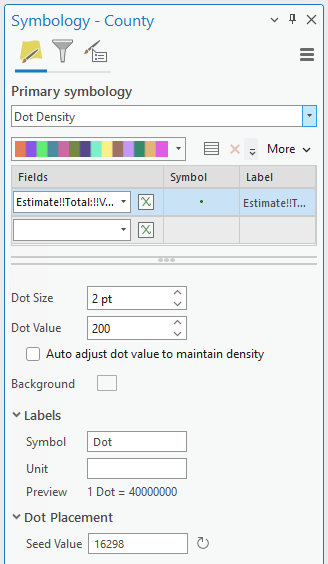
9. Save-As Building Dot Density Maps
Use the “Save-As” function and save a copy of your map project with a new name (like YourName_DotDensityMaps). This way, you won’t have to add any new data. Creating your second layout will be much easier this way – instead of doing data joining, downloading, etc., you can just focus on the design!
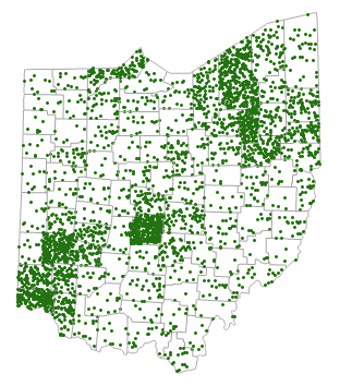
Have fun adjusting your symbolization as appropriate! Try out different colors and symbols. Experiment with the parameters to see what works! The best design will depend on many factors, including the scale of your map, your chosen state, and the data you are mapping.
10. Additional Tips
You are free to edit your data in this lab as needed to clean it up. You may want to make any unneeded boundaries invisible instead, as this will make it easier to bring them back if necessary. You can also change the number of legend items using the symbology pane.
Reference current and previous lesson content for design ideas. Test several layout configurations and lots of symbol designs (sizes; colors; outlines; transparency) – you’ll learn a lot as you go!
