Lab 5 Visual Guide
Lab 5 Visual Guide Index
- Downloading the Census Data
- Explore the Health Insurance Data in Excel
- Standardize Chosen Data for Visualization
- Create Dot Plots Using your Standardized Data
- Use this Plot to Visually Select Breaks
- Joining Data in ArcGIS Pro
- Create Maps (1 & 2) Using these Breaks
- Create Maps (3 & 4) Using Diverging Colors
- Create Maps (5 & 6) Unclassed vs. Classed
- Final Deliverables
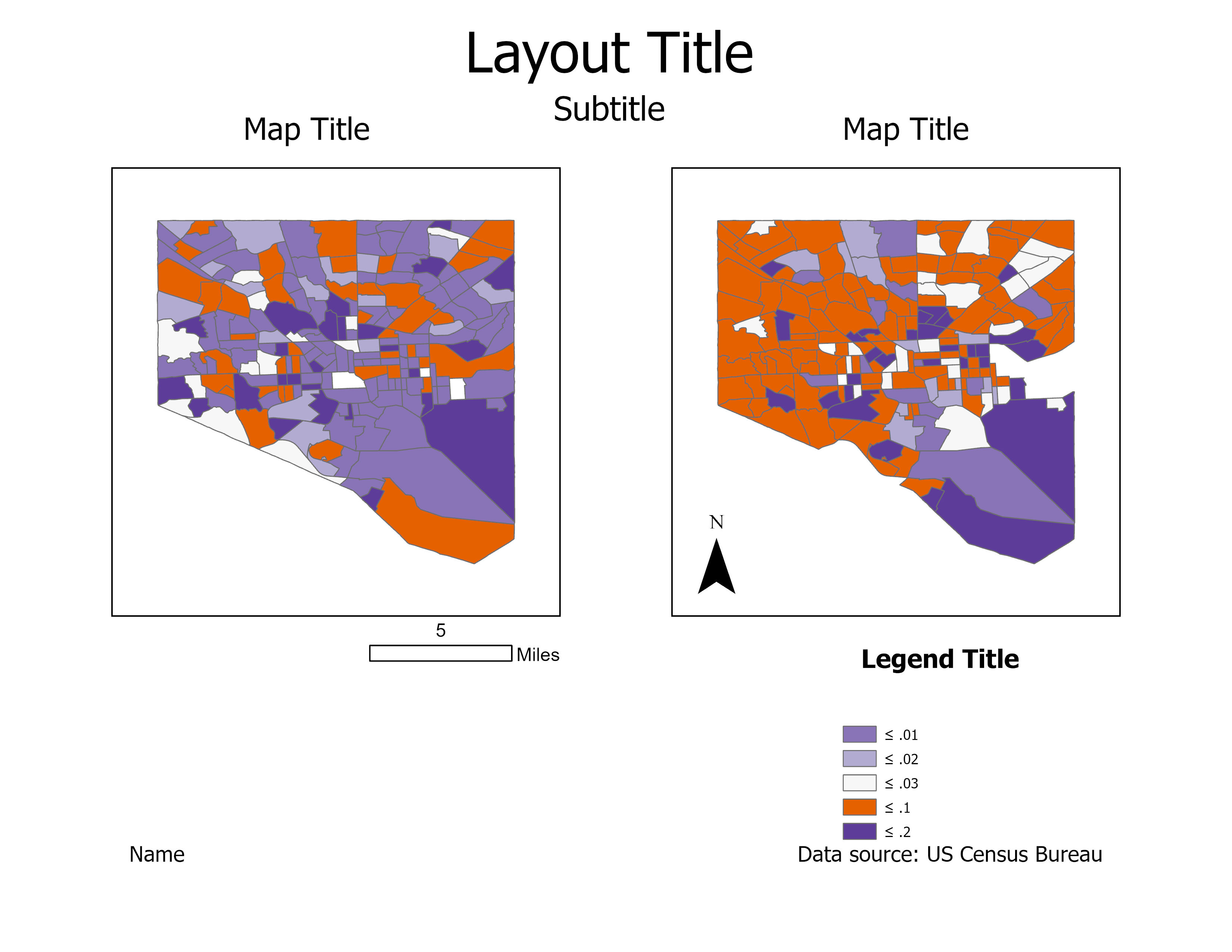
- Example Map Pair #1
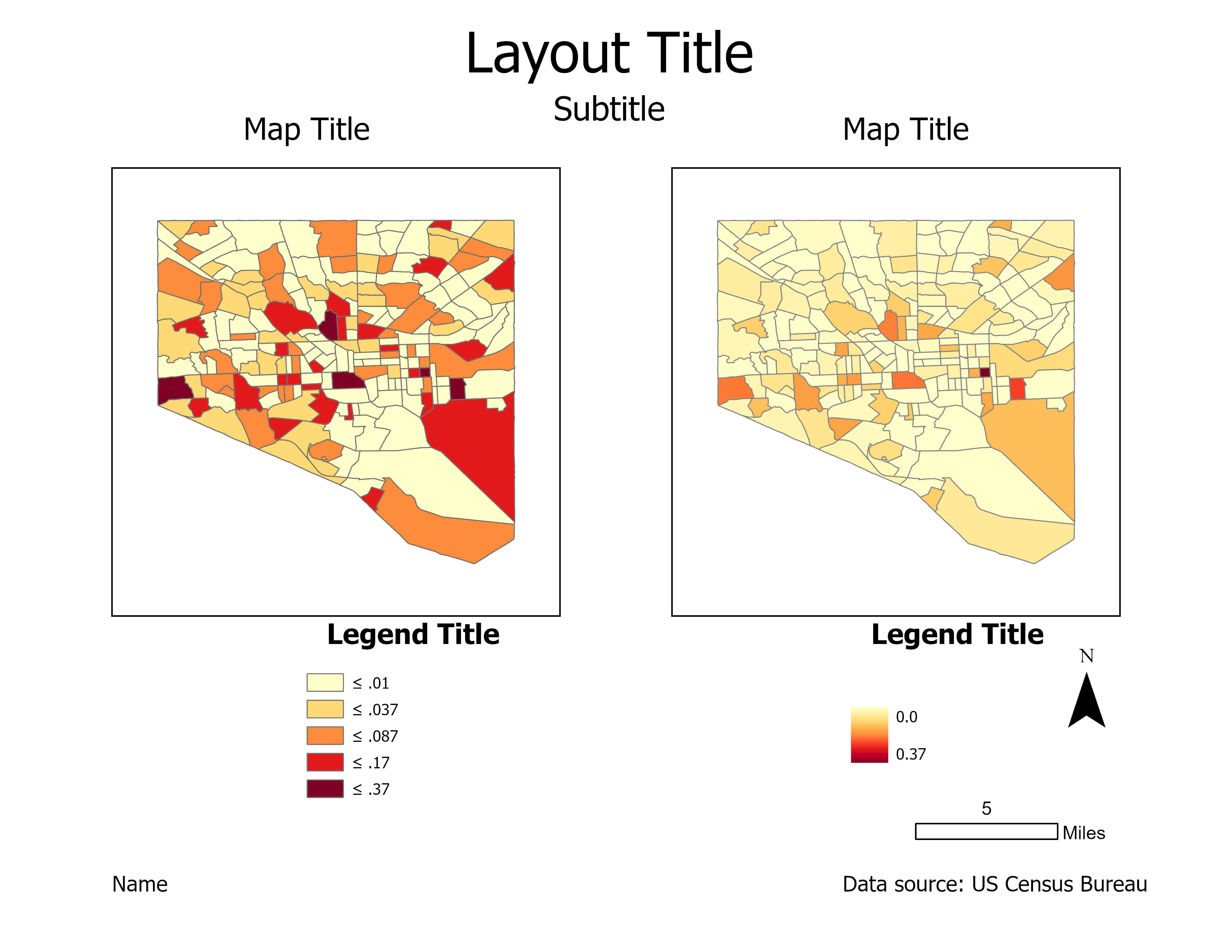
- Example Map Pair #2
- Example Map Pair #3
1. Downloading Census Data
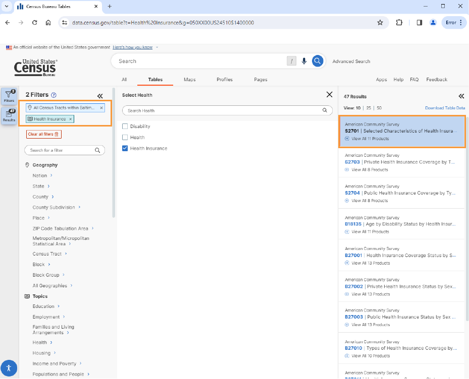
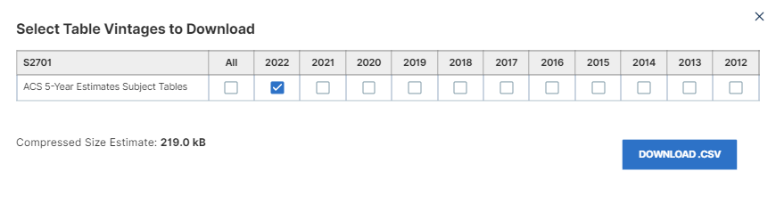
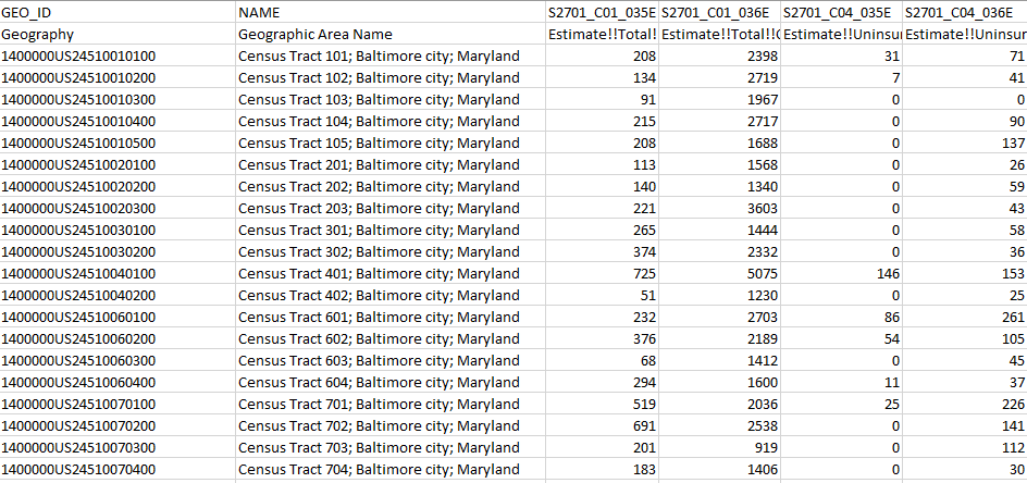
You will need to go to data.census.gov and click on the Advanced Search option. This will allow you to do a filtered search. Under Geography, click on County and choose the census tracts of your chosen city. The following example will use census tracts in Baltimore City. Under Topics, choose Health > Health Insurance. Once you are finished, click on Tables. You should see S2701 – Selected Characteristics of Health Insurance Coverage in the United States along with a preview of the table. Download the table and make sure it is the ACS 5-Year Estimates Subject table for 2022.
2. Explore the Health Insurance Data in Excel
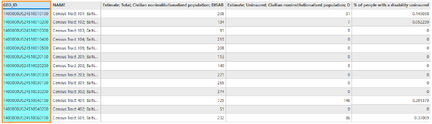
Your data should be in a zipped folder with the actual data, metadata, and table notes. You will have to create a new file in the Excel workbook (.xlsx) file format that includes columns to your two variables of interest, the GEO_ID column, and the NAME column. Open the metadata file to find the columns with columns pertaining to uninsured populations. For example, if I were to compare the uninsured rate with the population with a disability and no disability, these columns would need to be in my new Excel workbook file:
- GEO_ID: Geography
- NAME: Geographic Area Name
- S2701_C01_035E: Estimate!!Total !!Civilian noninstitutionalized population!!DISABILITY STATUS!!With a disability
- S2701_C01_036E: Estimate!!Total!!Civilian noninstitutionalized population!!DISABILITY STATUS!!
- S2701_C04_035E: Estimate!!Uninsured!!Civilian noninstitutionalized population!!DISABILITY STATUS!!With a disability
- S2701_C04_036E: Estimate!!Uninsured!!Civilian noninstutionalized population!!DISABILITY STATUS!!With a disability
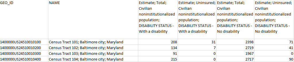
You can just delete what you don’t need, go to File > Save As > and use the naming convention CityName_Uninsured. Make sure that you save your csv file in a folder that is easily accessible. Change the file type under Save as type to Excel Workbook. Your updated data file should look like below:
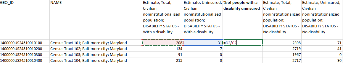
3. Standardize Chosen Data for Visualization
We will calculate standardized values from your newly created Excel workbook. We will use these standardized values to determine class breaks for our first set of maps.
Let’s first do some formatting of the columns. Replace the column codes with the actual name of the column category. Feel free to clean the column names to make them more legible such as removing the “!!” and replacing them with a “;” Columns with the same variable were also moved next to each other. See the below image for a reference.
Once you have your variables of interest (i.e. with a disability, with no disability) and their total counts, use Excel to calculate a standardized column of data for each of your variables. You want to divide each variable of interest by the total count in that category. Check the data to see if there are any errors such as #DIV/0! And change the value to zero.
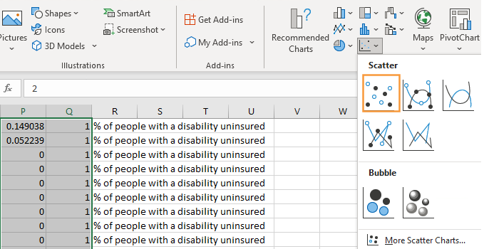
4. Create Dot Plots Using your Standardized Data
Go to an empty set of columns to do these steps. Copy the standardized values for both variables on the spreadsheet in the same column in which you put a space between the two variables.
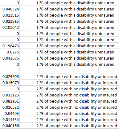
Insert a column of 1s and 2s as shown – we will use this to create a dot plot. Highlight columns with the percentages and the 1s and 2s. Go to Insert > Charts > Scatter and choose the Scatter option. This will create a dot plot showing the distribution of your two standardized variables along the number line.
5. Use this Plot to Visually Select Breaks
Draw lines with the “insert shape” tool to illustrate where you will be placing breaks in your data. Annotate your lines if you choose the breaks for a reason other than just eyeing the dot distribution. For example, if you place a break at the national average for a variable, annotate this break with a text box explanation such as “US national average.” “Ex: national average.”
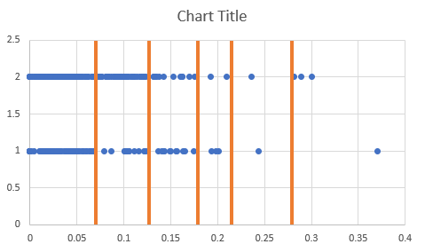
Note that this example is how to draw lines above your dot plot, but these are not good breaks. Make sure to save your file.
6. Joining Data in ArcGIS Pro
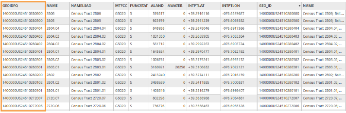
Open ArcGIS Pro and create a new project. Make sure to connect the folder that contains your workbook. Import the Census tract shapefile, city boundary (which should be in the geodatabase you completed for Lab 1), and Census data table of your chosen city to the project geodatabase for Lab 4. The easiest way to import the data table is to click on the arrow next to the workbook in your catalog panel to expand the workbook to see the spreadsheets and add the spreadsheet to the Contents panel and then right-click on your project geodatabase > Import > Table(s). Before joining the data, lets only use the Census tracts that are within your city. You can do this by doing Select By Attributes and using the COUNTYFP of your city or a Select by Location in which you select Census Tracts that are within a city boundary. Right-click on the Census tract shapefile >Export Features and name it CityName_Tracts. Make sure to save this layer in your geodatabase. When joining the data, use the data table in the contents pane. You will need to use the GEO_ID field in your spreadsheet file and the GEOIDFQ field in your shapefile.
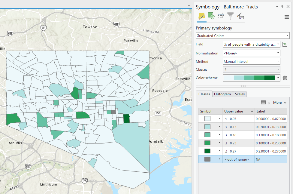
7. Create Maps (1 & 2) Using these Breaks
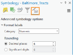
When adding a symbology to your map, manually edit the class breaks that you made on your dot plot (use your eye to estimate the values). Use the field indicating the percentage of uninsured that you calculated for the Field. Under More, click on Show values out of range and give it the label of NA. You will submit a Screenshot of the Symbology Pane for both maps in layout one, in addition to an image of your plot with annotated breaks.
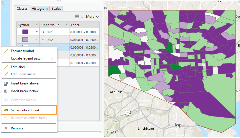
8. Create Maps (3 & 4) Using Diverging Colors
For these maps, you will be setting a critical class break (e.g., based on the mean of the data) and a diverging color scheme. To create your second pair of maps, choose a diverging color scheme. Then, set a deliberate and useful critical class or break. Once the break is set, you should manipulate the other class breaks manually. As a suggestion, for the other class breaks you could start with the manual breaks you chose for your first two maps, but you may need to adjust them to work with this new color scheme.
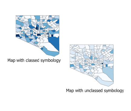
9. Create Maps (5 & 6) Unclassed vs. Classed
For the third set of maps, abandon your previously selected class breaks. In this set of maps, you will compare the visual difference between a classed map and unclassed map. Use the same sequential color scheme for both maps so they can be adequately compared. You should also use consistent line design, etc., so as to not distract from the primary difference of interest – the classification method used. Unlike with the two sets of maps, you will not be mapping two different variables for comparison here. You will choose just one of the variables from your previous maps and visualized this variable on both of maps 5 & 6.
For your classed map, choose any of the methods available in ArcGIS Pro – but have a reason why! You will discuss your reasoning for choosing one of the methods in your write-up for this map pair.
10. Final Deliverables
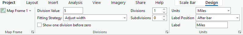
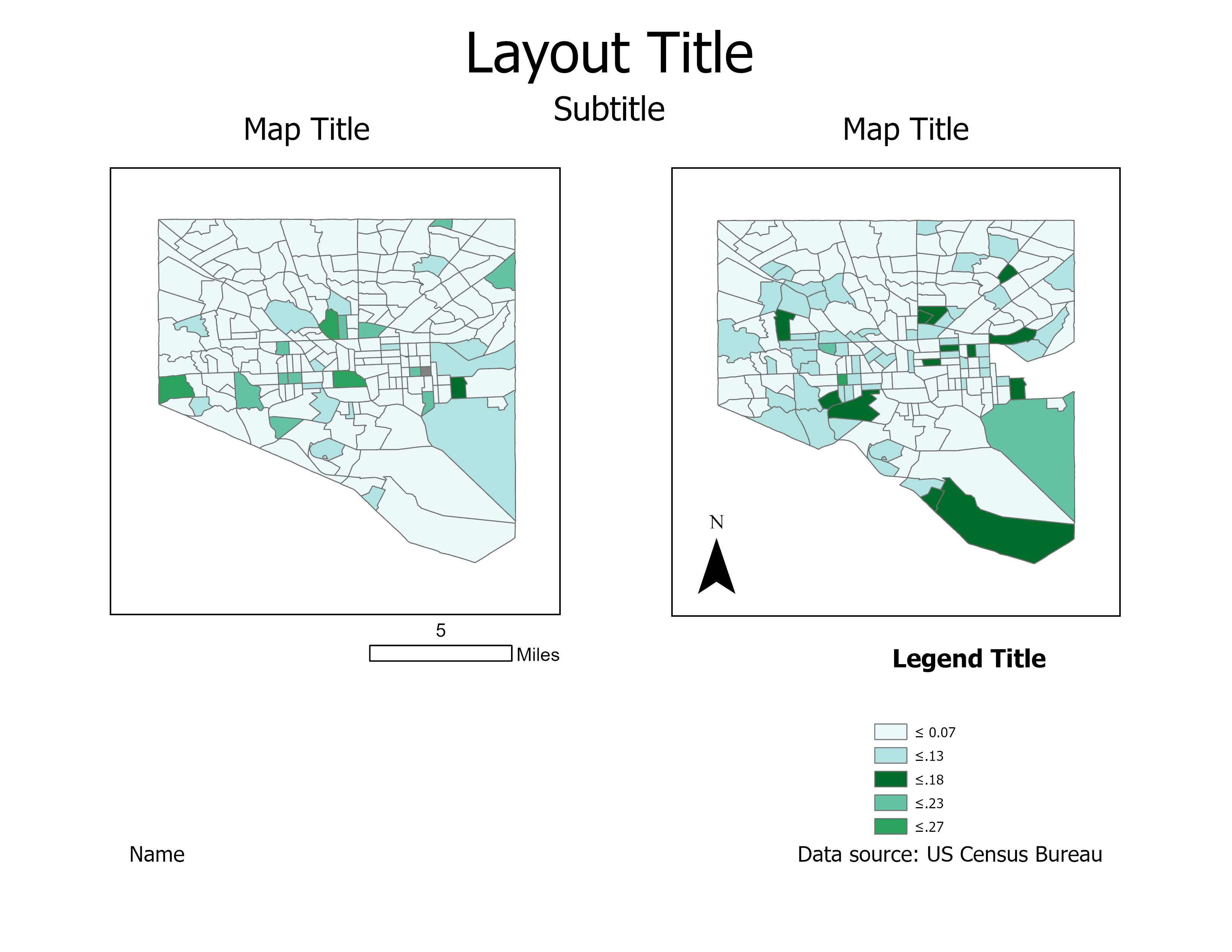
For this lab you will submit three layout, each containing a pair of maps. You will also submit a write-up document, with a 100+ word explanation of your design (data classification and color) choices for each map pair. Make sure to also design a neat and useful layout. Do not copy these layout designs. These are for demonstration purposes only. Use your knowledge of good cartographic design principles when creating these maps (i.e. you would have to give your legend an actual title). Note that elements which refer to both maps (legend; north arrow; scale bar) need to only be included once.
Example Map Pair #1
Example Map Pair #2
Example Map Pair #3
11. Additional Tips
Think about color and what you are mapping. Are you mapping insured or uninsured? Choose colors wisely – what do they represent?
Remember that you can employ text to explain your map! Use text sparingly but effectively – don’t be afraid to use convert to graphics and/or manually edit text and layout elements. When choosing a color scheme as well as when doing your write-up, keep in mind: the perceptual progression of your data should match the perceptual progression of your color scheme.