
Lab 6 Visual Guide
Lab 6 Visual Guide Index
- Downloading the Census Data
- Explore the Health Insurance Data in Excel
- Standardize Chosen Data for Visualization
- Create Dot Plots Using your Standardized Data
- Use this Plot to Visually Select Breaks
- Joining Data in ArcGIS Pro
- Create Maps (1 & 2) Using these Breaks
- Creat Maps (3 & 4) Using Diverging Colors
- Create Maps (5 & 6) Unclassed vs. Classed
- Final Deliverables
Lab 6 Visual Guide
1. Downloading the Census Data
You should have already have downloaded the census tract data in Lab 1. If not, go to the Census TIGER/Line Shapefiles webpage and download the files for your chosen city. For this visual guide, we will use Baltimore census tracts.
F5tor the unemployment data, go to the Census data portal and click on Advanced Search. Under Geography, click on Census Tract and choose the Census tracts for your city of interest. Make sure to click All Census Tracts within your city of interest. Under Topics, click on Employment > Employment and then click Search on the bottom right-hand corner. You will see various tables in your search results. You will need to download the S2301 Employment Status table.
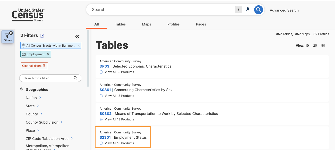
Click on the table and you should see a preview of the S2301 table. Make sure that you check the box before the name of the data table so you can download it. Before downloading, confirm that you are downloading the 2022: ACS 5-Year Estimates Data Profiles. If not, you can click the “+” next to View All __ Products to show the available datasets for the given table. Once you confirm you are downloading the correct table, then click Download.
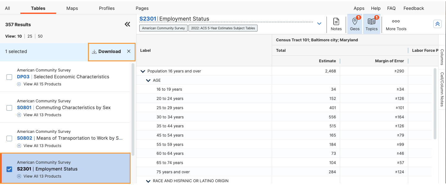
You will see the Select Table Vintages to Download prompt. Make sure to click 2022 under ACS 5-Year Estimates Data Profiles. Click Download.ZIP to download the data table.
2. Exploring the Employment Data
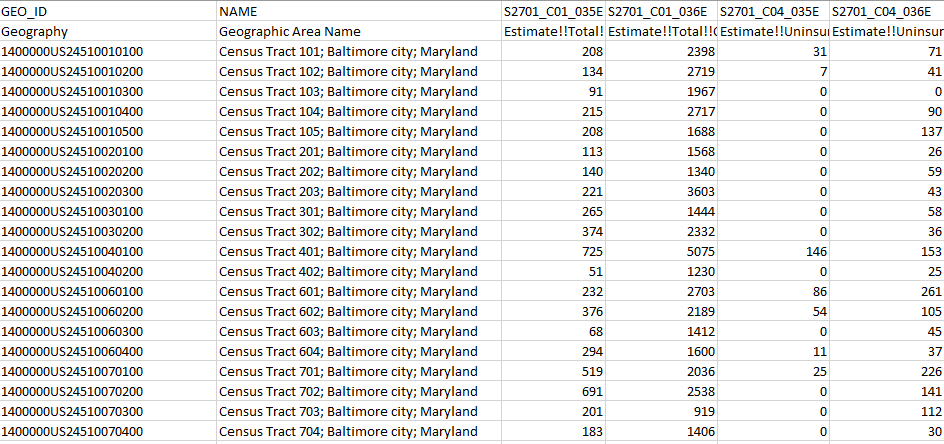
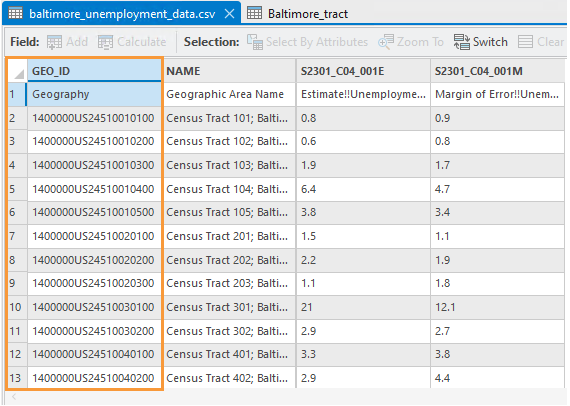
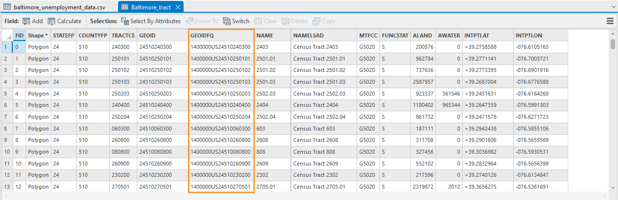
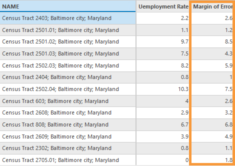
Next, we will look at the employment data in Excel. We will single out what we need and then create a new data table. This will be the table we use when we join the data. We will need the GEO_ID and NAME fields to do this. The other columns we are interested in are S2301_C04_001E: Estimate – Unemployment Rate – Population 16 years and over and C2301_C04_001M: Margin of Error – Unemployment rate – Population 16 years and over. Create a new blank workbook and copy and paste those four fields in your new workbook. Save the workbook as a CSV (Comma delimited) file and name it city_unemployment_data. In case of this example, the csv file will be named baltimore_unemployment_data.
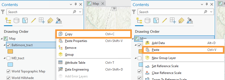
3. Joining data in ArcGIS Pro
Open up ArcGIS Pro and add the census tracts and the CSV file to your project. You will now need to join the CSV file to the census tract shapefile using the GEO_ID in the CSV file and GEOIDFQ in the census tract shapefile.
Make sure to follow the same steps for the industry related data with the S2405 table. For this data, call your new csv file city_industry_data. Join this CSV file to your shapefile.
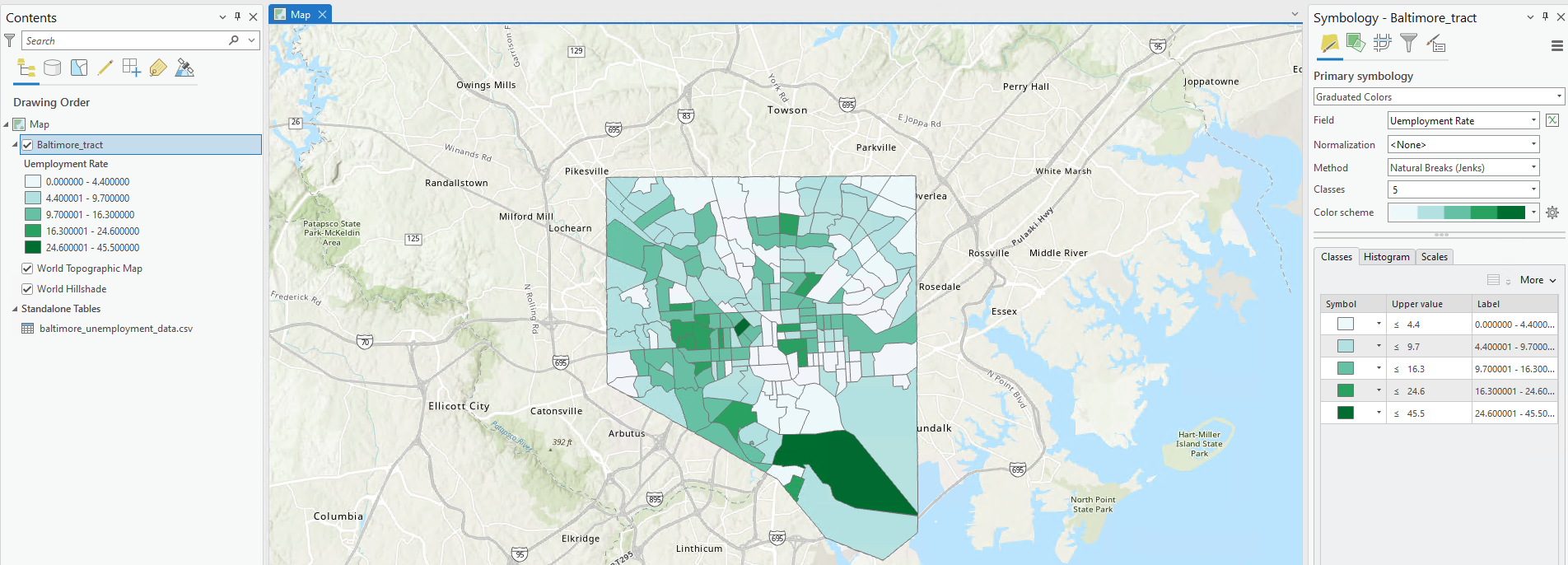
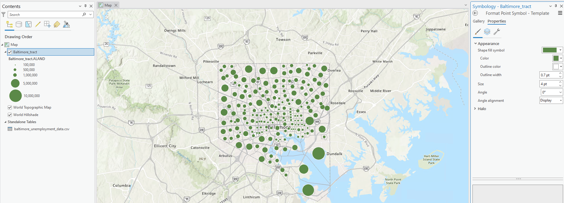
4. Create your Primary Map
With your primary map, you will show the unemployment rate across your city by census tract. Having such information will help with selecting areas in terms of targeting vocational education and job training to certain parts of the city. When mapping this variable, you may choose among several thematic mapping options (choropleth; graduated symbol; proportional symbol, etc). Shown below are some examples of symbolization you might use for your primary map.
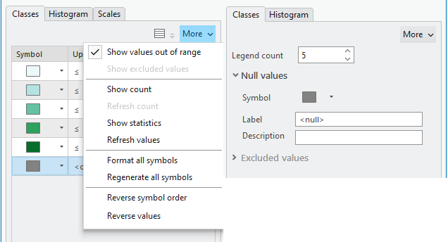
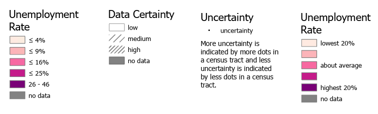
You might come upon a situation in which some census tracts do not have an unemployment rate. Due to this, an element of your map design will be deciding how to visualize null values. You want it to be clear to the map reader which census tracts do not have an unemployment rate, but you do not want these to be too prominent in your map’s visual hierarchy – they should not distract from your map’s main purpose. As shown below, symbolizing null or “out of range” values is a slightly different process depending on which symbolization method you choose.
5. Add Visual Depiction of Uncertainty
Your primary map should visualize not only the unemployment rate you have selected, but also its associated uncertainty. For this lab, you will use the margin of error field as a proxy for uncertainty. Assume that a higher margin of error = higher uncertainty. Though the statistics involved are slightly more complicated than this, this focus is on visualization and thus this generous assumption is suitable for our purposes. Additionally, as we are interested in where the data is more or less certain, rather than in the actual standard error values, you should classify uncertainty data into general groupings (e.g., “low,” “medium,” “high”).
You may choose to visualize uncertainty either extrinsically or intrinsically. When selecting a method, consider how you will represent this uncertainty in your map’s legend as well as how your design might be interpreted by your map’s intended audience. This guide presents two popular methods for visualizing uncertainty, though there may be others.
Option #1: Extrinsic uncertainty visualization
The easiest way to create an extrinsic uncertainty visualization is to copy-and-paste your census tract boundary data and symbolize uncertainty with the duplicate layer.
Two examples of extrinsic uncertainty are shown in figure 6.9. Recall from the lesson content the visual variables most effective for visualizing uncertainty. Your goal should be to create an intuitive design.
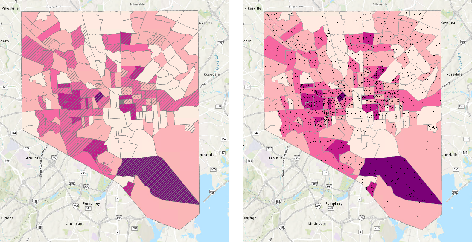
Option #2: Intrinsic uncertainty visualization.
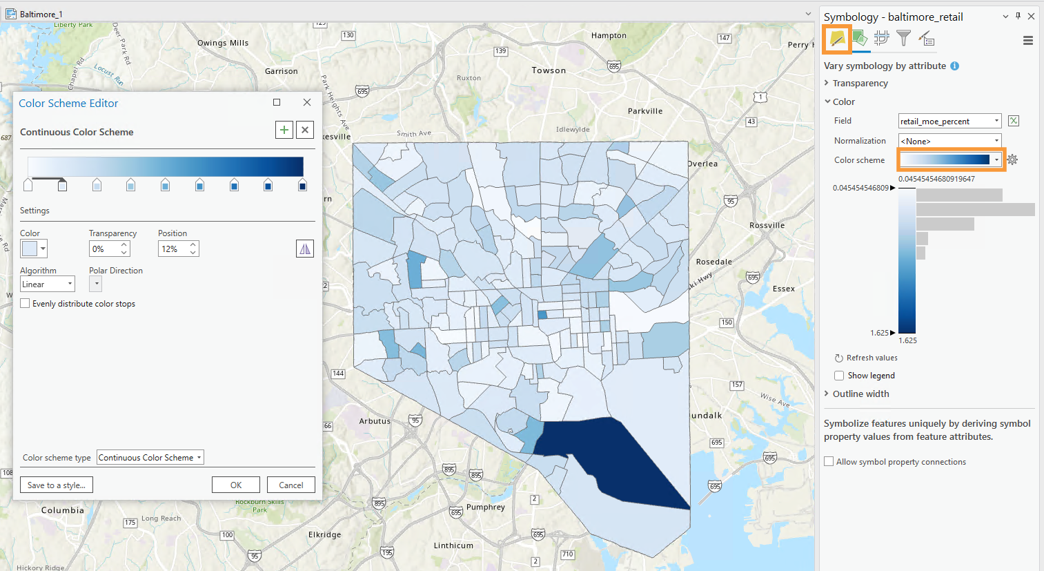
The other primary option for visualizing uncertainty in your map is intrinsically, via the “vary symbology by attribute” option in ArcGIS Pro. Think carefully about how you apply elements like transparency – the progression of your data should match the visual progression of your design. To accurately depict your data and its uncertainty, you may have to manually edit or reverse a color scheme or transparency range. You can open up the color scheme editor by clicking on the color bar next to the Color Scheme option and then clicking on Format color scheme.
6. Create Small Multiple Maps and Report
Once you finished your primary map, you will create three smaller maps showing the percentage of population on variables of interest for the economic development agency which are:
- Transportation and warehousing, and utilities
- Retail trade
- Manufacturing
All three of these maps should be in one map frame. You should also make sure that there is one map per variable. There will be a total of four maps for this section. Revisit the Comparing vs. Combining section for an example of a small multiples map within one map frame. You do not need to visualize uncertainty in these smaller maps. For this lab’s final deliverable, you will need to submit a report in which you analyze the trends you see in your maps. Feel free to add additional information outside of the Census data you are working with. Be creative as you want with this report! The more information you include, the more the economic development organization will be better informed in their decision-making Your report should be able to answer these questions:
- What is average unemployment rate in your city and where is the highest and lowest unemployment rates within your city? Along with indicating where the highest and lowest unemployment rates are (i.e. in the north part of the city) you should include names of some neighborhoods in this report (tip: adjust the transparency to see the neighborhoods)
- What is the average rate employment in the trades of interest of the economic development agency?
- Which trade has the highest and lowest employment rates?
- Given the economic development agency is working with three stakeholders recommend the best areas in the city to pursue these initiatives and provide a rationale behind your recommendation:
- A major logistics company wanting to open a distribution center.
- A mid-size retailer who is interested in opening a new store site.
- A consumer goods start-up who wants to open a manufacturing plant.
- What role should the knowledge of data uncertainty play in your recommendations?
7. Additional Tips
Remember design ideas from previous labs – you may want to add elements such as a grid, explanatory text, and data credits to your layouts. It’s up to you how you balance your final document with such elements – for example, instead of listing a data source on your map images, you can simply include this source in the text you write. Focus on creating a useful and cohesive document, as well as smartly-designed legends.
