Making Chloropleth Maps
Making Chloropleth Maps
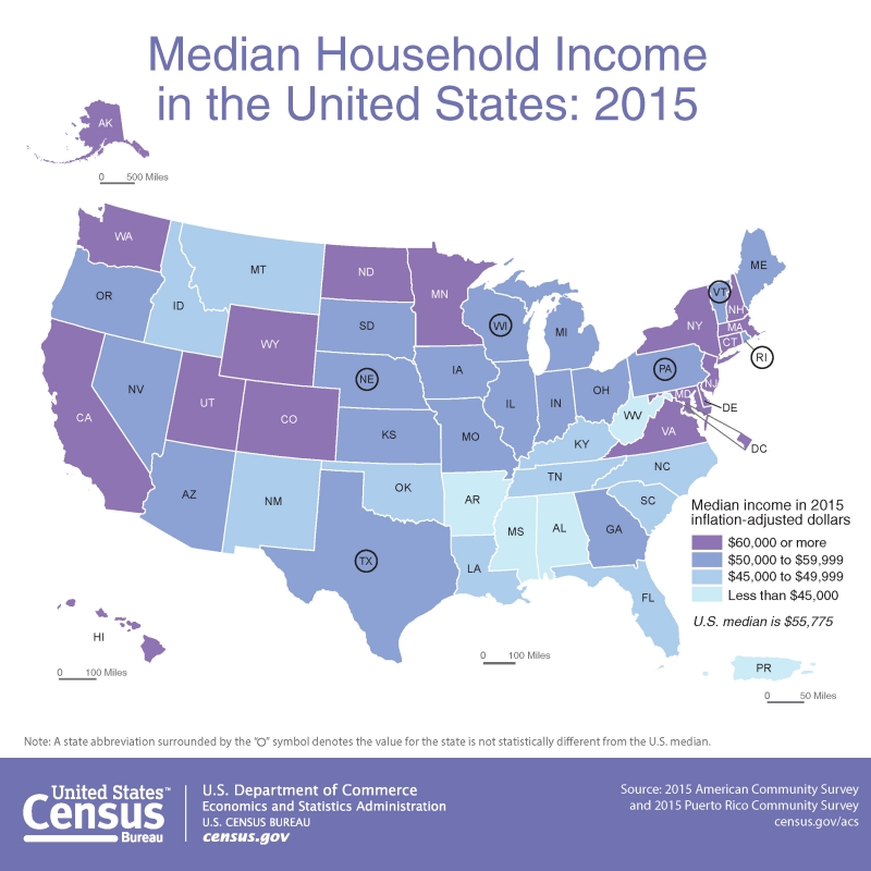
Let’s return again to a map that should be becoming familiar, posted now as Figure 4.6.1. Median income is visually encoded in each state as belonging to one of four classes: (1) less than $45,000; (2) $45,000 to $49,999; (3) $50,000 to $59,999, and (4) $60,0000 and more. How were these classes chosen?
Student Reflection
One side-step before we discuss data classification: think back to our discussion of types of color schemes—can you think of another type of color scheme that would be effective in Figure 4.6.1? Do you think it would be better?
When the map in Figure 4.6.1 was being designed, the aforementioned classes had to be decided upon – and there are many different ways in which class breaks in median income could have been drawn. So, how do you choose? Rather than simply choosing the default classification scheme that your GIS software suggests, you should think critically about how your data classes are defined. The first decision you should make, however, is not how, but whether to class your data.
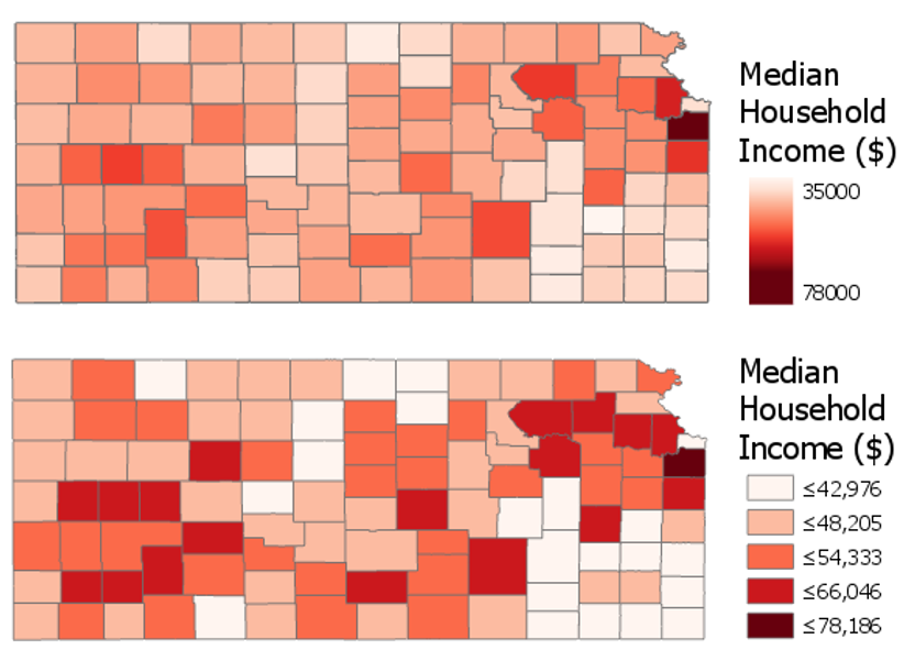
Figure 4.6.2 shows an example of two maps—one unclassed (sometimes called a “class-less” map), and one classed. Unclassed maps encode color (usually with lightness) based on the specific value within each enumeration unit, rather than based on a pre-defined class within which the data value falls. These maps are useful as—if designed properly—they may more accurately reflect nuances in the distribution of the data. However, they should not be considered an easy solution to the problem of data classification. They have their own disadvantages, for example, they make it challenging for the reader to match the value encoded in an enumeration unit to its location on the legend.
Before modern GIS software, unclassed maps were quite difficult to create, but new technology has made their design quite simple. Unclassed maps show a more “direct” visualization of the data, while classifying maps gives you more control over the final map. It will be up to you as the map designer to decide whether to class your map; however, many map readers—and cartographers—still prefer classed maps.
As you will likely be classifying your maps, it is important to understand how this process can influence your final map design. Most of the commonly-used classification methods are available in ArcGIS, and the software interface gives a good simple explanation of each of these methods (Figure 4.6.3). We will not discuss the mathematical details of each of these classification methods here—it is recommended that you explore the recommended readings or do your own research on the web to learn more.
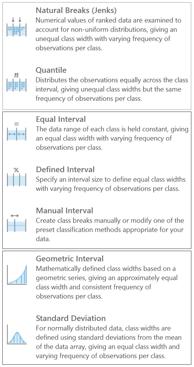
Though Figure 4.6.3 gives helpful descriptions of each classification method, it offers little advice as to when to use them. A good way to approach this question is to view your data along the number line. You can use histograms (for large data sets) or dot plots (for small data sets) to visualize how your data is distributed, and to select class breaks accordingly. The following suggestions are given by Penn State cartographer Dr. Cynthia Brewer.
- For data with near-normal distributions, consider classifying your data based on the mean and standard deviation.
- For skewed distributions, consider systematically increasing classes, such as arithmetic and geometric classing methods.
- If your data are evenly distributed, equal interval and quantile classing methods work well. These methods are also best for ranked data.
- Natural breaks, created using Jenks classing method or in selecting breaks by eye, work best for data which shows obvious groupings through the range. The natural breaks method highlights the natural sets of values in the data.
We will look at data using dot plots during this lab associated with this lesson. When you make maps, unless you are working with a very large data set, this will often be the most effective way to visually investigate your dataset in order to choose a classification method or visually/manually place your own breaks. ArcGIS, however, creates histograms of your data that you can also use to understand how the breaks you have chosen relate to the spread of your data.
Student Reflections
Note that the spread of your data is only one of multiple elements you should consider when choosing how to classify your data. As with other map design choices, your map’s intended audience, medium, and purpose are also of vital importance here.
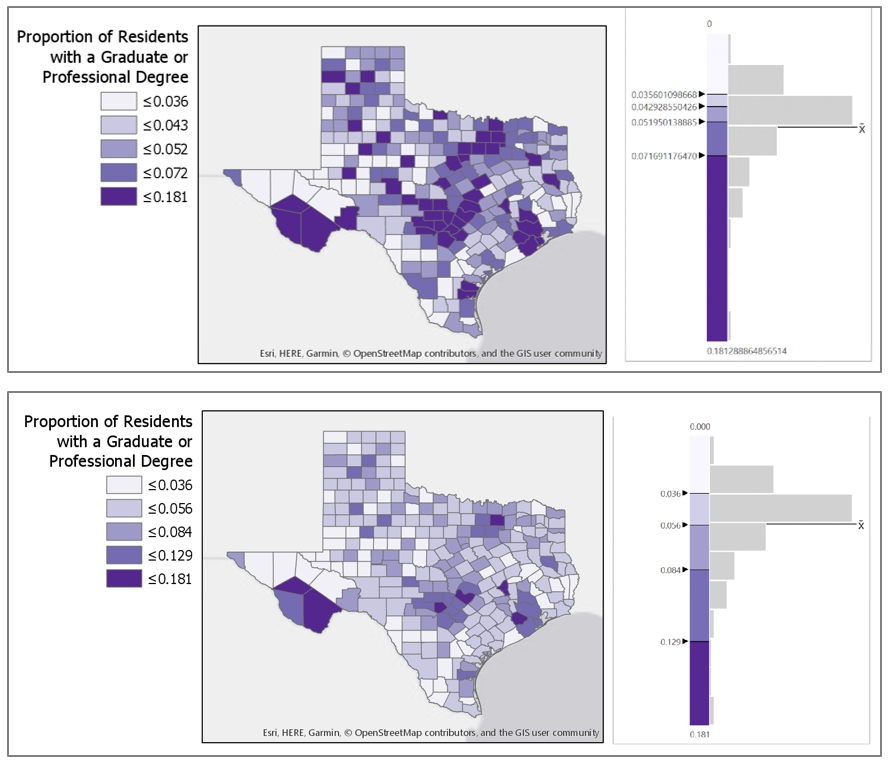
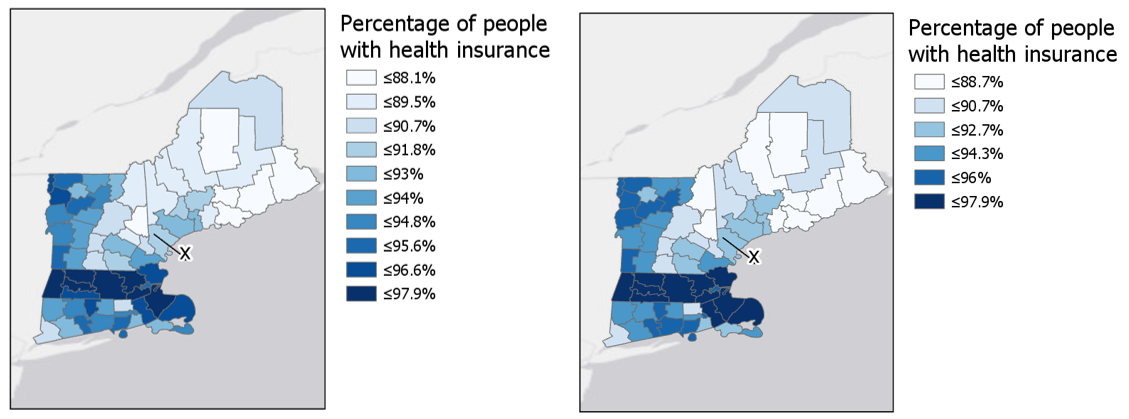
In addition to choosing a classification method for your maps, you also must decide how many classes to create. It may be tempting to create a large number of classes, as more classes means less simplification of your data, and thus more information conveyed to the map viewer. Unfortunately, the human eye can only differentiate between so many colors. The limit is about a dozen colors for a qualitative map, ten for a diverging scheme, and only eight for a sequential scheme. If anything, these are optimistic estimates—your map reader is likely to be able to differentiate between even less.
Student Reflection
View the maps in Figure 4.6.5 below. Looking at the map on the left, can you identify within which class county x belongs? How confident are you that this is the correct answer? What about in the map on the right?
Finally, when classifying your map data, you will have to contend with outliers in your dataset. Consider a county-level map, where one county has double the rate (for example, of people with graduate-level degrees) of any other county in your data. Some classification methods, such as natural breaks or equal intervals, will most likely group this outlier into a class of its own. Other methods, such as quartiles, will simply place it into a group with all the next-highest counties.
There is no rule for which method is best, except that context matters. Is the rate high because that county contains the most prestigious university in the state? In that case, you probably want it to be highlighted on your map. If instead, it is the highest because only five people live there—and two are college professors—you probably don’t. In general, the more data you have, the less likely an outlier is to be noise: this is called the law of large numbers. Whenever possible, however, you should investigate the possible causes of an outlier—there is no substitute for contextual clues.
There are additional ways to classify your data, including by combining methods—for example, using equal intervals for most of the range, and then switching to natural breaks. Methods also exist that consider not just the distribution of data along the number line, but its distribution through geographic space as well. These are beyond the scope and intent of this lesson, but be aware that you may encounter them in the future.

