Multivariate Glyphs
Multivariate Glyphs
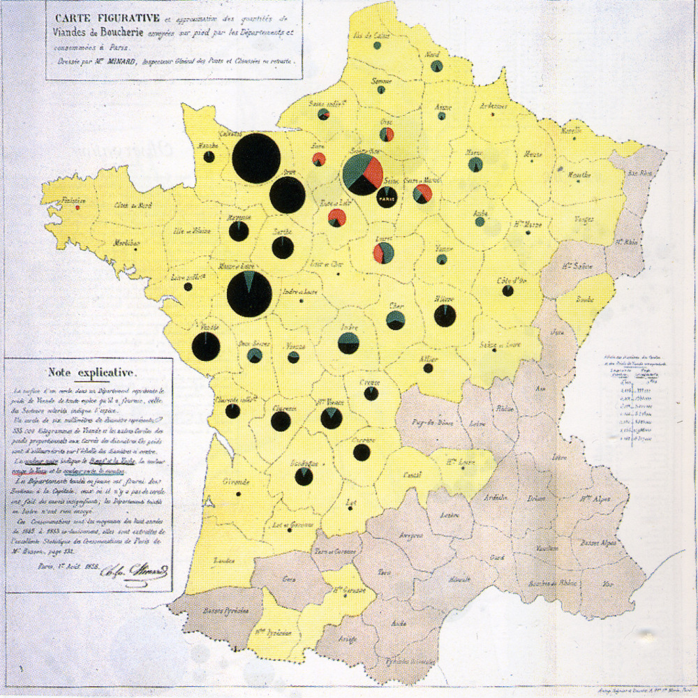
The examples we have explored so far have only visualized two or three variables at once. Occasionally, you may want to visualize more. One possible solution is to design data graphics that can then be incorporated into your map. A classic example of this is the use of pie charts as proportional symbols: an example is shown in Figure 5.5.1 below.
A more recent (and more complicated) example is shown in Figure 5.5.2.
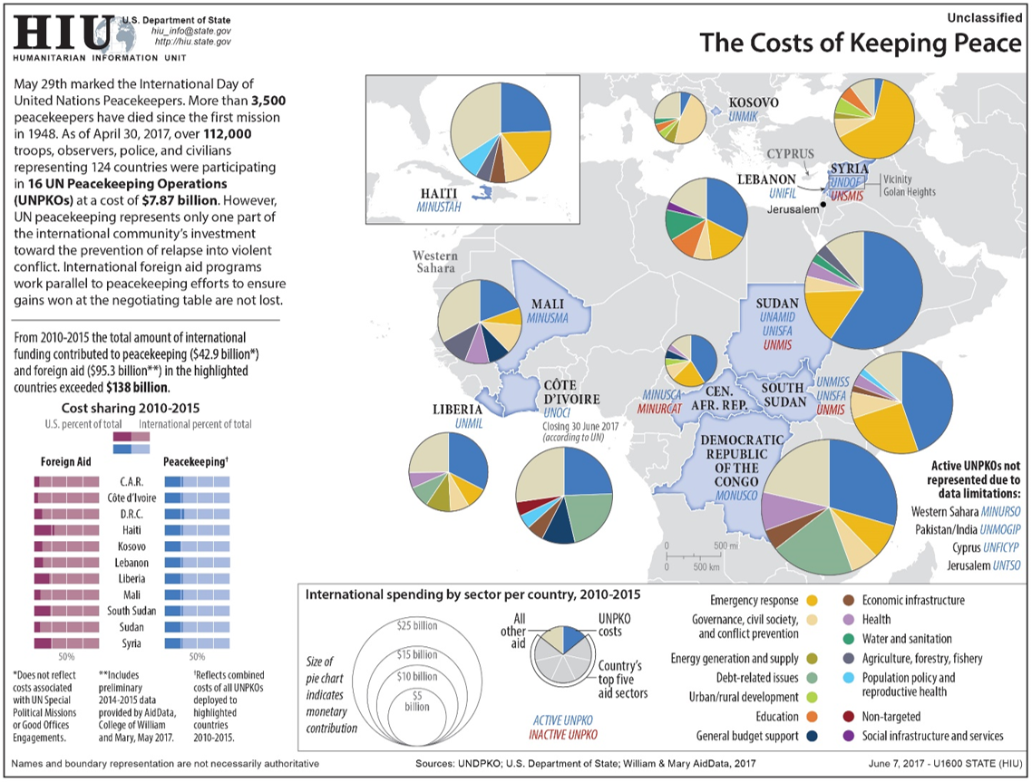
Though the use of overlay glyphs does permit the addition of many variables onto the map, this does not mean it is always the best solution. As shown in the above examples, including a large amount of data in a map can make it challenging to interpret. Additionally, multivariate glyphs in general—and pie charts in particular—have well-documented disadvantages in terms of reader comprehension (Tufte 2001). Adding graphics that are already challenging for people to understand to maps tends to exacerbate such issues. This is not to say that they should never be used, however—just with caution. And fortunately, there are ways in which such maps can be made easier to interpret.
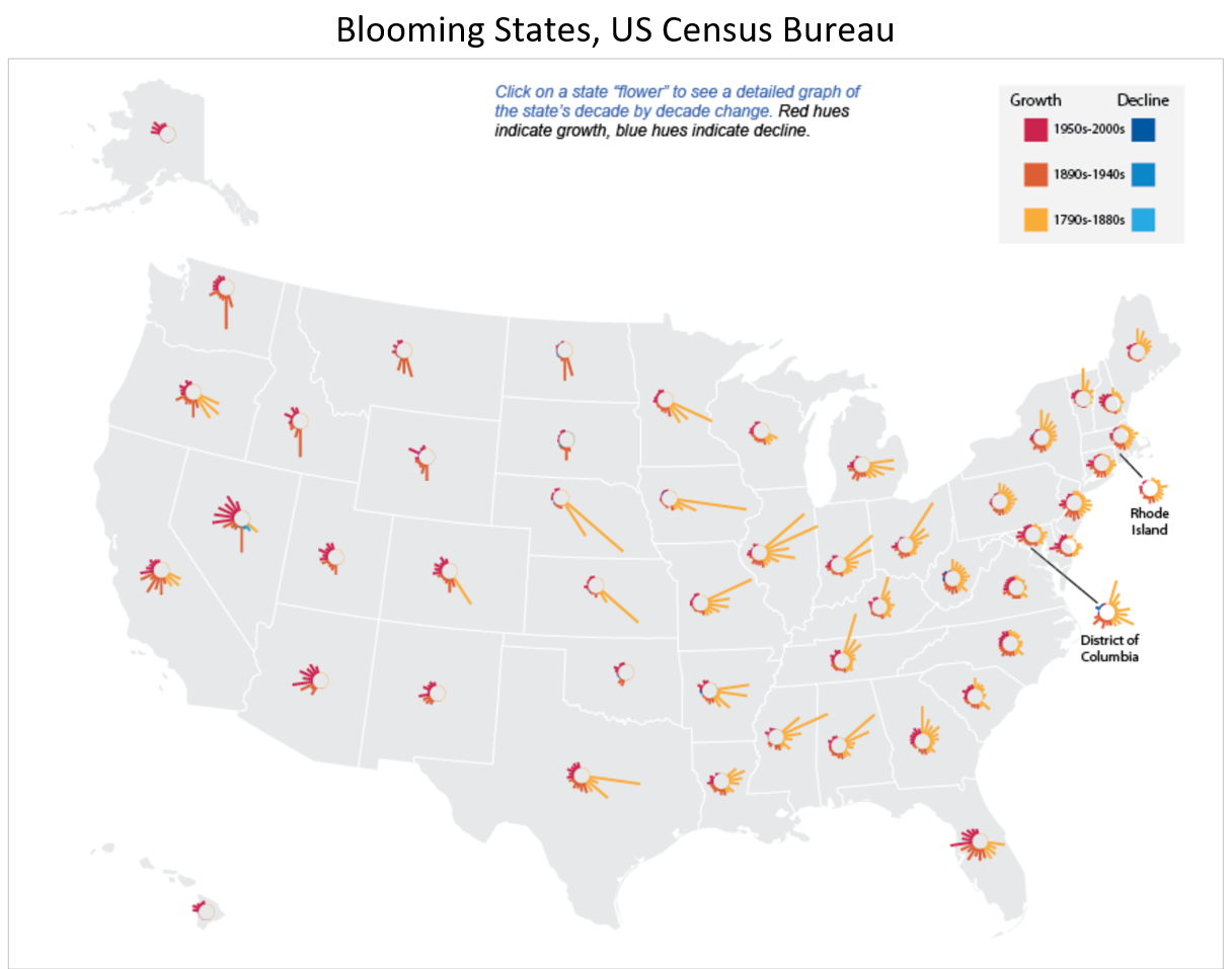
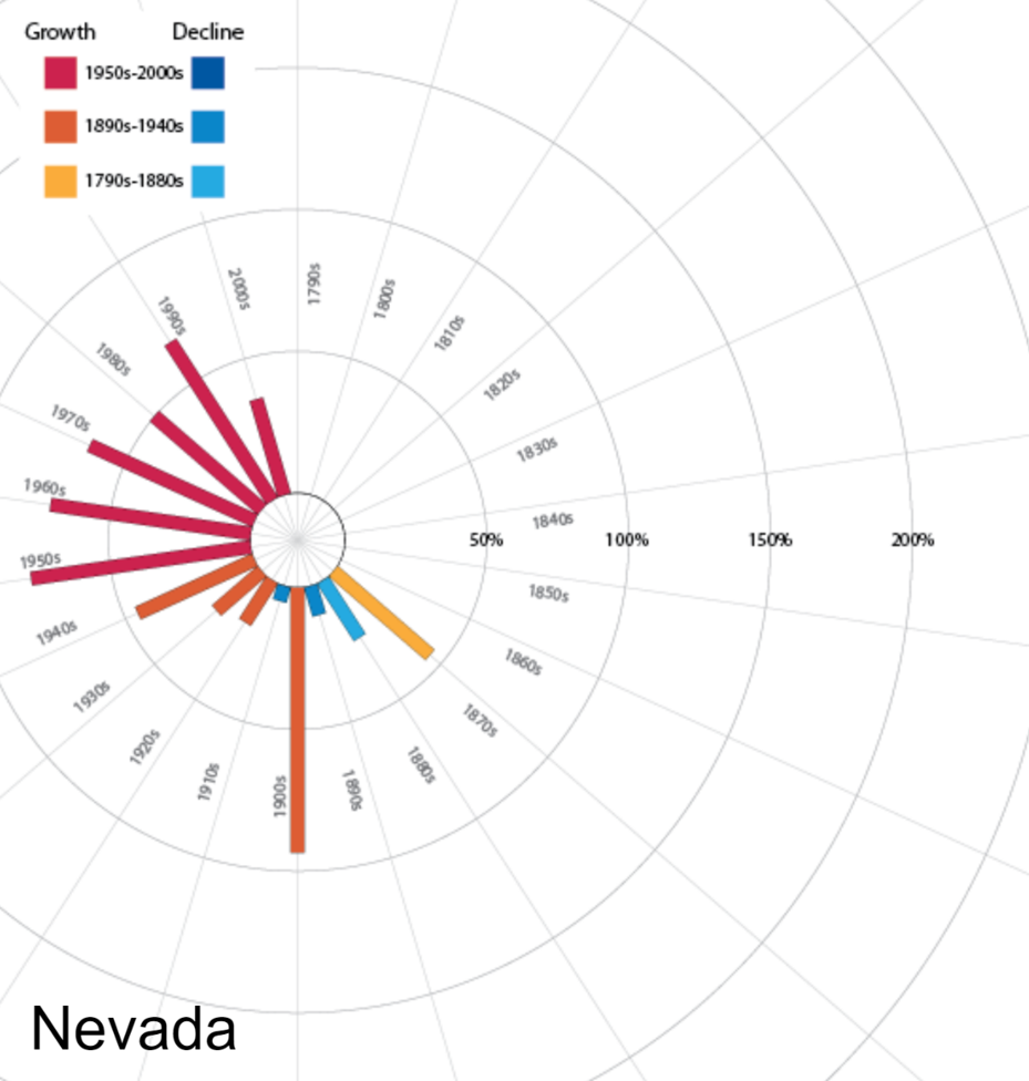
One way that multivariate maps can be made more comprehensible is through the addition of user interaction. Figure 5.5.3, for example, is challenging to interpret as a static image, particularly as the glyphs used are quite small. However, this is an interactive map. Clicking on a state creates a more informative pop-up, shown in Figure 5.5.4.
Student Reflection
Explore the use of multivariate glyphs to explore data about well-being. Can you think of ways in which this data might be symbolized instead as a static map or maps?
Despite the difficulty of creating maps with multivariate glyphs, cartographers have long attempted to tackle this challenge. One particularly interesting example of this is Chernoff faces. Chernoff faces are glyphs created by mapping variables onto facial attributes. When mapping the variable average household income, for example, a bigger smile might indicate a higher income level.
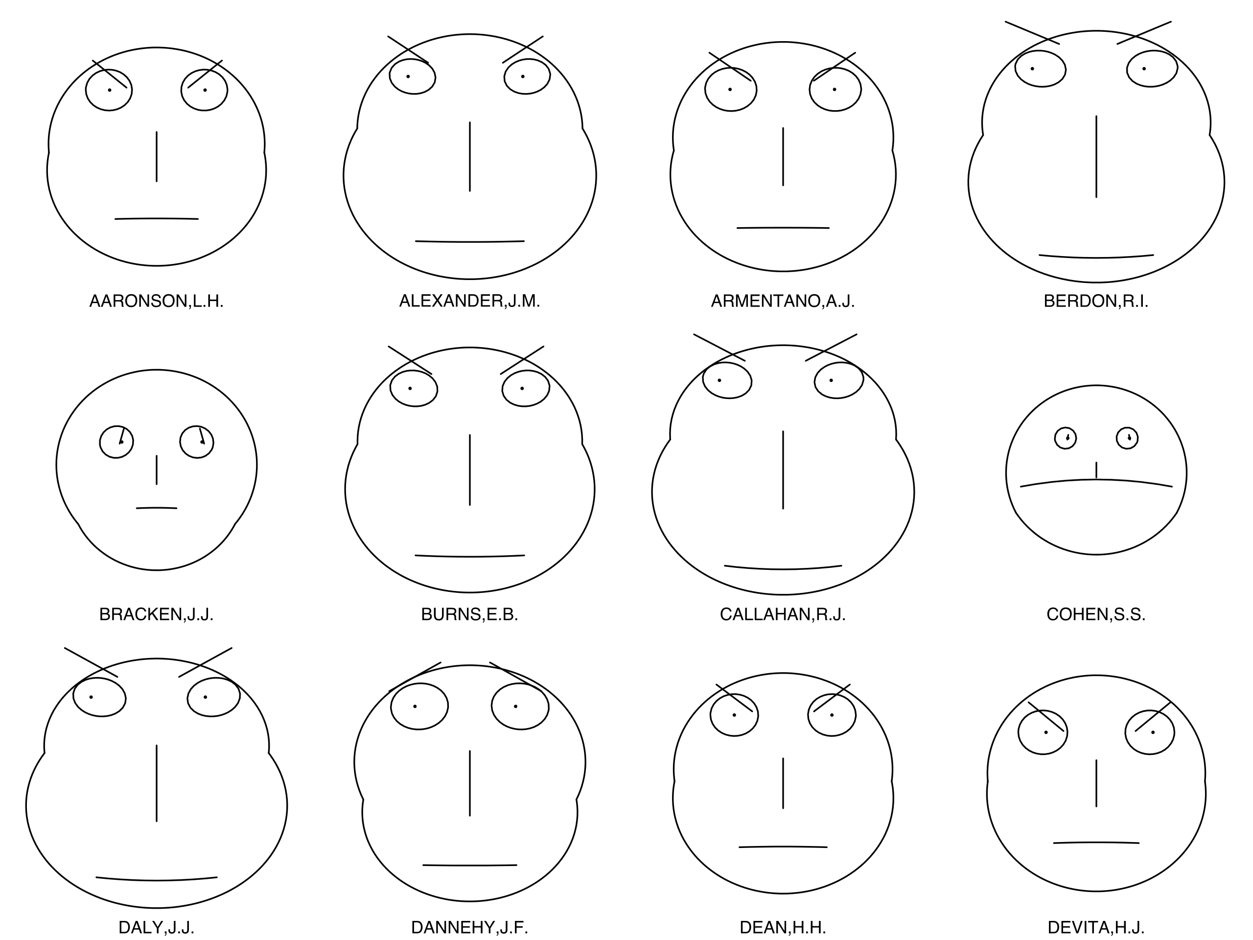
The Chernoff face technique was first proposed by Herman Chernoff in 1973. Chernoff’s intention was to capitalize on the ability of humans to intuitively interpret differences in facial characteristics—both by subconsciously noting important differences in expressions that are almost unmeasurable—and by being able to ignore large differences when these differences are not relevant in context (Chernoff 1973). Chernoff also noted that his method was desirable as it permitted the designer to map many variables (as many as 18!) onto just one graphic.
Chernoff’s original application of his technique used fossil and geological data, but Chernoff mapping is more commonly used to depict social data such as well-being, or other topics related to the emotions that might be intuitively encoded using facial attribute variables. The history of Chernoff mapping is rife with controversy—some Chernoff maps such as this one: Life in Los Angeles by Eugene Turner, 1977(link is external), have been heavily criticized for their use of stereotypical facial attributes and a cartoonish over-simplification of complex issues.
In response to these critiques, some cartographers have developed techniques for utilizing the advantages of Chernoff faces without some of the downsides. Heather Rosenfeld and her colleagues, for example, proposed using Zombieface glyphs rather than human faces—maintaining the emotive content and still capitalizing on people’s ability to intuitively interpret facial features, but removing the human context and thus lowering the likelihood of reinforcing harmful stereotypes (Figure 5.5.6).
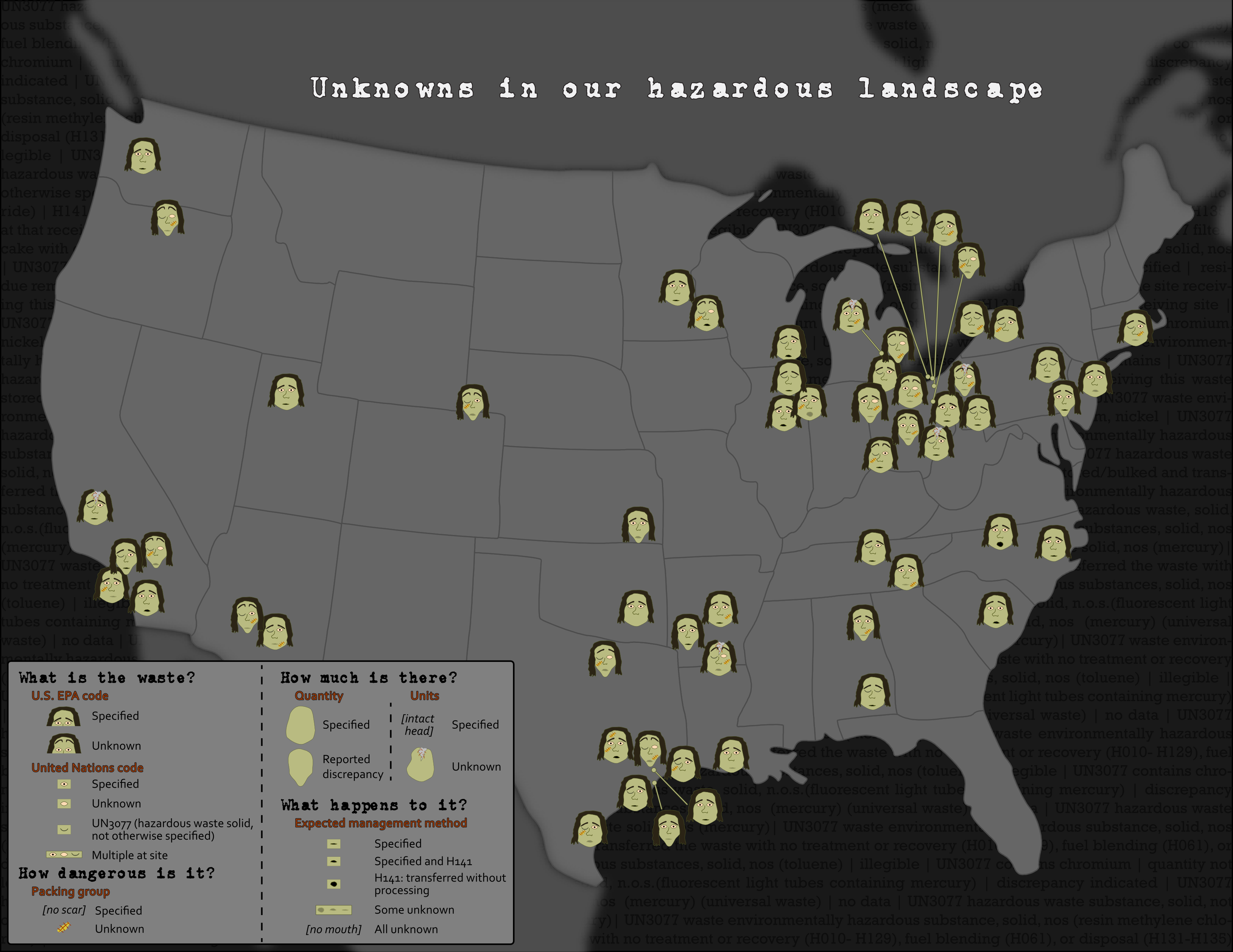
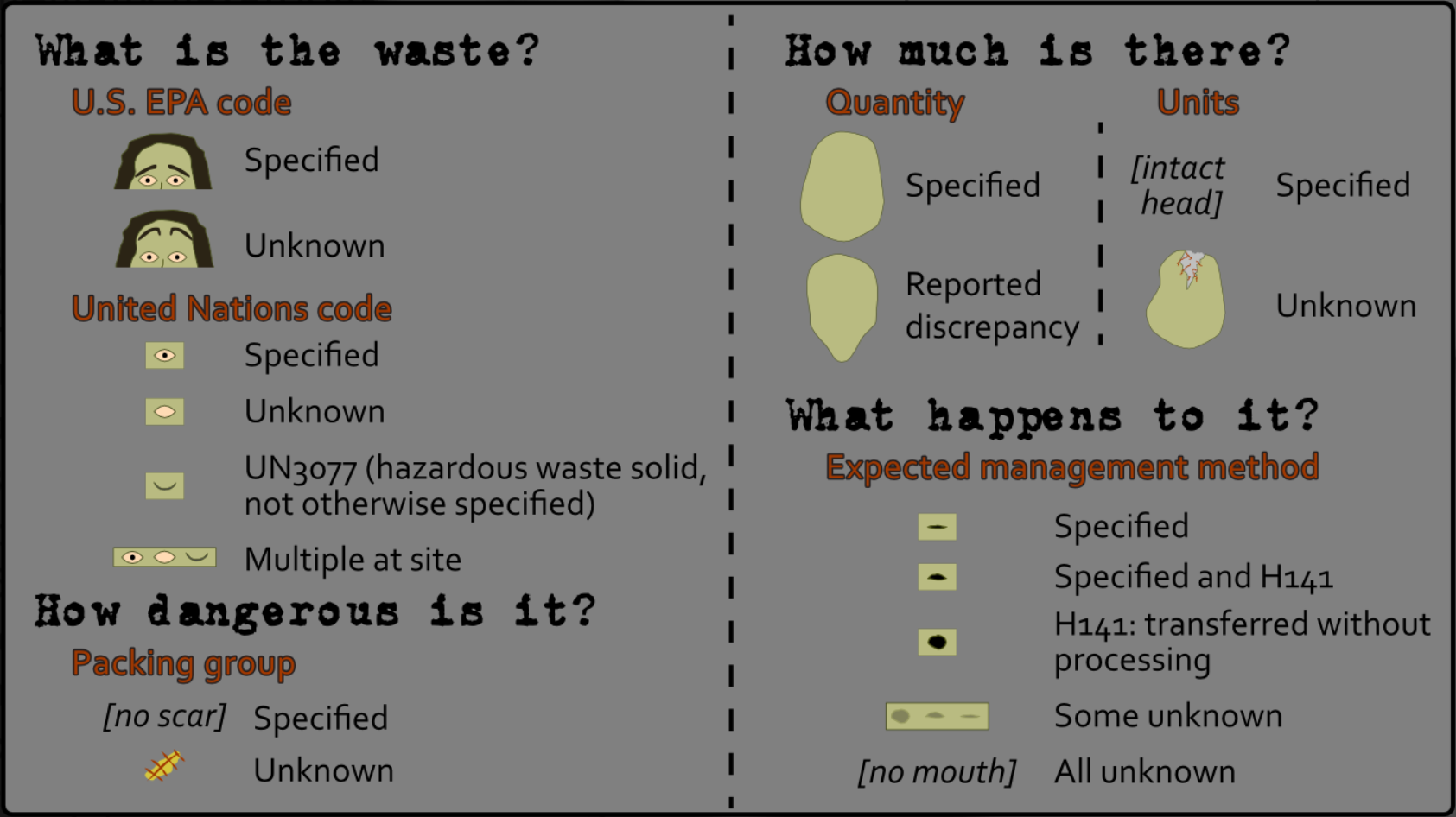
Take a closer look at the legend of this map—which demonstrates how the hazardous waste data was mapped to Zombie facial attributes—in the image below. As you can see, the map focuses on visualizing the presence of unknowns and uncertainty in the mapped dataset. We’ll discuss further techniques for visualizing uncertainty later in this lesson.
Chernoff Zombies are among several creative solutions recently proposed: a fun example is shown in the following quasi-Chernoff map: Mapping Happiness(link is external). It maps happiness, or well-being, across the United States using emoticons. Though these abstract icons cannot easily encode as many data attributes as Chernoff faces, they share the benefit of visualizing data at-a-glance using facial expressions.

