Overview
Overview
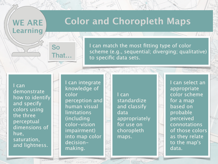
Welcome to Lesson 4! Last lesson, we learned about thematic maps, including how to choose a thematic mapping method and adjust our designs based on the characteristics of a geographic phenomenon. This week, we focus on a specific type of thematic map: choropleth maps. Choropleth maps are the most popular thematic map type, and designing them properly relies on adequate understanding of other important topics in cartography, such as data standardization and classification methods. Choropleth maps also typically employ color in their design: in Lesson 4, we discuss color in-depth. You will learn about the different ways in which we can model color space, and how visual perception constraints – both in the general population, and in those with color-vision impairments – influence map perception.
In Lab 4, we’ll explore how choosing a different color scheme and/or classification method can alter how readers interpret your maps. We’ll also learn how to make maps that work well in pairs—a common task that is often significantly more challenging than making one map that stands alone.
Learning Outcomes