
Summary
By the end of this week you should feel pretty confident on the foundations of typography and labeling different features. We covered:
- The anatomy of a font.
- Different types of fonts.
- Different types of labels.
- How to demonstrate differing levels of importance with text.
- How to demonstrate category with text.
- Recommended practices in using shadows, halos, and callouts.
- Label placement when it comes to points, lines, and polygons.
Remember not to take what you do in ArcGIS Pro at face value. Experiment with these various techniques to add extra finesse to your map! However, make sure not to sacrifice finesse with legibility.
Take a look at this topographic map of University City. How is typography used to delineate certain elements of the map?
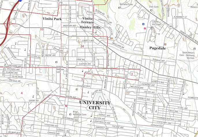
Image source: USGS Topoview
