
Summary
This week we covered these topics:
- Symbolizing points, lines, polygons, 2.5D and 3D features
- The major types of thematic maps
- Geographic phenomena models
- Geographic representation by data type
- Types of maps
- Legends for different types of maps
- Map wording
One interesting map that makes use of the dot density map is Mapping Segregation by New York Times, which is a dot density map by ethnicity across the U.S. Take a look at the dot density map of various metropolitan areas. What patterns do you see? Do you think the dot density map best shows ethnicity across the U.S?
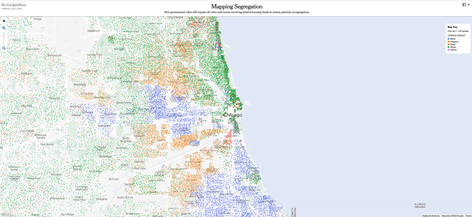
Image source: New York Times
