
Summary
By the end of this week, you should feel confident in taking in considerations regarding color and classification schemes when it comes to creating choropleth maps. This week we covered:
- The perceptual dimensions of color which are hue, lightness, or value and saturation or chroma
- Munsell’s color system
- Types of color schemes which are sequential, diverging, and qualitative
- Tips on choosing hues for your color scheme
- Accessibility
- Useful resources to help you choose color and classification schemes
The Washington Post created a web map where you can look to see the change of rent per county. Does this map effectively communicate the change in rent in terms of the color scale and classification breaks? What can be improved?
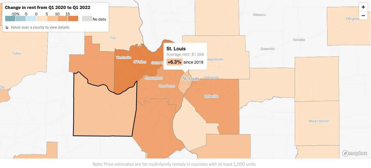
Image source: Washington Post
