The Visualization of Uncertainty
The Visualization of Uncertainty
Of the many variables you may wish to include in your maps, there is one that has received particular focus from cartographers due to its unique characteristics—uncertainty. Uncertainty is a complex concept which has been defined differently by various authors. For example, Longley et al. (2005) define uncertainty as “the difference between a real geographic phenomenon and the user’s understanding of the geographic phenomenon.” We use this definition as it encompasses the many variations of uncertainty that in emerge during multiple stages of map-making—during data collection, data classification, visualization, map-reader interpretation, and more (Kinkeldey and Senaratne, 2018).
It can be assumed that all geographic data contain some level of uncertainty. A map of average income by county, for example, might classify a county as having an average household income between $50,000 and $60,000. Despite this, it is possible that the actual value falls outside of this range—due to survey response errors, non-response to survey (e.g., Census) requests by some residents, or changes in the data over time (e.g., some survey respondents have moved in or out of the county since the data was collected). A map of precipitation levels, similarly, will also contain uncertainty, likely due to the imprecision or inaccuracy of measurement instruments, but possibly due to human error or related factors as well.
Traditionally, researchers have grouped geodata uncertainty into three categories – the what (attribute/thematic uncertainty), the where (positional or locational uncertainty), and the when (temporal uncertainty) (MacEachren et al. 2005). The success of visual variables for depicting uncertainty depends on the type of uncertainty to be mapping. Containing a point within a colored glyph or circle, such as Google’s “blue dot,” might be most effective for depicting positional uncertainty (Google Maps; McKenzie et al. 2016). Use of another variable such as transparency might be more effective for depicting attribute uncertainty, such as uncertainty of unemployment rates in a county-level map.
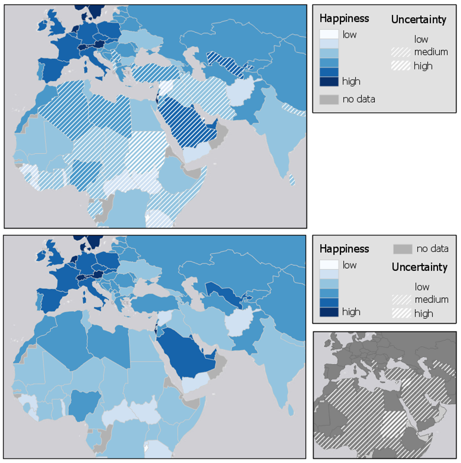
Like other multivariate data, uncertainty can be combined with the other visualized data in a map, or compared by visualizing it in a separate map view. Figure 7.8.1 shows two maps that use different techniques to visualize the uncertainty in the data. Figure 7.8.1 (top) uses a combining technique, in which a visual overlay is used to show attributional uncertainty. Figure 7.8.1 (bottom) uses a reliability diagram—an inset map that the reader can reference to understand which locations on the map contain the most certain data values. In general, the combining method is a more popular technique, though a compare technique might be useful if the primary map is sufficiently complex, and thus adding overlay would make the map difficult to comprehend.

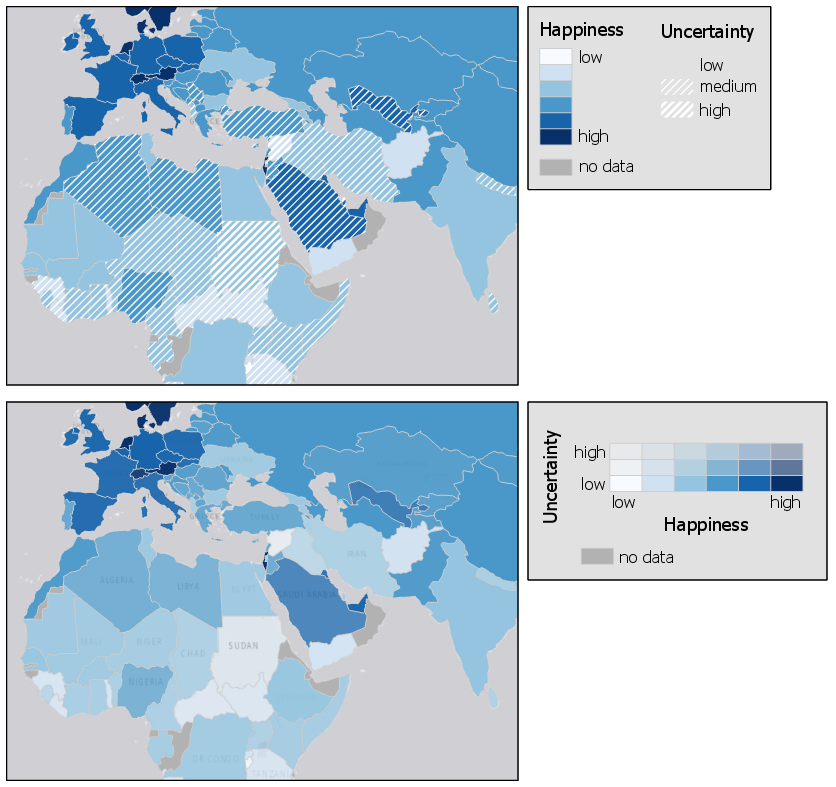
Among combined uncertainty visualization techniques, methods for visualizing uncertainty are typically classified as either intrinsic or extrinsic. Intrinsic uncertainty visualization techniques cannot be visually separated from the visualization of one or more other variables, while extrinsic visualization techniques are easier to interpret separately. An example of the difference between these two techniques is shown in Figure 5.8.2.

In Figure 5.8.2, both extrinsic (top) and intrinsic (bottom) uncertainly visualization techniques are shown. The extrinsic visualization uses a hatched fill overlay to denote uncertain values—thus, the visualization of uncertainty is visually separable from the visualization of the data underneath. Figure 5.8.2 (bottom) by contrast, uses an intrinsic visual variable—transparency—to visualize data uncertainty. The two variables are combined together to create the legend as well.
Any visual variable can be adapted to demonstrate uncertainty. However, some have been developed specifically for this purpose. MacEachren (1995) proposed the idea of clarity as a visual variable for static maps, an overarching concept that can be further divided into three visual variables: transparency, crispness, and resolution (MacEachren 1995). Transparency is a somewhat familiar visual variable, as it has been adapted for other purposes than displaying uncertainty, such as in the value-by-alpha maps described earlier in this lesson.
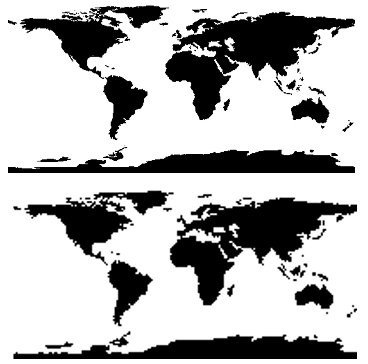
Crispness is a particularly intuitive way of visualizing uncertainty. Features are depicted on a continuum from crisp to blurry, with less certain values appearing appropriately out-of-focus (Figure 5.8.3).

Resolution creates a similar effect—features with less certain boundaries or attributes are depicted in courser resolution, suggesting a lack of certainty in the map.

These visual variables are popular for depicting uncertainty as they intuitively suggest uncertainty (or certainty) by design. Just as higher data values are visually encoded with larger symbols, less certain boundaries, for example, may be visually encoded with fuzzy boundaries.
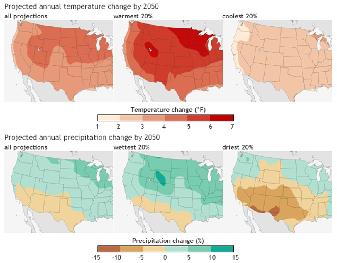
Though uncertainty is often discussed in terms of uncertainty within data due to imprecise instruments, imperfect collection methods, etc., an important additional context where uncertainty plays a role is in the mapping of future scenarios. Climate models, for example, use past and present data to predict future conditions, but these predictions are inherently uncertain. Figure 7.8.5 below contains maps of temperature and precipitation change predictions. The first map (top left) maps the average result of 37 predictive models intended to estimate temperature change by 2050 (Kennedy 2014). The middle map shows the warmest 20% of models—the 20% coldest models are summarized at the right. The bottom three maps show a similar comparison of maps created from precipitation models.

Unlike previous examples, these maps do not use intuitive visual depictions of uncertainty. However, the map-maker’s inclusion of all three maps for each data variable shows the range of possibilities that might lie ahead: the future is always an uncertain entity. It is implied that these maps depict not all possible scenarios but a range of likely ones; they intend not to precisely predict the future but to help users understand what might future conditions they might expect to come about.

