
Types of Maps
Types of Maps
Maps are generally classified into one of three categories: (1) general purpose, (2) thematic, and (3) cartometric maps.
General Purpose Maps
General Purpose Maps are often also called basemaps or reference maps. They display natural and man-made features of general interest, and are intended for widespread public use (Dent, Torguson, and Hodler 2009).
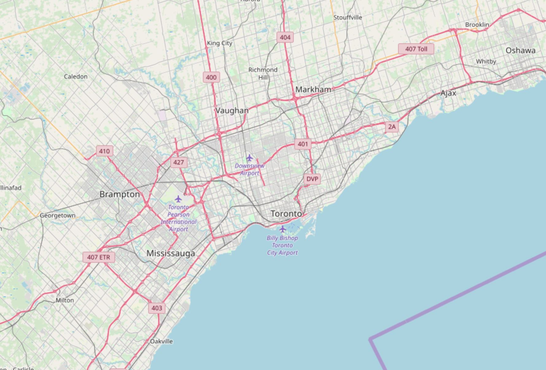
Image description: OpenStreetMap basemap showing Toronto and the surrounding areas of Brampton, and Mississauga which is West of Toronto, Vaughaun and Markham which is north of Toronto, and Ajax and Oshawa which is west of Toronto. There are areas of green on the map which indicates park/greenspace while blue areas indicates lake/oceans. Red lines indicate main roads.
Thematic Maps
Thematic Maps are sometimes also called special purpose, single topic, or statistical maps. They highlight features, data, or concepts, and these data may be qualitative, quantitative, or both. Thematic maps can be further divided into two main categories: qualitative and quantitative. Qualitative thematic maps show the spatial extent of categorical, or nominal, data (e.g., soil type, land cover, political districts). Quantitative thematic maps, conversely, demonstrate the spatial patterns of numerical data (e.g., income, age, population).

The image is a map of the United States depicting the median household income in 2015, presented in inflation-adjusted dollars. The states are color-coded based on income ranges. The map includes all 50 states, the District of Columbia (DC), and Puerto Rico (PR). A color legend is located in the bottom right corner of the map, which outlines four income categories: 60,000 or more(dark purple), 50,000 to 59,999(medium purple), 45,000 to 49,999(light blue), and less than 45,000 (lightest blue).
- States like Maryland, New Jersey, and Massachusetts are shaded in dark purple, indicating a median income of $60,000 or more.
- States such as Oregon, Indiana, and Illinois are in medium purple, indicating a median income between 50,000 and 59,999.
- States like North Carolina and Ohio are in light blue, indicating a median income between 45,000 and 49,999.
- States including Mississippi and Arkansas are in the lightest blue, indicating a median income of less than $45,000.
Alaska and Hawaii are represented in insets on the map. The U.S. median household income in 2015 is noted as $55,775. There is also a note indicating that states surrounded by an “O” symbol have values that are not statistically different from the U.S. median.
Cartometric Maps
Cartometric Maps are a more specialized type of map and are designed for making accurate measurements. Cartometrics, or cartometric analysis, refers to mathematical operations such as counting, measuring, and estimating—thus, cartometric maps are maps which are optimized for these purposes (Muehrcke, Muehrcke, and Kimerling 2001). Examples include aeronautical and nautical navigational charts—used for routing over land or sea—and USGS topographic maps, which are often used for tasks requiring accurate distance calculations, such as surveying, hiking, and resource management.
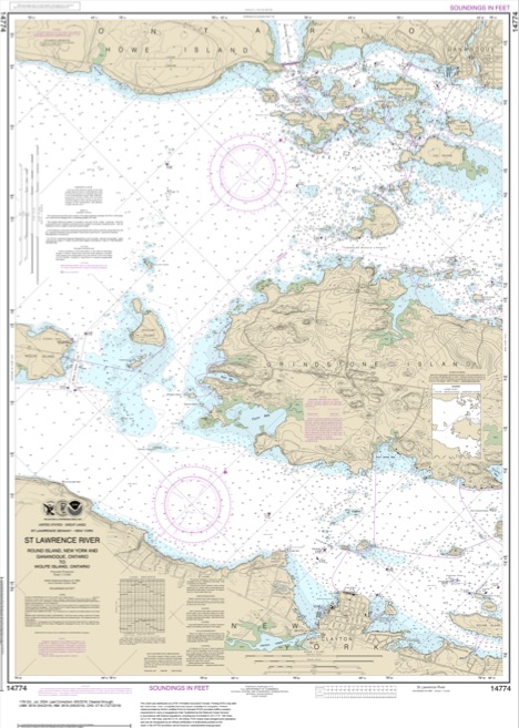
Image description: The image is a nautical chart of the St. Lawrence River, specifically the areas between Kingston, Ontario, and the Admiralty Islands. The chart is oriented in portrait mode and primarily beige with aqua blue patches representing water bodies. Brown contours and black lines indicate depth measurements. Two large circular compass roses, one located near the center and another towards the bottom left, provide directional information. A grid of longitude and latitude lines overlays the map. In the lower left corner, there is a section containing descriptive text and data. Several navigational aids, such as buoys and other markers, are shown as symbols scattered throughout the water areas. Annotations, including place names and navigational information, are printed in black.
In theory, these map categories are distinct, and it can be helpful to understand them as such. However, few maps fit cleanly into one of these categories—most maps in the real world are really hybrid general purpose/thematic maps.
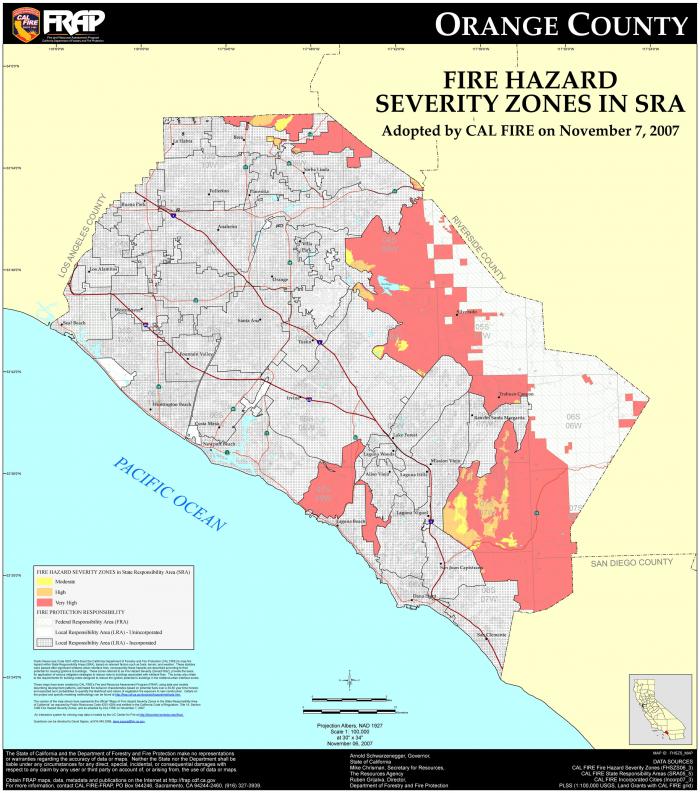
Image description: The image is a detailed map of Orange County with designated fire hazard severity zones as of November 7, 2007. The map encompasses coastal and inland regions, extending from the Pacific Ocean on the southwest side to the borders with Los Angeles, Riverside, and San Diego counties. Areas on the map are color-coded to represent different severities of fire hazards: red for ‘Very High,’ orange for ‘High,’ and yellow for ‘Moderate.’ The majority of the coastal region is marked in grey, indicating urban developments with limited fire risk. The inland areas, particularly towards the eastern part of the county, show larger red and orange zones indicating higher fire hazard areas. Major highways and roads are outlined in black, with specific routes highlighted in purple and pink. The map features several important features like the Pacific Ocean, county borders, and major road networks.
Advancements in technology and in the availability of data have resulted in the proliferation of many diverse types of maps. Some, as shown in Figure 1.2.5, are embedded into exploratory tools intended to inform researchers and policy-makers.
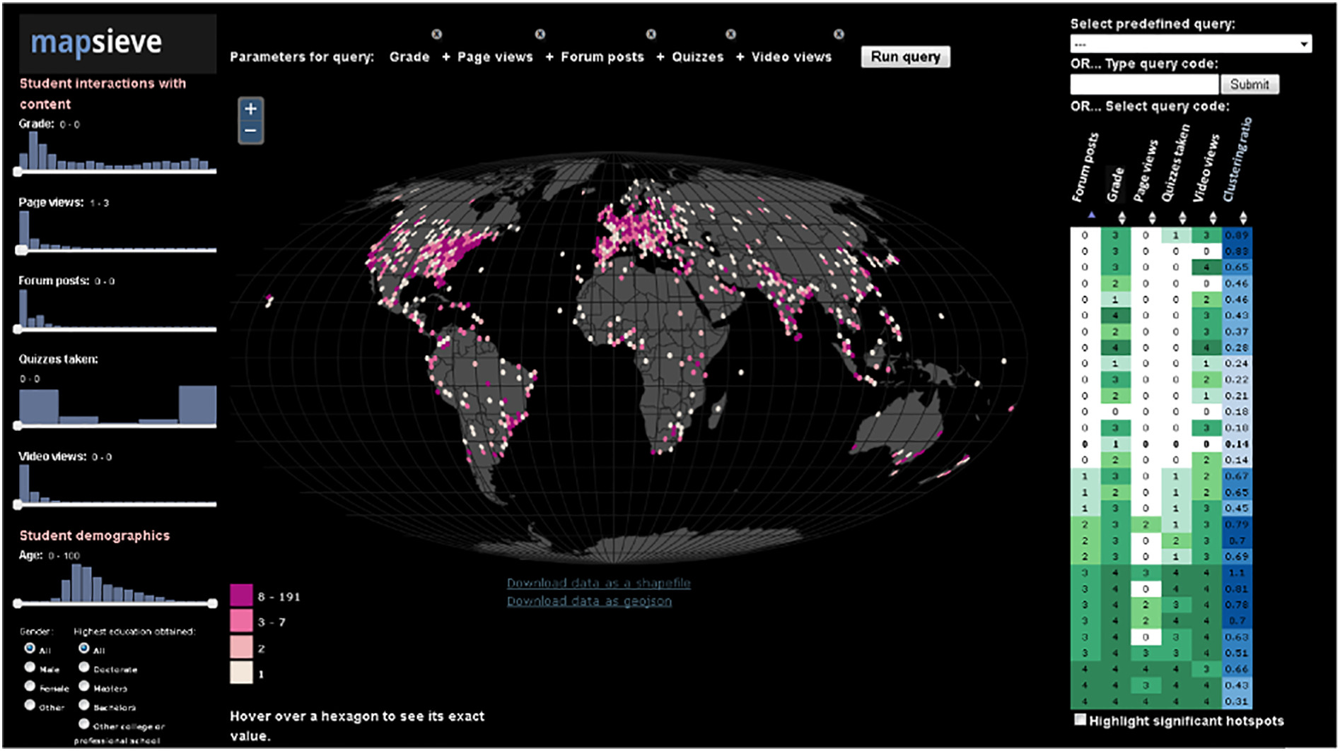
Image description: The image is a detailed data visualization dashboard titled “mapsieve.” It features student interactions and demographics data overlaid on a map of the world. The central element is a dark spherical map with graticules displaying various points in pink and white, indicating student interaction hot spots. These points vary in color and size, with a legend at the bottom left corner explaining the interaction range: 1-2 (white), 3-7 (light pink), and 8-191 (dark pink).
On the left side of the dashboard, there are several histograms under the header “Student interactions with content.” These histograms display data on different parameters including Grade, Page views, Forum posts, Quizzes taken, and Video views, all on a scale of 0 to a specific upper limit. Below these, there’s another histogram graph titled “Student demographics” showing the age distribution from 0 to 100.
Various interactive control options are present at the top, labeled “Parameters for query,” allowing selections such as Grade, Page views, Forum posts, Quizzes, and Video views. On the right, there’s a pane for selecting predefined queries, typing or selecting query codes, and viewing a data table showing different interaction metrics (Forum posts, Grade, Page views, Quizzes taken, Video views, and Clustering ratio). The background of the dashboard is black, enhancing the contrast and clarity of the data visualizations.
Other maps are intended for a wider audience but share the goal of uncovering and visualizing interesting relationships in spatial data (Figure 1.2.6).
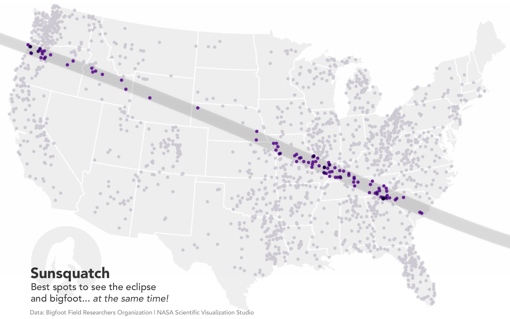
Image description: A map of the US that shows places to see both bigfoot and the solar eclipse. Bigfoot sightings are indicated by grey dots outside the eclipse path and purple within the eclipse path. The eclipse path is a dark grey line and runs through Oregon, Idaho, Wyoming, Nebraska, Missouri, Tennessee, and South Carolina. On the bottom-left is an image of a bigfoot in which the bigfoot is white and there is a grey circle background. Black text is on the image which is “Sunsquatch best spots to see the eclipse and bigfoot…at the same time!”. Below this text is smaller text that says “Data: Bigfoot Field Researchers Organizations | NASA Scientific Visualization Studio.”
Maps also are not limited to depicting outdoor landscapes. Some maps, such as the one in Figure 1.2.7, are designed to help people navigate complicated indoor spaces, such as malls, airports, hotels, and hospitals.
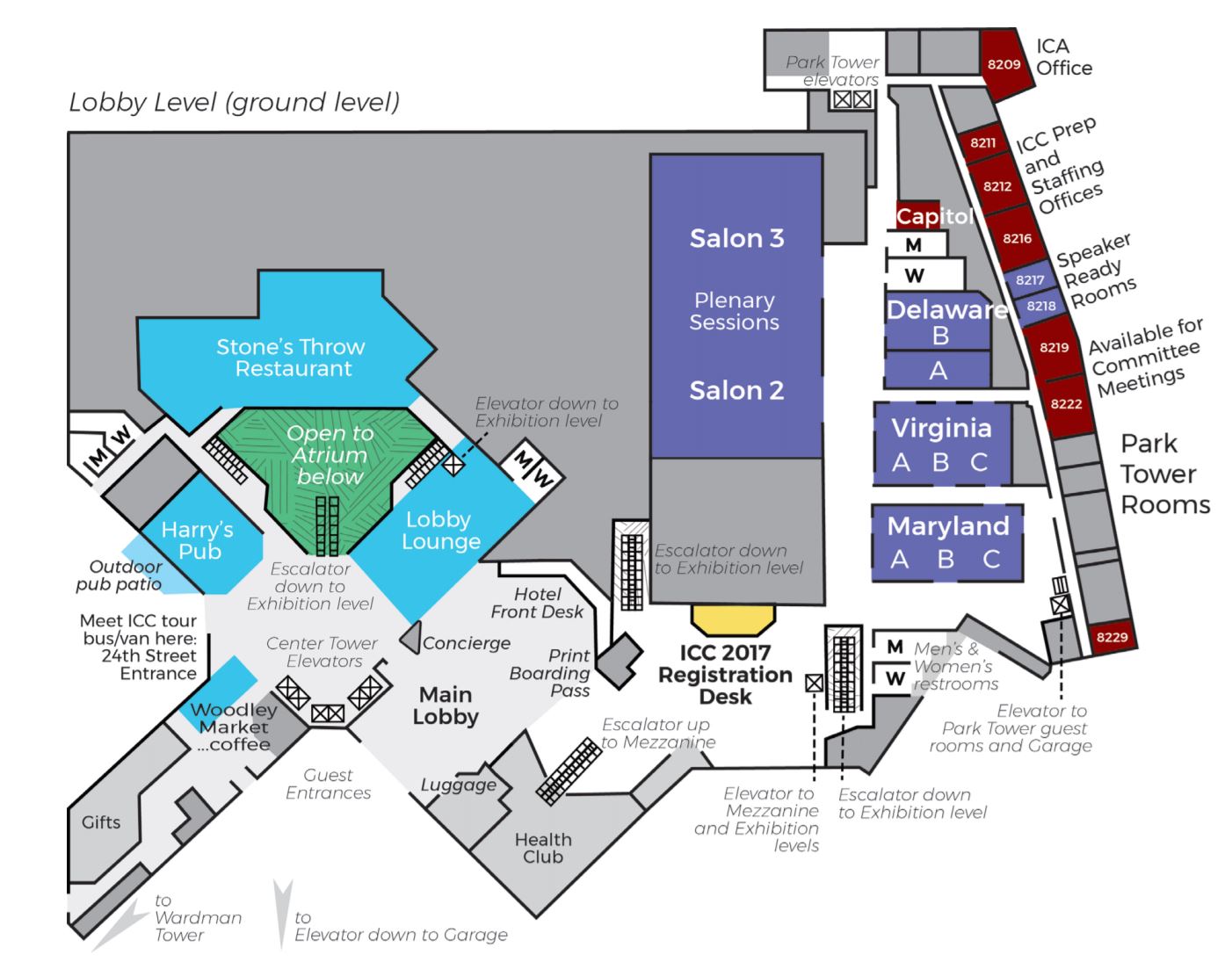
Image description: Indoor map of the Washington DC Marriott Lobby level from the 2017 International Cartographic Conference. The title of the map is “Lobby Level (ground level)” which is in grey and italic text. Restaurants are indicated in blue with white text such as “Stone’s Throw Restaurant, “Harry’s Pub,” “Lobby Lounge,” and “Woodley Market Coffee” which are on the west side of the Lobby level. Amentities and facilities such as “Gifts,” “Luggage,” and “Health Club” are indicated in light grey with black text and located in the southwest part of the lobby. The main lobby, hotel front desk, print boarding pass, concierge, escalator down to the exhibition level, and Center Tower elevators are on the west side of the floor. Session halls are indicated by purple with white bold text for the room names. “Salon 3” and “Salon 2” is in the center of the floor and will hold the plenary sessions which is indicated by “Plenary Sessions” in white text that is not bold. On the east side of the floor are the “Delaware B, A, Virginia A, B, C, and Maryland A, B, and C” rooms. On the far east are rooms that are indicated in maroon and in black text which are administrative rooms. These rooms are “ICA Office, ICC Prep” and “Staffing Offices.” There are also two rooms that are available for Committee meetings.
For a map to be useful, it is not always necessary that they realistically portray the geography they represent. This map of the public transit system in Boston, MA (Figure 1.2.8) drastically simplifies the geography of the area to create a map that is more useful for travelers than it would be if it were entirely spatially accurate.
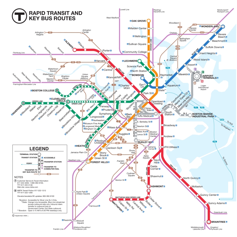
Image description: The image is a detailed schematic map of the rapid transit and key bus routes of the Boston metropolitan area. The map uses several colors to distinguish between different lines: Red, Blue, Orange, Green, Silver, and Purple, along with a dotted line representing key bus routes. The map is overlaid on a light background and includes waterways and other significant landmarks. Key transit stations are highlighted with specific symbols indicating types of services available, such as accessibility and transfer points to commuter rail or buses. Each transit line terminates at distinct locations, with terminal stations marked clearly.
The top left corner of the map contains the MBTA logo and the text “Rapid Transit and Key Bus Routes.” Major lines include the Red Line ending at Alewife and Braintree, the Blue Line from Wonderland to Bowdoin, the Orange Line from Oak Grove to Forest Hills, and the Green Line with branches ending at Boston College, Cleveland Circle, Riverside, and Heath Street. The map also includes a legend explaining symbols and notes on how to use the system.
Maps that show general spatial relationships but not geography are often called diagrammatic maps, or spatializations. Spatializations are often significantly more abstract than public transit maps; the term refers to any visualization in which abstract information is converted into a visual-spatial framework (Slocum et al 2009).
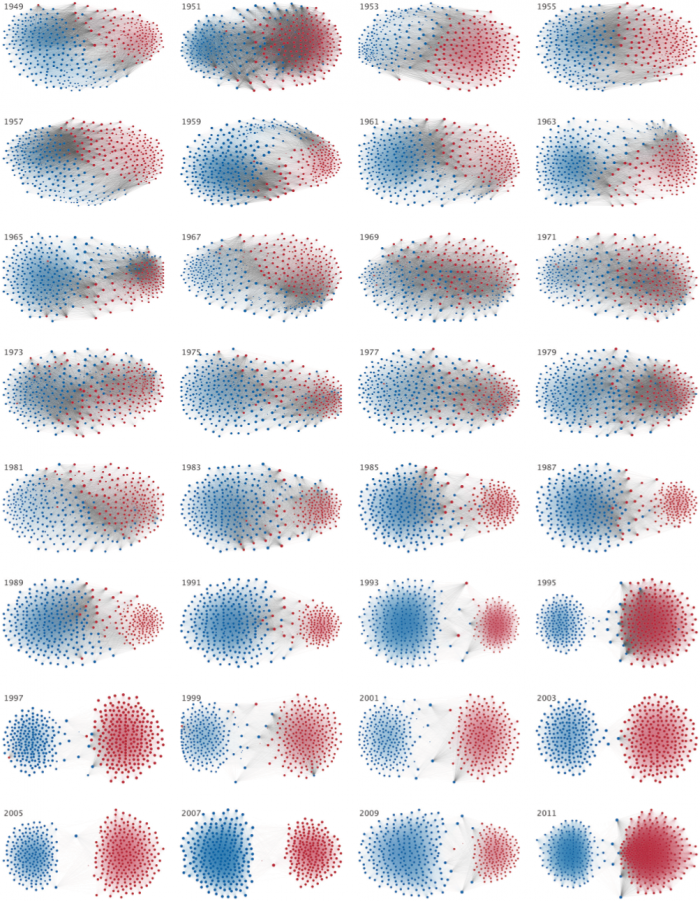
Image description: The image consists of a 9×6 grid showing 54 individual network diagrams which represents the increasing polarization between members of the U.S. House of Representatives between 1949 and 2011 with nodes in blue and red.. Each diagram is a representation of a network made up of blue and red nodes connected by thin, curved lines, indicating edges. The network shapes change over time as the diagrams are labeled chronologically in sequence, starting from 1949 in the top-left corner and ending with 2011 in the bottom-right corner. The colors blue and red seem to indicate different categories or groups, with varying degrees of mixing and separation across different years. In many diagrams, there is a noticeable transition or shift in the spatial arrangement of the nodes.
Though there are many different types of maps, they share the goal of demonstrating complex spatial information in a clear and useful way. Rather than attempt to place maps into discrete categories, it is generally more productive to see them as individual entities designed to suit a particular audience, medium, and purpose. We will discuss this more in the next section.
