Chapter 7: Visually Representing Geospatial Thinking
The Lay of The Land or Mapping Basics: Lying with Maps
Successfully communicating the results of geospatial thinking depends on how data are presented. This chapter will provide an overview of communicating geospatial results. As a reminder, the communication may or may not be a map. Insights from geospatial thinking could also come in the form of a research article, a workflow, or a dashboard.
Whatever the medium, geospatial results can wield a powerful authority. Thematic mapping is an excellent example of how we can sway audiences with our communication choices. Mark Monmonier warns us in “How to Lie with Maps” not only to be careful in designing our own maps, but also to critically examine the maps of others with healthy skepticism. Maps are not alone; compelling data visualization can also tell powerful stories, or at least a side of it. For those who rely on data-driven decision making, it is especially important to critically evaluate what’s presented.
GIS utilizes many concepts and themes from cartography, the formal study of maps and mapping. To become proficient with GIS, it helps to understand cartography. The first part of this chapter defines what a map is and describes a few key map types. Next, cartographic or mapping conventions are discussed with particular emphasis placed upon map scale, coordinate systems, and map projections. The chapter concludes with a discussion of the process of map abstraction as it relates to GISs. This chapter provides the foundations for working with, integrating, and making maps with GIS.
Maps are among the most compelling forms of information for several reasons. Maps are artistic. Maps are scientific. Maps preserve history. Maps clarify. Maps reveal the invisible. Maps inform the future. Regardless of the reason, maps capture the imagination of people around the world. As one of the most trusted forms of information, map makers and geographic information system (GIS) practitioners hold a considerable amount of power and influence (Wood 1992; Monmonier 1996).
So, what exactly is a map? As stated before, maps are tools of representation, notwithstanding the actual presentation medium of the map (e.g., our fleeting thoughts, paper, or digital display), maps communicate aspects of the world. For purposes of clarity, the three high-level map categories are reference (general purpose) maps, thematic maps, and the dynamic maps.
Reference Maps
The primary purpose of a reference map is to deliver location information to the map user. Geographic features and map elements on a reference map tend to be treated and represented equally. In other words, no single aspect of a reference map takes precedent over any other aspect. Moreover, reference maps generally represent geographic reality accurately. Examples of some common types of reference maps include topographic maps such as those created by the United States Geological Survey (USGS) and image maps obtained from satellites or aircraft that are available through online mapping services.
The accuracy of a given reference map is indeed critical to many users. For instance, local governments need accurate reference maps for land use, zoning, and tax purposes. National governments need accurate reference maps for political, infrastructure, and military purposes. People who depend on navigation devices like global positioning system (GPS) units also need accurate and up-to-date reference maps in order to arrive at their desired destinations.
Thematic Maps
Contrasting the reference map are thematic maps. As the name suggests, thematic maps are concerned with a particular theme or topic of interest. While reference maps emphasize the location of geographic features, thematic maps are more concerned with how things are distributed across space. Such things are often abstract concepts such as life expectancy around the world, per capita gross domestic product (GDP) in Europe, or literacy rates across India. One of the strengths of mapping, and particularly thematic mapping, is making abstract and invisible concepts visible and comparable on a map.
It is important to note that reference and thematic maps are not mutually exclusive. In other words, thematic maps often contain and combine geographical reference information, and conversely, reference maps may contain thematic information. What is more, when used in conjunction, thematic and reference maps often complement each other.
When presented in hard-copy format, both reference and thematic maps are static or fixed representations of reality. Such permanence on the page suggests that geography and the things that we map are also in many ways fixed or constant. This is far from reality. Leveraging dynamic, interactive mapping elevates the information and provides the viewer an opportunity to engage with the data.
Dynamic Maps
Dynamic maps are changeable or interactive representations of place. It refers more to how maps are designed, delivered, and used than to the content of the map itself. Both reference and thematic maps can be dynamic in nature, and such maps are an integral component to any GIS. Dynamic maps encourage and sometimes require user interaction. Such interaction can include changing the scale or visible area by zooming in or zooming out, selecting which features or layers to include or to remove from a map (e.g., roads, imagery), or starting/stopping a map animation. The use of dynamic mapping has become ubiquitous and map users continue to demand more interactive map features and controls. As democratization of maps and mapping continues, the geographic awareness and map appreciation of map users will also increase. Therefore, it is of critical importance to understand the nature, form, and content of maps to support the changing needs, demands, and expectations of map users in the future.
Basics of Symbology
Color is an extremely powerful communication tool, but it has to be used appropriately, Color will greatly enhance and support map design, but if used carelessly, it can also detract from a mapping product. To use color properly, one must first understand color basics and consider the purpose of the map. In some cases, the use of color is not warranted. Grayscale maps can be just as effective as color.
Primary aspects
Color is a tricky subject in mapping and data visualization in general. Colors vary in hue as well as lightness. Monmonier has written in depth about color choice in How to Lie with Maps, and Dorris Scott has a helpful textbook on Digital Cartography [link to this: . For the purpose of this text, we will cover some basic rules.
The three primary aspects of color that must be addressed in cartography are hue, value, and saturation.
Hue is the dominant wavelength or color associated with a reflecting object.
Hue is the most basic component of color and includes red, blue, yellow, purple, and so forth. Value is the amount of white or black in the color.
Value is often synonymous with contrast.
Variations in the amount of value for a given hue result in varying degrees of lightness or darkness for that color. Lighter colors are said to possess high value, while dark colors possess low value. Monochrome colors are groups of colors with the same hue but with incremental variations in value. As seen in, variations in value will typically lead the viewer’s eye from dark areas to light areas.
Saturation describes the intensity of color.
Full saturation results in pure colors, while low saturation colors approach gray. Variations in saturation yield different shades and tints. Shades are produced by blocking light, such as by an umbrella, tree, curtain, and so forth. Increasing the amount of shading results in grays and blacks. Tint is the opposite of shade and is produced by adding white to a color. Tints and shades are particularly germane when using additive color models (see for more on additive color models). To maximize the interpretability of a map, use saturated colors to represent hierarchically prominent features and washed-out colors to represent background features.
Meaning
Color is particularly suited to convey meaning. For example, red is a strong color that evokes a passionate response in humans. Red has been shown to evoke physiological responses such as increasing the rate of respiration and raising blood pressure. Red is frequently associated with blood, war, violence, even love. On the other hand, blue is a color associated with calming effects. Associated with the sky or ocean, blue colors can actually assist in sleep and is therefore a recommended color for bedrooms. Too much blue, however, can result in a lapse from calming effects into feelings of depression (i.e., having the “blues”).
Green is most commonly associated with life or nature (plants). The color green is certainly one of the most topical colors in today’s society with commonplace references to green construction, the Green party, going green, and so forth. Green, however, can also represent envy and inexperience (e.g., the green-eyed monster, greenhorn). Brown is also a nature color but more as a representation of earth and stone. Brown can also imply dullness. Yellow is most commonly associated with sunshine and warmth, somewhat similar to red. Yellow can also represent cowardice (e.g., yellow-bellied).
Black, the absence of color, is possibly the most meaning-laden color in modern parlance. Even more than the others, the color black purports surprisingly strong positive and negative connotations. Black conveys mystery, elegance, and sophistication (e.g., a black-tie affair, in the black), while also conveying loss, evil, and negativity (e.g., blackout, black-hearted, black cloud, blacklist).
Clarification and Emphasis
Warm colors, such as reds and yellows, are notable for emphasizing spatial features. These colors will often jump off the page and are usually the first to attract the reader’s eye, particularly if they are counterbalanced with cool colors, such as blues and greens (see for more on warm and cool colors). In addition, the use of a hue with high saturation will stand out starkly against similar hues of low saturation.
Aesthetics
Color use is also important for creating a map with pleasing aesthetics. Certainly, one of the most challenging aspects of map creation is developing an effective color palette. When looking at maps through an aesthetic lens, we are truly starting to think of our creations as artwork. Although somewhat particular to individual viewers, we all have an innate understanding of when colors in a graphic/art are aesthetically pleasing and when they are not. For example, color use is considered harmonious when colors from opposite sides of the color wheel are used, whereas equitable use of several major hues can create an unbalanced image.
Abstraction
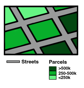
Color abstraction is an effective way to illustrate quantitative and qualitative data, particularly for thematic products such as choropleth maps. Here, colors are used solely to denote different values for a variable and may not have any rhyme or reason. shows a typical thematic map with abstract colors representing different countries.
Opposite abstraction, color can also be used to represent reality. Maps showing elevation (e.g., digital elevation models or DEMs) are often given false colors that approximate reality. Low areas are colored in variations of green to show areas of lush vegetation growth. Mid-elevations (or low-lying desert areas) are colored brown to show sparse vegetation growth. Mountain ridges and peaks are colored white to show accumulated snowfall. Watercourses and water bodies are colored blue. Unless there is a specific reason not to, natural phenomena represented on maps should always be colored to approximate their actual color to increase interpretability and to decrease confusion.
Reserved Colors
There are certain feature/color combinations that are widely accepted.
| Color | Example | Use |
|---|---|---|
| Blue | | Water (streams, lakes, permanent snow fields and glaciers, etc.) |
| Green | | Forest and vegetation, parks etc. |
| White | A general lack of vegetation (or data) | |
| Brown | | Contour lines (elevation information) |
| Black | | Man-made/cultural features (buildings, place names, boundary lines, roads, etc.) |
| Red | | Highways and major roads, Township/Range/Section information |
| Pink | | Urban areas |
| Purple | | Reflect revisions to a map but is no longer used on maps in production |
Data Classification
As discussed earlier, all maps are abstractions. This means they depict select information based on the question the geospatial problem addressed and the limits of display resolution, comparable limits of human visual acuity, and especially the limits imposed by the costs of collecting and processing detailed data.
Single Symbol
Single symbol is a method of stylizing data in a feature class will the same symbol shape and color. The character of the symbol can be customized to represent the feature class, but they are all like each other.
Unique Values
Unique values uses categorical (ordinal) information to symbolize features using a specific variable, so that when values for that variable are the same, they can be symbolized the using the same symbol type or color.
Graduated Colors
Maps produced by this method are properly called choropleth maps. They are symbolized by a gradient representing numeric values which increase/decreases; generally high values are given darker shades, decreasing in shade as the numbers decrease. Because our ability to discriminate among colors is limited, attribute data values at the ratio or interval level are usually sorted into four to eight ordinal level categories. The categories are often referred to as classes. The number of classes may be adjusted, as can the method of parsing the values.
Parsing methods
Although our data values don’t change for a variable in each dataset, the way those values are presented can suggest different meanings. It’s important as map makers that we are transparent in how we have parsed the data for visualization
• Equal Interval : This method breaks values into consistent chunks. The chunks serve as milestones which provide a useful point of reference.
• Quantiles : Divide values into five bins, each of which contains the same number of values. This is accomplished by varying the width or range of each class. Quantile is a general label for any grouping of rank ordered data divided into an equal number of entities.
• Standard Deviation : This method finds the mean of a variable and then the distance from the mean for each value in that variable. Groupings are made based on that distance from the mean.
• Jenks Natural Breaks : This algorithm groups data values based on their likeness to each other. The number of classes will help determine what values are grouped.
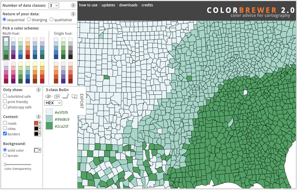
Exercise
Visit Color Brewer and explore colorblind-safe ramps for each nature of map:
- Sequential
- Diverging
- Qualitative